







Lead gen ads are built to capture a contact, not close a sale, so the highest-reach creatives here trade a small piece of value, a free guide, a quiz, or a starter plan, for an email or a click. This curated snapshot of top Meta lead-capture ads shows how the strongest performers hook on a problem, prove they can solve it, and make the opt-in feel like the obvious next step. Across 664 ads from 122 advertisers, a few clear creative patterns keep surfacing.
Key takeaways
- Video carries lead generation. The format mix runs 71% video to 29% image, so most of the highest-reach lead gen creatives are moving pieces that dramatise a problem and a fix rather than static frames.
- Deep reach across many advertisers. The 664 ads come from 122 distinct advertisers, with median reach of 1.0M and top reach touching 9.3M on a single ad. Average run length lands at 174 days, a signal these lead-capture ads keep earning their budget.
- The offer is a free micro-asset. Winning ads lead with a low-friction giveaway: a free guide, a one-minute quiz, or a personalized plan. The value feels immediate and specific, which lowers the cost of handing over a lead.
- A hidden cause reframes the problem. Top creatives take a familiar frustration and pin it on a cause the viewer has not considered, building enough tension that opting in feels like the answer they were missing.
What makes a winning Lead Gen ad
A strong lead gen creative opens on a sharp, specific problem the viewer already feels, then agitates it by naming a cause they had not connected to it. Proof arrives fast, often by showing the actual product doing its job, a personalized plan with locked progression, or a demonstration that makes the outcome concrete. The offer is a free micro-asset, a guide, a quiz, or a starter plan, framed as the obvious next step. One clean call to action, such as GET STARTED or take the quiz, closes the loop and captures the lead with minimal friction.
What the top Lead Gen ads look like
Scan the highest-reach lead gen ads and you see a recurring cast of contrast and demonstration: split frames that put a current state on one side and a goal state on the other, a presenter handling a prop that dramatises a hidden cause, or the product UI itself filling the screen with progress bars, locked tiles, and one unlocked preview. On-screen text is blunt and benefit-led, often flagging the word free or a one-minute promise, with a single prominent button as the focal point. Minimalist variants strip it back to a logo, one line of copy, and one link surrounded by calm space. About 71% of these top ads are video and 29% are image.
Prefer one format? Filter this page to Lead Gen video ads or Lead Gen image ads only.
Winning ad frameworks in Lead Gen
The highest-reach Lead Gen ads reuse a handful of proven creative frameworks. Here are the ones that stand out here, each with a real example you can play or open in full.
1. Problem, Agitate, Solution (PAS)
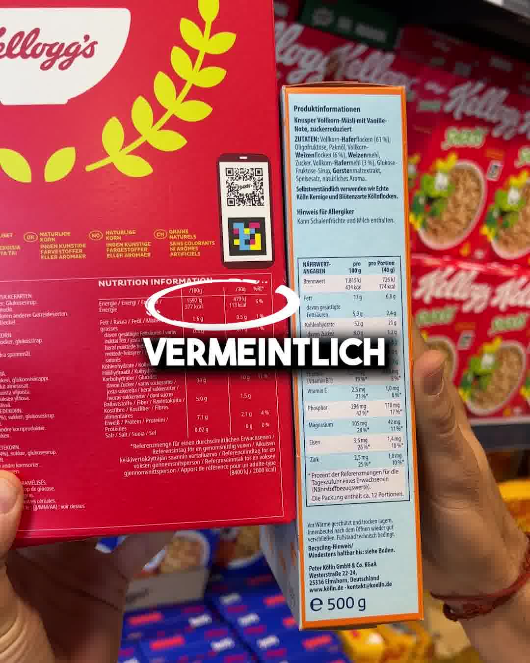
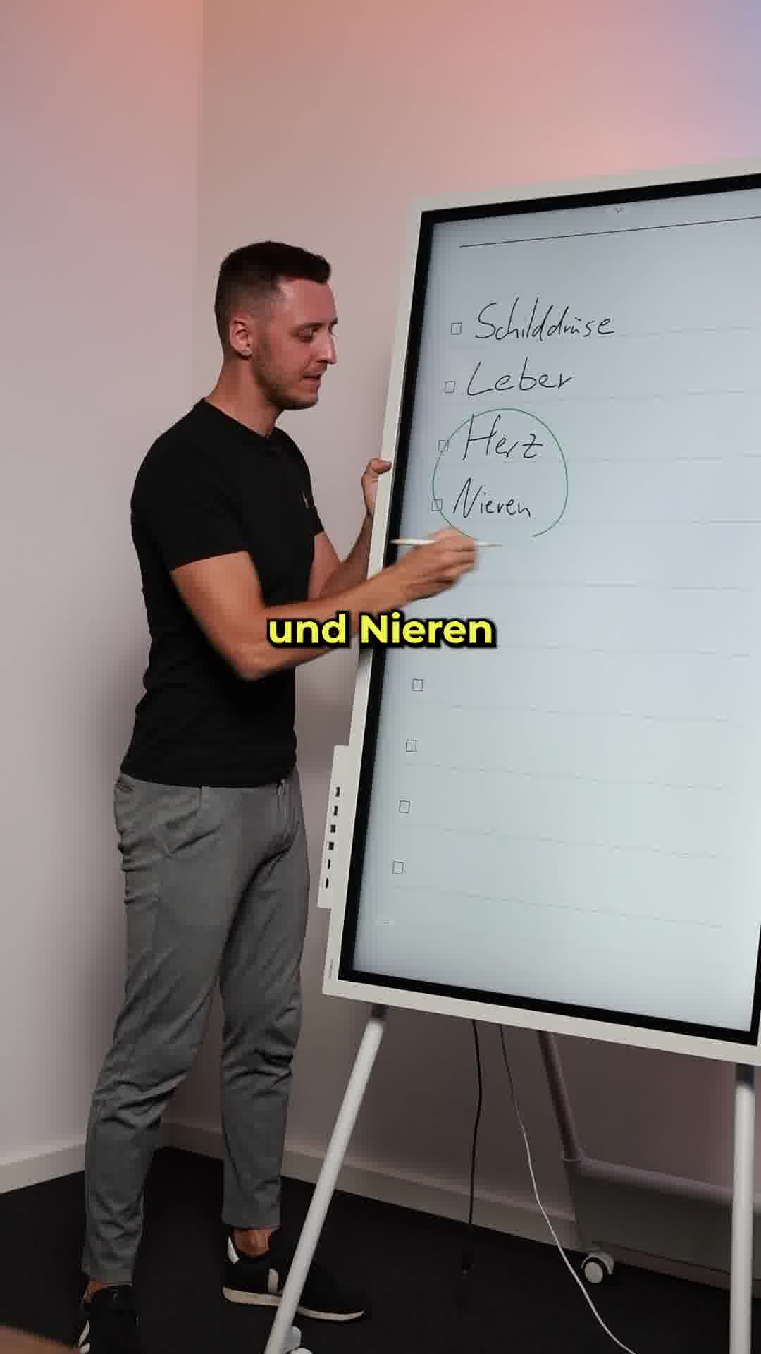
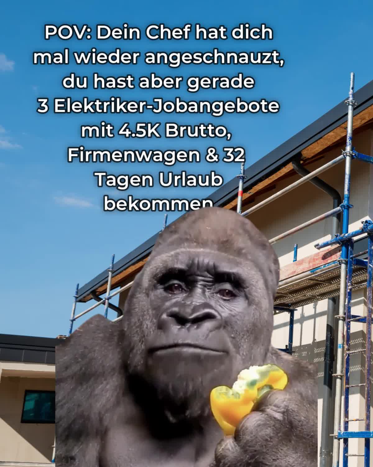
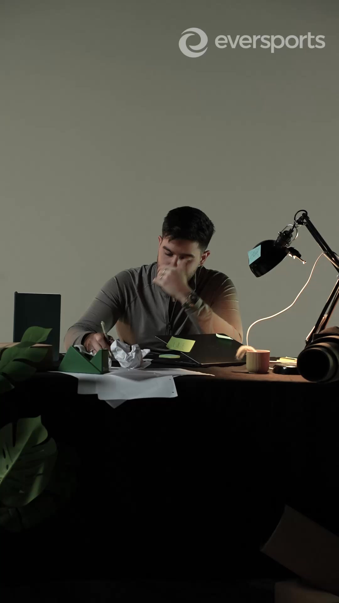
What it does. Jasper Caven opens on a specific everyday problem, stubborn belly fat, then agitates it in the copy: the fat clings on because an organ cannot work properly, and one in three adults has a non-alcoholic fatty liver. On screen a man in a green shirt studies an anatomical organ model, hand on the belly area, dramatising the internal cause before the free 4-pillar liver-detox guide is offered as the fix.
Why it works. It reframes a familiar frustration around a hidden internal cause the viewer has not considered, which builds enough tension that the free guide feels like the obvious next step to capture the lead.
Ad data. 9.3M reach over 198 days running. Gender split: 48% women / 52% men.
2. Split screen
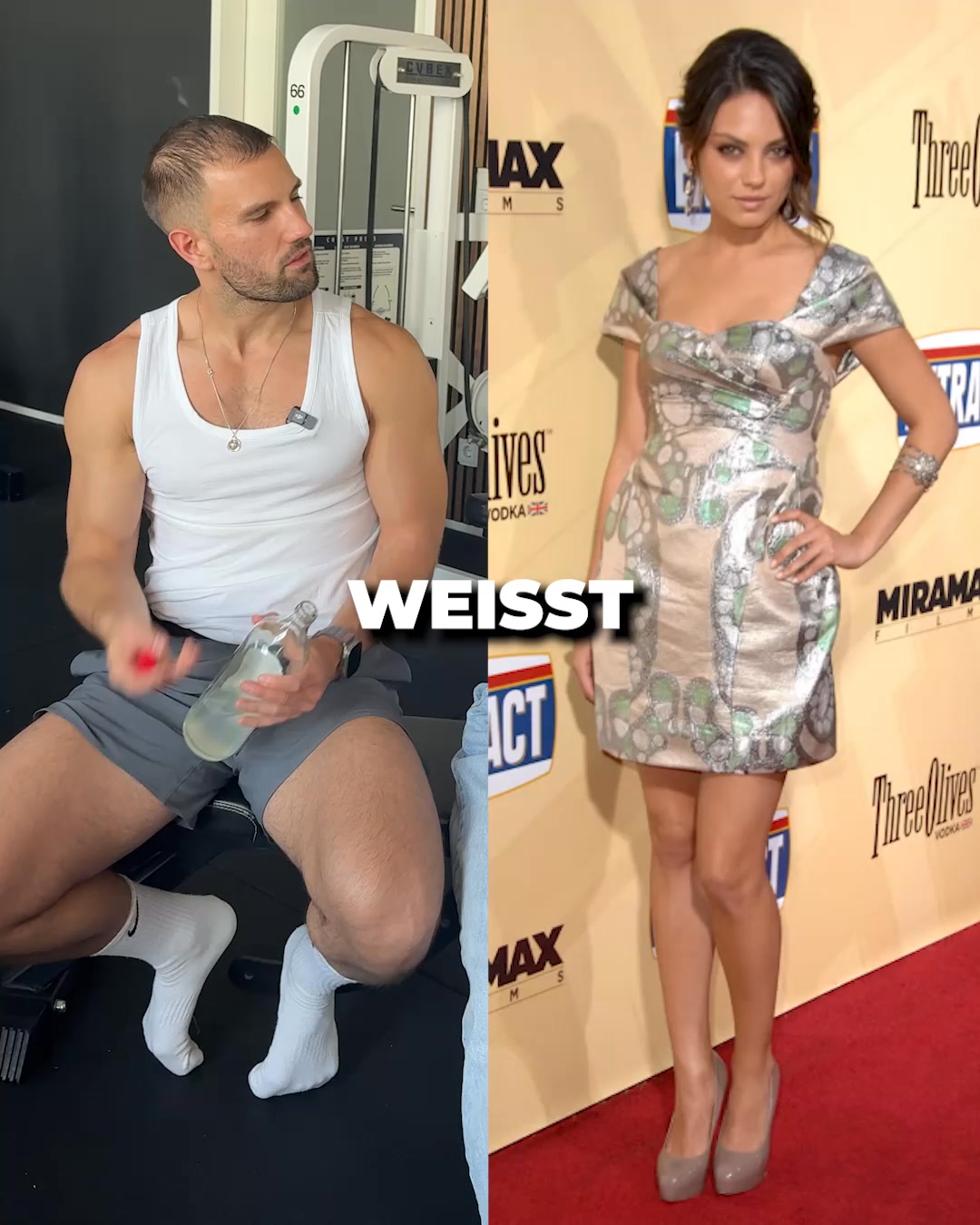
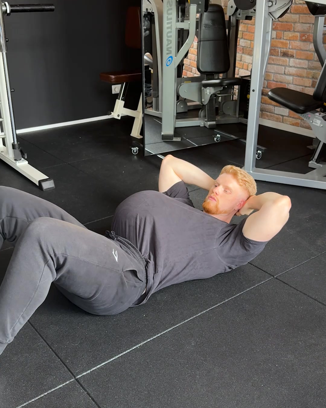
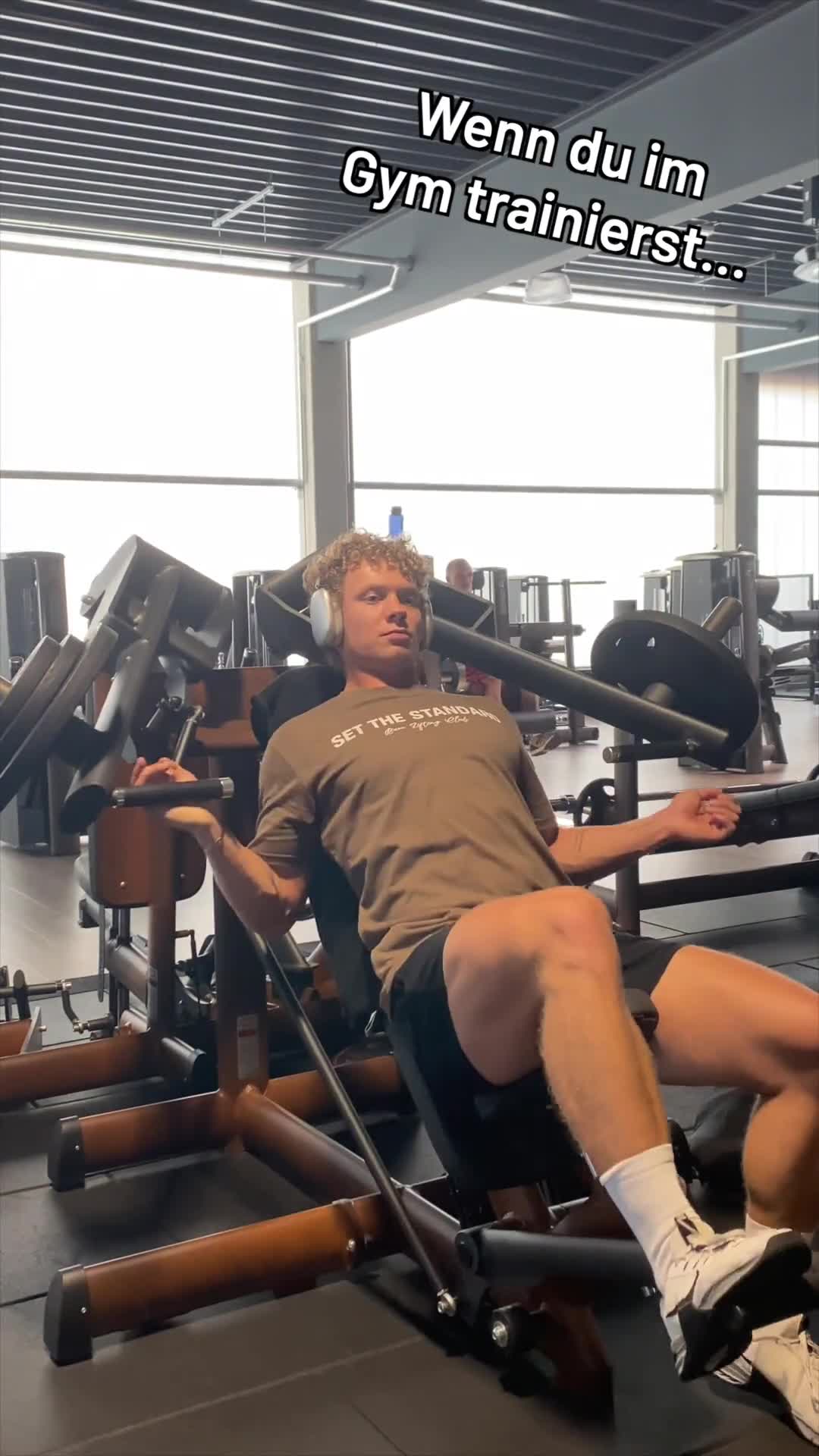
What it does. Sjard Fitness splits the frame straight down the middle: a man mid-workout in a gym on the left, a slim woman in a dress on the right, with the caption WEISST bridging the two halves. The copy pushes the 1-minute quiz to your dream figure and argues standard calorie calculators are always wrong because they ignore your individual starting point and goal.
Why it works. The hard visual divide sets up an us-versus-them, current-versus-goal contrast in a single glance, and the blunt claim that calculators make you fat drives curious viewers into the quiz to capture the lead.
Ad data. 9.0M reach over 141 days running. Gender split: 57% women / 43% men.
3. Demo or tutorial
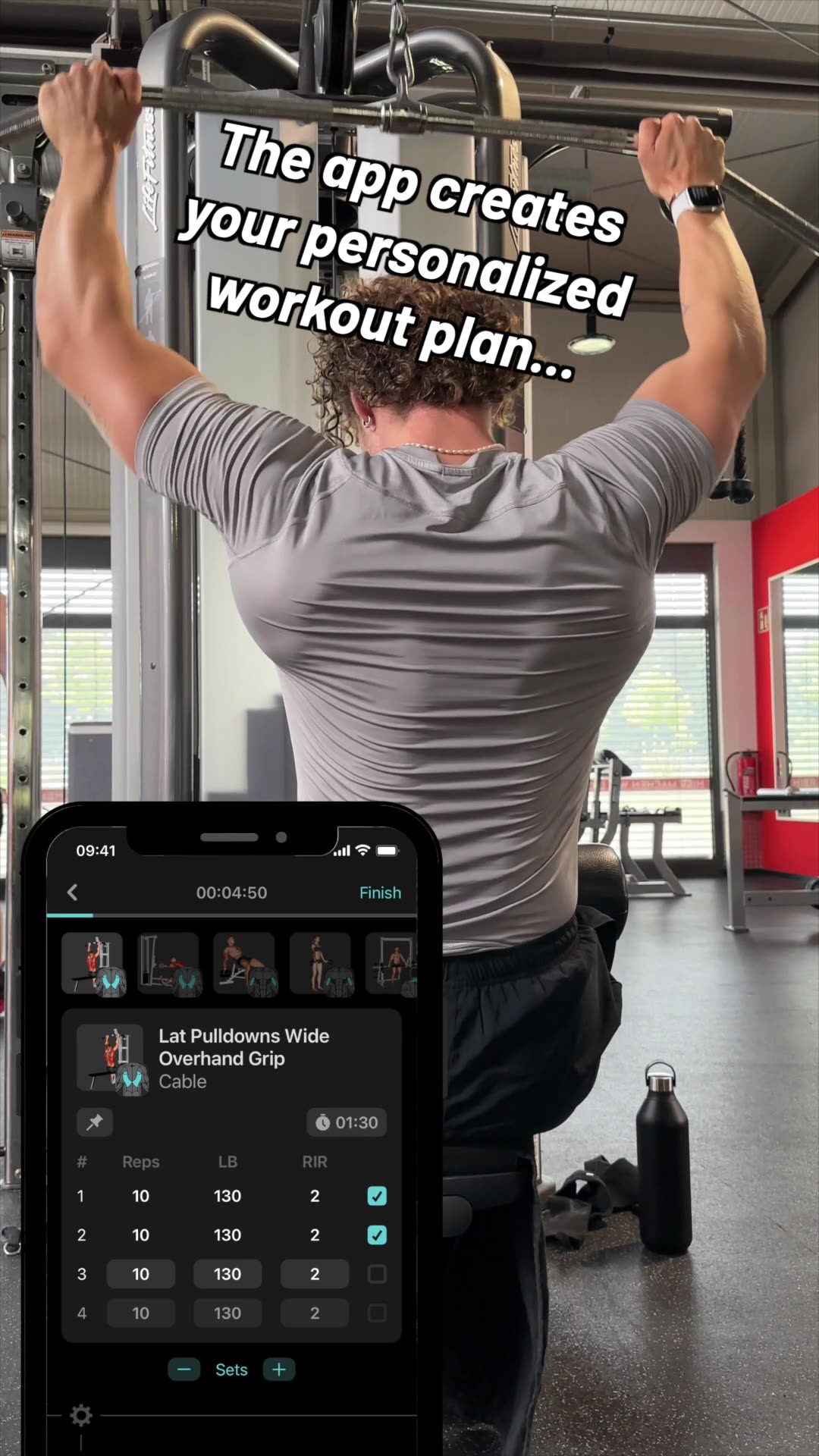
What it does. MyFitCoach shows the product doing its job: the frame is the app itself, a 28-day calisthenics workout challenge with the goal Build muscle, an 82 kg current weight, a 2 of 28 progress bar, an unlocked Leg Workout video tagged 45 minutes, No Equipment, and locked day-by-day tiles. The copy simply promises a personalized workout plan.
Why it works. Seeing the actual personalized plan and locked progression makes the offer concrete and lets the viewer picture their own journey, so the free plan quiz becomes the natural way to unlock it and hand over the lead.
Ad data. 5.7M reach over 244 days running. Gender split: 9% women / 91% men.
4. Minimalist product shot
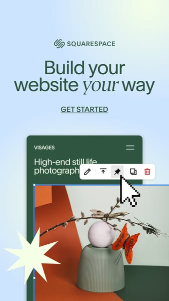
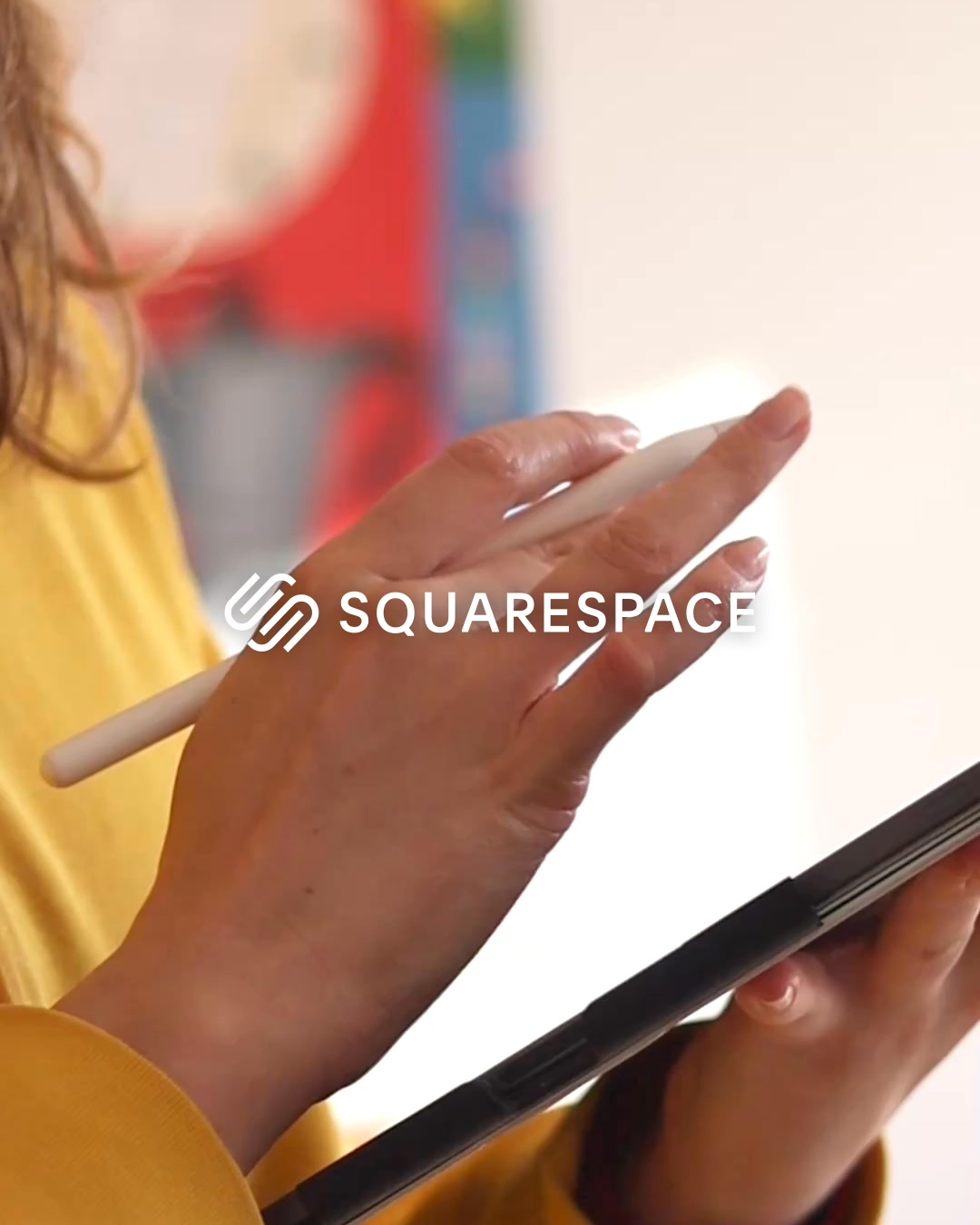
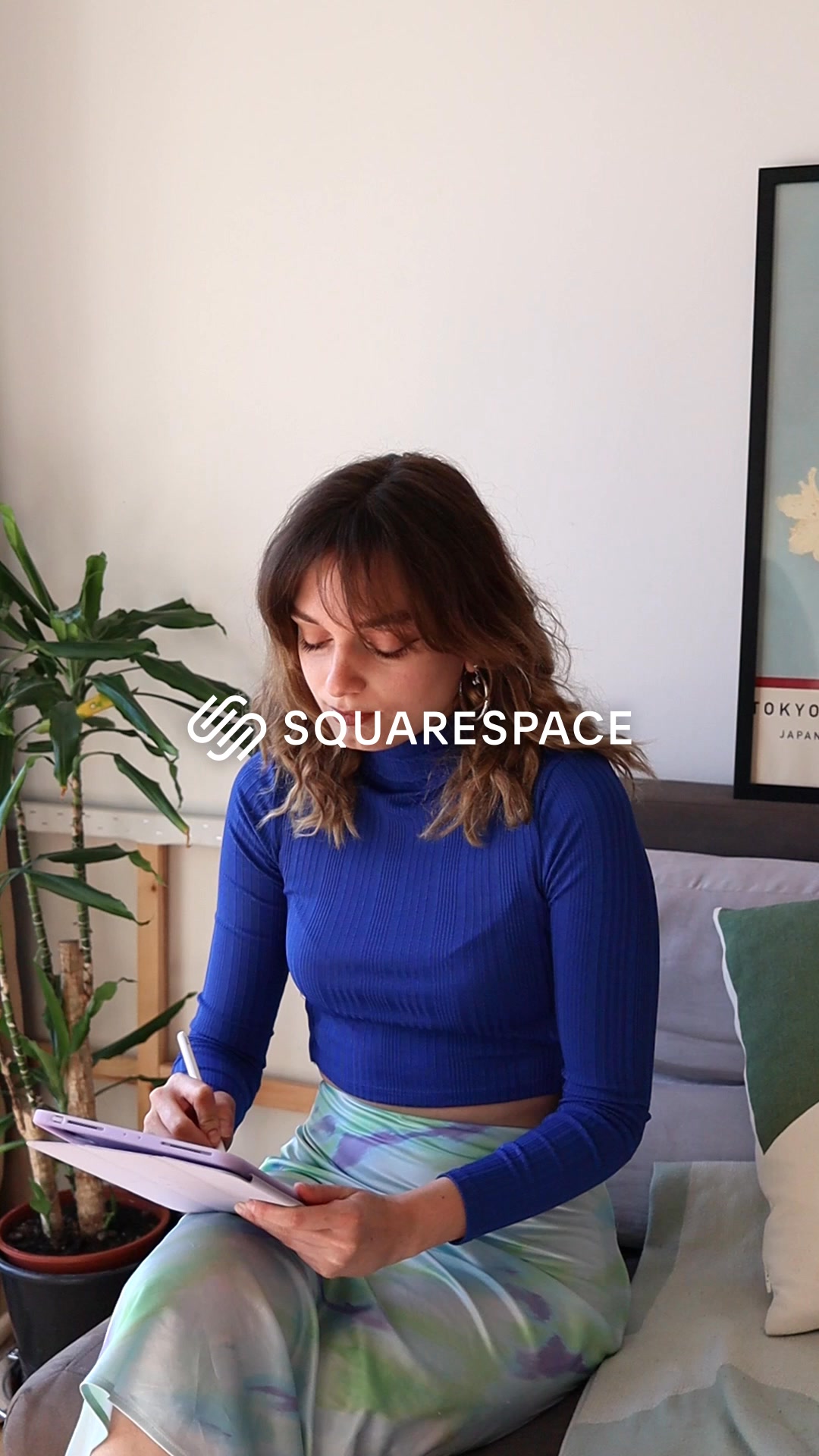
What it does. Squarespace runs a clean single hero: the logo up top, the line Build your website your way, one GET STARTED link, and a single product UI card previewing a photography site build. Minimal copy, lots of calm space, one focused call to action.
Why it works. The restrained, uncluttered layout signals a polished, easy tool and keeps the eye on the one action, so the low-friction GET STARTED prompt cleanly funnels the viewer into signing up.
Ad data. 6.8M reach over 139 days running. Gender split: 41% women / 59% men.
Lead Gen ad best practices
- Open on a problem, then twist it. Start the first frame on a frustration the viewer already owns, then reveal an unexpected cause behind it. That reframe builds the tension that makes a free guide or quiz feel worth the opt-in.
- Show the product doing its job. Put the actual interface on screen, a plan, a progress bar, a locked next step, so the offer is concrete and the viewer can picture their own journey. A visible demo beats a described one for lead capture.
- Use a split or before-versus-after frame. Divide the screen to contrast the current state with the goal state in a single glance. The hard visual divide sets up the gap your quiz or plan promises to close.
- End on one unmistakable call to action. Give the eye a single prominent button or link, GET STARTED, take the quiz, get the free guide, and cut competing copy around it. Low friction on the final frame is what converts attention into a lead.
How this data is collected
This Ad Library is a curated snapshot, not a complete record of Meta advertising. We sample only the highest-reach Facebook and Instagram ads in each industry, so every count and pattern describes the top-performing ads adtribute tracks, not every advertiser on the platform. Every reach figure is Meta-reported EU-transparency data, broken down by gender, age and country; none of it is estimated on our side. Estimated spend is the exception: we compute it from the reported reach using an assumed 5 to 30 EUR CPM.
The raw ad data is collected via top-ads.io. The Ad Library itself is a free resource from adtribute, a marketing analytics platform built around attribution: this library shows what scales for others, adtribute shows what converts for you.