

Image ads are the workhorse of the Meta feed: a single static frame that has to stop the scroll, land a message, and drive a tap without any motion to lean on. This snapshot gathers the highest-reach static ads from across 326 advertisers, where the median creative reaches 2.1M people and the best-performing frame tops out at 26M. What separates the winners is a single readable idea per frame, whether that is a visual joke, a handwritten testimonial, or an editorial-style headline.
Key takeaways
- Every winner is a single static frame. The format mix here is 100% image and 0% video across 2,448 ads, so each creative earns its reach on one still frame alone.
- Reach spans a wide range. The median image ad reaches 2.1M people while the top performer hits 26M, and the pool is spread across 326 distinct advertisers rather than a handful of accounts.
- One readable idea per frame. Top image ad creative commits to a single hook, a visual gag, a sticky-note claim, or an editorial headline, and lets that one idea do the selling before the product is even explained.
- Proof is staged on the product. The strongest static ads tie the claim to the thing for sale, pairing a specific customer result with the actual bottle, box, or device so the promise feels concrete and earned.
What makes a winning Image ads ad
A high-performing static ad opens with one instantly readable hook: a visual metaphor like bushy beards standing in for ungroomed hair, or a bold editorial headline that reads as a story rather than a pitch. Proof arrives inside the same frame, whether that is a handwritten sticky note leaning against the product, a before-and-after illustration, or a clean hero shot of the craftsmanship itself. The offer stays simple and the product lockup usually sits in a corner, so nothing competes with the idea. A light call to action such as a quiz prompt or a Read more link converts the attention the hook just won.
What the top Image ads ads look like
Scan these static ads and a few recurring layouts jump out: bold on-screen text carrying the message, the product shown small in a corner or held front and centre against a clean background, and framing borrowed from things that are not ads. You will see mock magazine articles with a kicker, a headline, a column of first-person body copy, and a Read more link, plus handwritten sticky notes propped against a real bottle and box. Others go minimalist, a single hero object on stone against a dark backdrop with only a logo, or line up a product range where each item is tagged to a specific use case with an icon. Every ad here is a still image, with no video in the set.
Winning ad frameworks in Image
The highest-reach Image ads reuse a handful of proven creative frameworks. Here are the ones that stand out here, each with a real example you can play or open in full.
1. Humour or metaphor hook
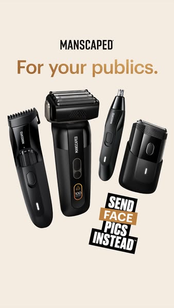
What it does. This MANSCAPED image lets a visual gag carry the whole ad: two men with wild bushy beards covering their faces stand beside a groomed man, with the line 'Give your boys the love they deserve' and The Lawn Mower trimmer in the corner. The beards are a metaphor for ungroomed body hair, so the joke lands before the product is even explained.
Why it works. The metaphor is instantly readable and funny, which stops the scroll and makes a sensitive grooming category feel light and shareable. The punchline does the selling, and the trimmer plus brand lockup only need a small corner to close the loop.
Ad data. Reached 26M and ran for 23 days. Gender split: 46% women / 54% men.
2. Sticky-note testimonial
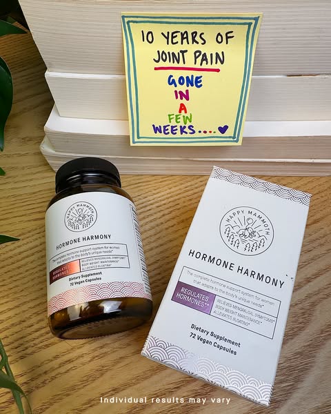
What it does. Happy Mammoth props a handwritten sticky note reading '10 YEARS OF JOINT PAIN GONE IN A FEW WEEKS' directly against its Hormone Harmony bottle and box, with 'Individual results may vary' beneath. The customer result is literally staged as a note on the product.
Why it works. The handwritten note reads as a genuine, personal result rather than brand copy, and pairing it with the actual product ties the claim straight to what is for sale. The specific 10 years to a few weeks contrast makes the outcome feel dramatic and concrete.
Ad data. Reached 16M and ran for 92 days. Gender split: 44% women / 56% men.
3. Native advertorial
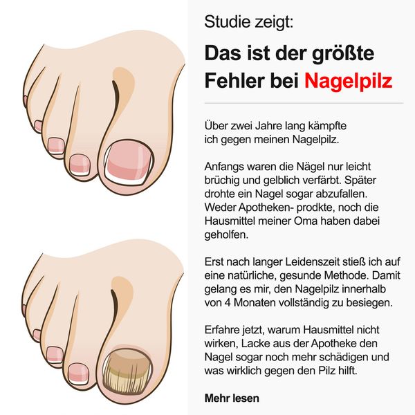
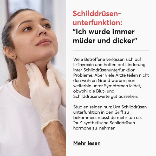
What it does. Health Routine styles the frame as an editorial health article: a 'Studie zeigt' kicker, a bold headline about the biggest mistake with nail fungus, a column of journalistic first-person body copy, illustrated toes, and a 'Mehr lesen' link at the bottom. It looks like a magazine story, not an ad.
Why it works. The article layout borrows the credibility of editorial content and invites the reader to keep reading instead of feeling sold to. The clear before and after toe illustration and the withheld answer behind 'Mehr lesen' pull the click.
Ad data. Reached 17M and ran for 331 days. Gender split: 61% women / 39% men.
4. Use-case callout
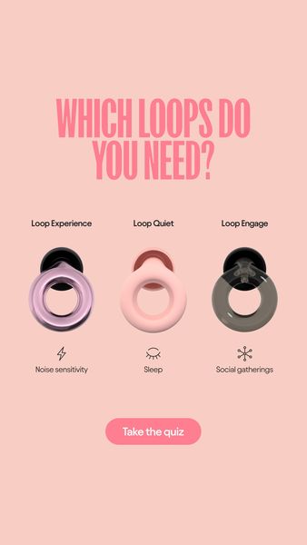
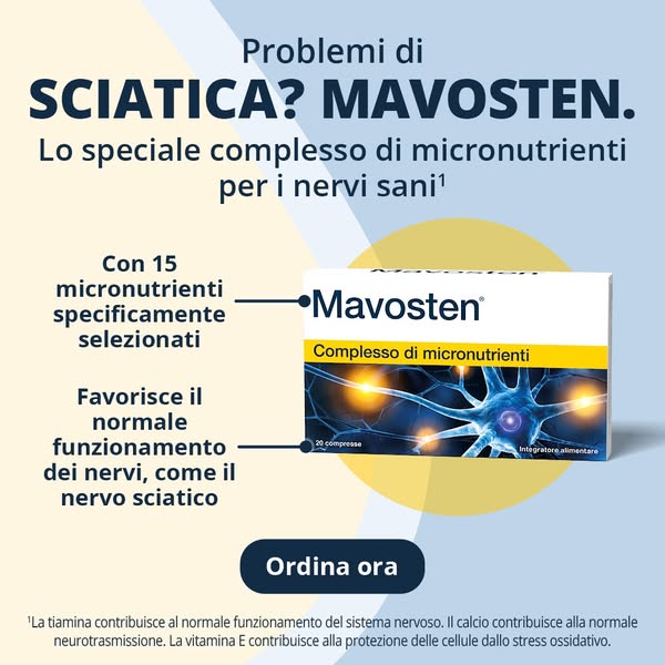
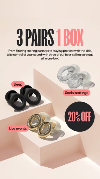
What it does. Loop Earplugs shows three products in a row under 'Which Loops do you need?', each tagged to a specific occasion with an icon: Loop Experience for Noise sensitivity, Loop Quiet for Sleep, and Loop Engage for Social gatherings, capped by a 'Take the quiz' button.
Why it works. Mapping each product to a distinct real-life use case helps the viewer self-select and see the range fitting their own life, and the quiz prompt turns that self-selection into a low-friction next step.
Ad data. Reached 14M and ran for 126 days. Gender split: 77% women / 23% men.
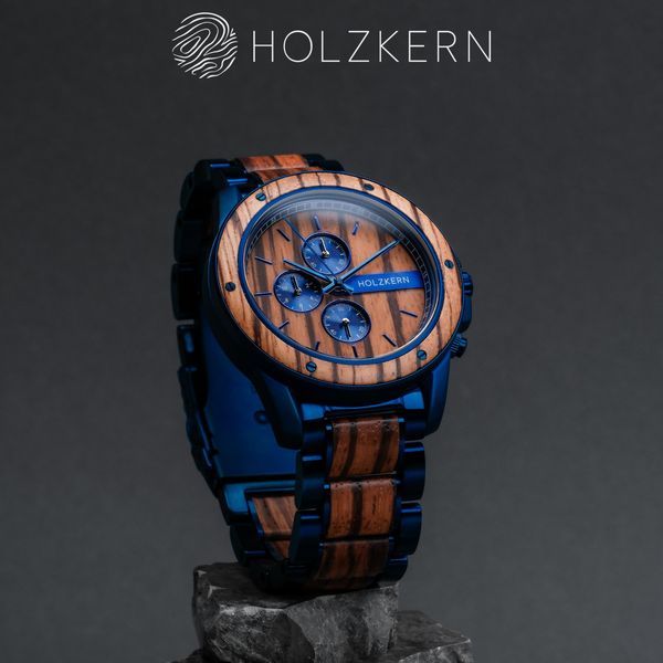
5. Minimalist product shot
What it does. Holzkern presents a single wood-and-blue-steel watch resting on a stone against a clean dark background, with only the Holzkern logo above and no other copy on the frame. One hero product, nothing competing for attention.
Why it works. The stripped-back, premium styling puts full focus on the craftsmanship and materials, letting the product itself signal quality and desirability without a word of persuasion.
Ad data. Reached 11M and ran for 386 days. Gender split: 53% women / 47% men.
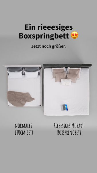
6. Side-by-side comparison
What it does. A single static sets a normal product next to the oversized version under one short headline, the smaller one on the left and the much larger one on the right, so the difference is unmissable at a glance.
Why it works. A hard visual comparison does the persuading before a word is read, making the product's main advantage feel obvious and concrete rather than claimed.
Ad data. Reached 11.3M over a 160-day run. Gender split: 48% women / 52% men.
7. Story-style results checklist
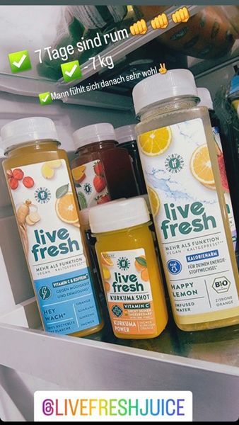
What it does. The ad looks like an organic phone photo of the product lined up in a real fridge, with green-check overlays listing results and a handle sticker in the corner, exactly like a customer's own story post.
Why it works. Mimicking a native story, checkmarks, casual snapshot and handle tag, sidesteps the scepticism a polished ad triggers, so the results read as a real person's experience.
Ad data. Reached 12M over an 805-day run, the longest-running static in this set. Gender split: 73% women / 27% men.
8. Bold benefit headline over lifestyle
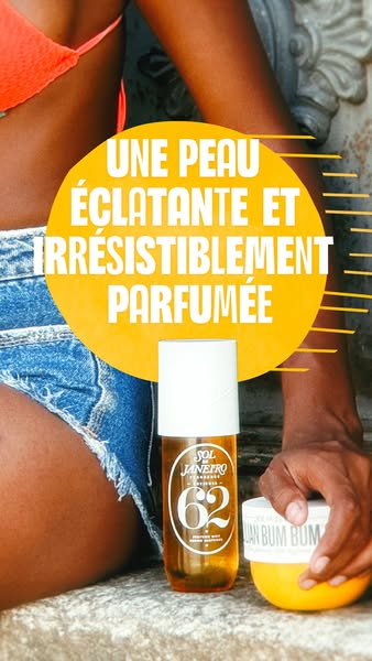
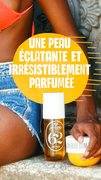
What it does. A product mist and cream sit in the foreground against a sun-lit, aspirational skin-and-lifestyle shot, with a big punchy benefit headline in the brand colour filling the top of the frame.
Why it works. The oversized sensory promise plus a warm, sun-soaked lifestyle scene sells the feeling first and the product second, and the bold type still lands as a thumbnail at feed size.
Ad data. Reached 11.4M over a 28-day run. Gender split: 42% women / 58% men.
Image ads ad best practices
- Lead with one readable idea. Build the frame around a single hook a viewer can grasp in a glance, a visual metaphor or a punchy headline, and let it land before you explain the product. A static ad has one frame, so a second competing idea just dilutes the first.
- Stage proof on the product. Put the claim physically next to what you sell: a handwritten testimonial leaning on the bottle, or a specific result printed beside the box. Anchoring the outcome to the actual product makes the promise feel personal rather than like brand copy.
- Borrow a familiar layout. Mimic formats people already trust, such as an editorial article with a kicker, headline, and Read more link, or a sticky note, so the ad reads as content and invites a click. The layout should feel native to the feed, not like a poster.
- Shrink the branding, keep the CTA obvious. Reserve just a corner for the product-and-logo lockup so it does not crowd the hook, then close with one low-friction prompt like Take the quiz or Read more. A single clear next step converts the attention the frame just captured.
How we build this snapshot
Everything on this page comes from a curated snapshot, so it is a selection, never the whole market. We sample only the highest-reach Facebook and Instagram ads in each industry, so every count and pattern describes the top-performing ads adtribute tracks, not every advertiser on the platform. The reach numbers are the exact figures Meta publishes in its Ad Library under EU transparency rules, including the breakdown by gender, age and country, so reach is reported by Meta, not modelled by us. The one number we derive ourselves is estimated spend, which we back out of the reported reach at an assumed 5 to 30 EUR CPM.
The raw ad data is collected via top-ads.io. The Ad Library itself is a free resource from adtribute, the platform that ties every ad to revenue with marketing attribution and custom analytics.