

The Dating hub gathers the highest-reach Meta ads from the brands people actually swipe on, spanning Facebook and Instagram feeds. It is a curated snapshot of what the top online dating creative looks like right now: cinematic love films, documentary-style couple stories, and playful feature demos. Use it to see the hooks, formats, and offers that keep a dating app in front of new singles.
Key takeaways
- Video is the default. Across 250 ads in the Dating hub, 90% are video and only 10% are static image. If you are building a dating app campaign, plan for motion first.
- Broad reach from a focused field. These ads come from just 8 distinct advertisers, yet the top creative reaches 4.3M with a median of 1.8M. A small set of players is putting enormous reach behind a handful of proven concepts.
- Sell the outcome, not the swipe. The strongest online dating creatives pitch the relationship, not the mechanic: a couple real enough to quit the app, a named pair captioned as a true love story. The product is the happy ending, and the app is how you get there.
- Feed-native beats polish. Many winners look like organic content, not a produced spot: handheld to-camera confessionals, behind-the-scenes footage, and self-aware winks that blend into the scroll. Relatable delivery sells a feature better than brand gloss.
What makes a winning Dating ad
A high-performing dating ad opens on an emotional or funny hook in the first second, then anchors it to a single clear promise. Proof carries the middle: a documentary-style clip of a real, named couple, or an on-screen demo of the actual in-app profile so a new feature is instantly legible. The offer is the outcome the viewer wants, a real match or a relationship worth deleting the app for, and the call to action is a simple, confident nudge to download and start. The best creatives keep one benefit in focus rather than listing everything the dating app can do.
What the top Dating ads look like
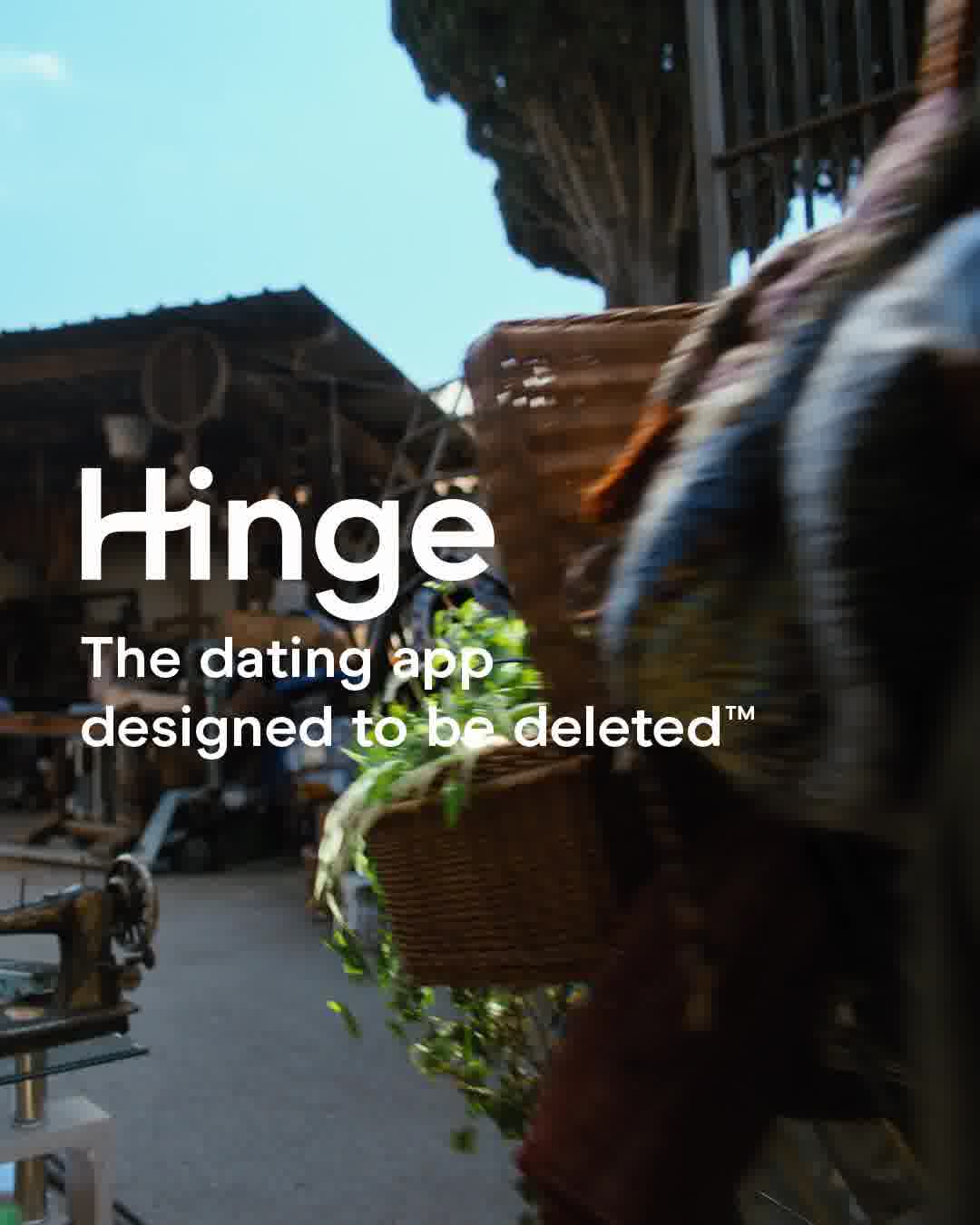
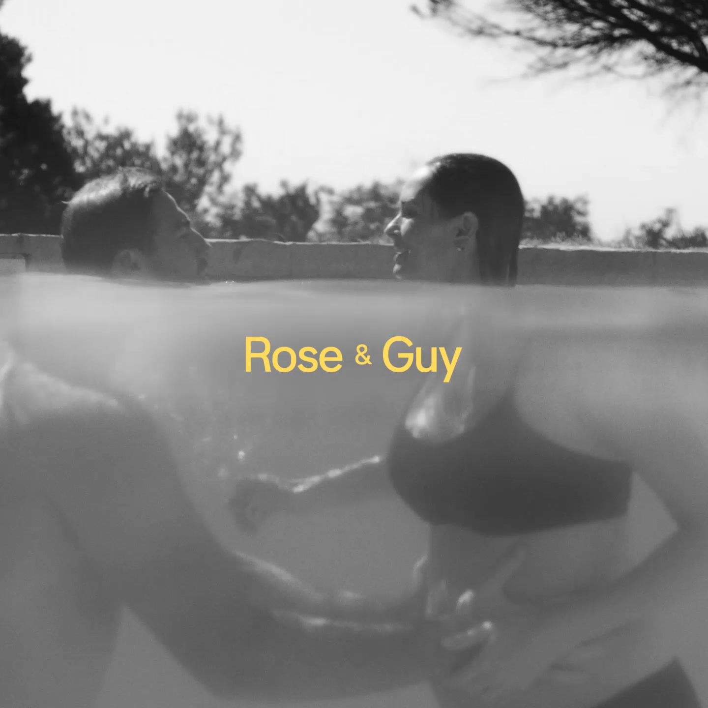
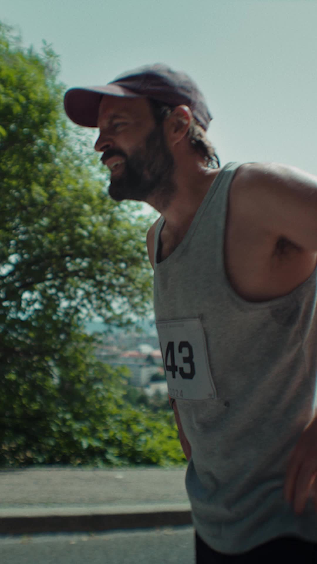
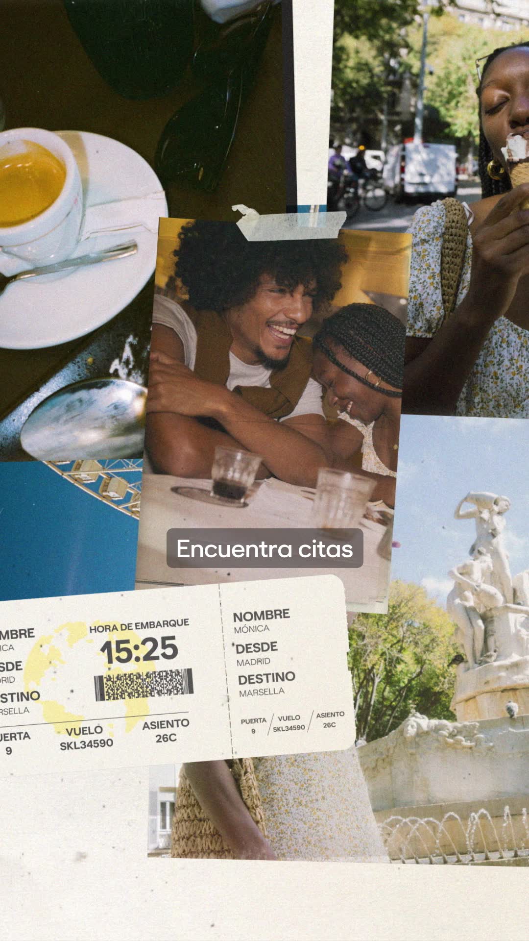
Scan the highest-reach dating ads and you see couples front and centre: two people carrying a flower basket through a market, an intimate black-and-white embrace in a pool, a candle-lit dinner table. On-screen text does the heavy lifting, from short taglines like "For the Love of Love" to first-name captions such as "Rose & Guy" that frame a moment as real. Feature demos hold a phone up to camera to show an actual profile or matches, while abstract motifs like glowing dots on a black screen make a benefit feel tangible, all closing on a bold logo card with app-store badges. Expect motion almost everywhere: 90% of these ads are video and only 10% are static image.
Prefer one format? Filter this page to Dating video ads or Dating image ads only.
Winning ad frameworks in Dating
The highest-reach Dating ads reuse a handful of proven creative frameworks. Here are the ones that stand out here, each with a real example you can play or open in full.
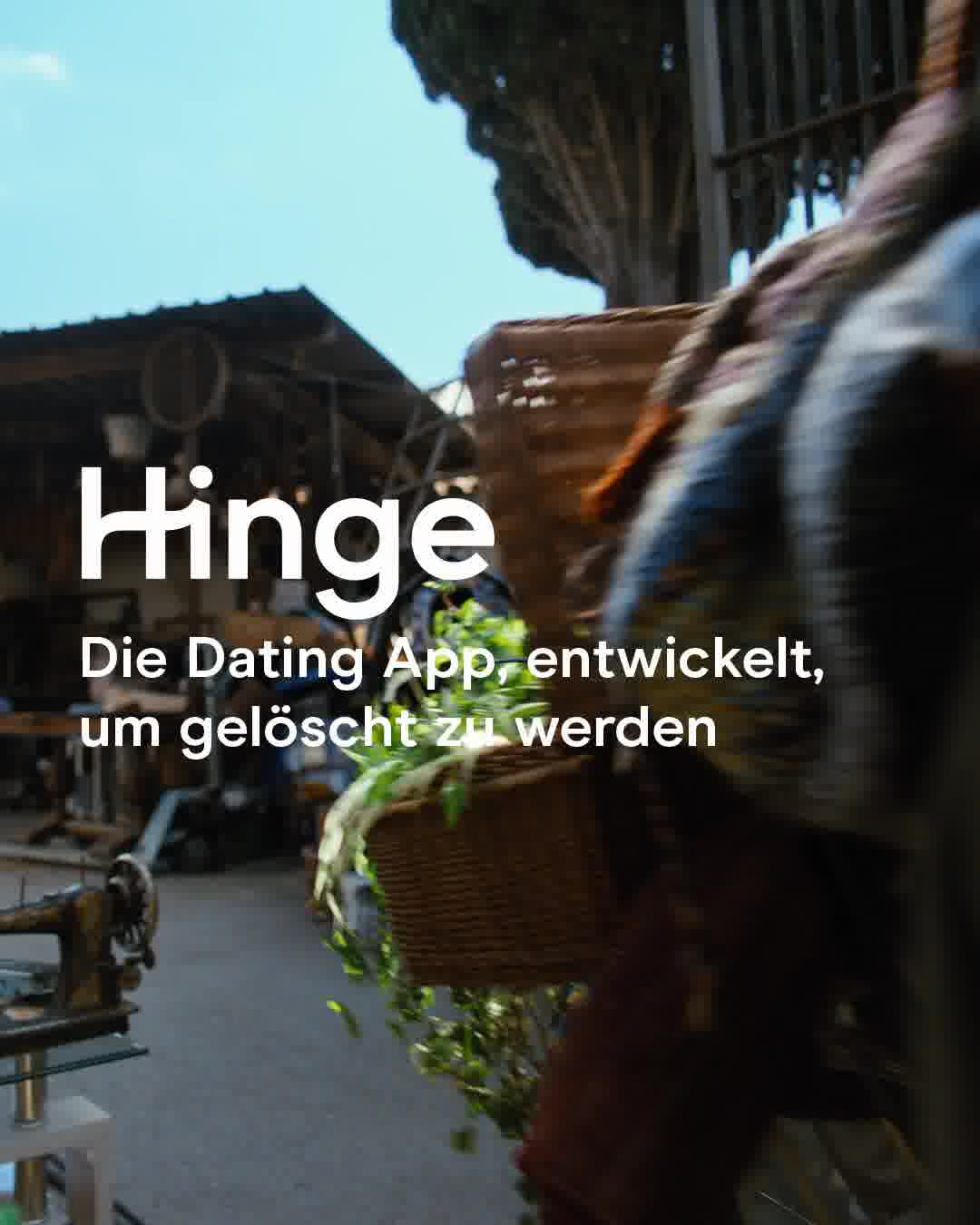
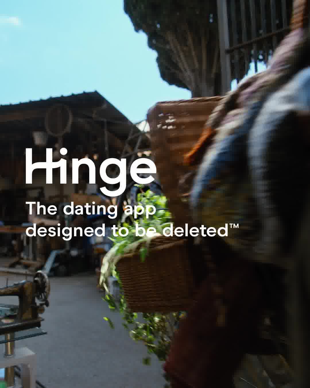
1. Delete-the-app love film
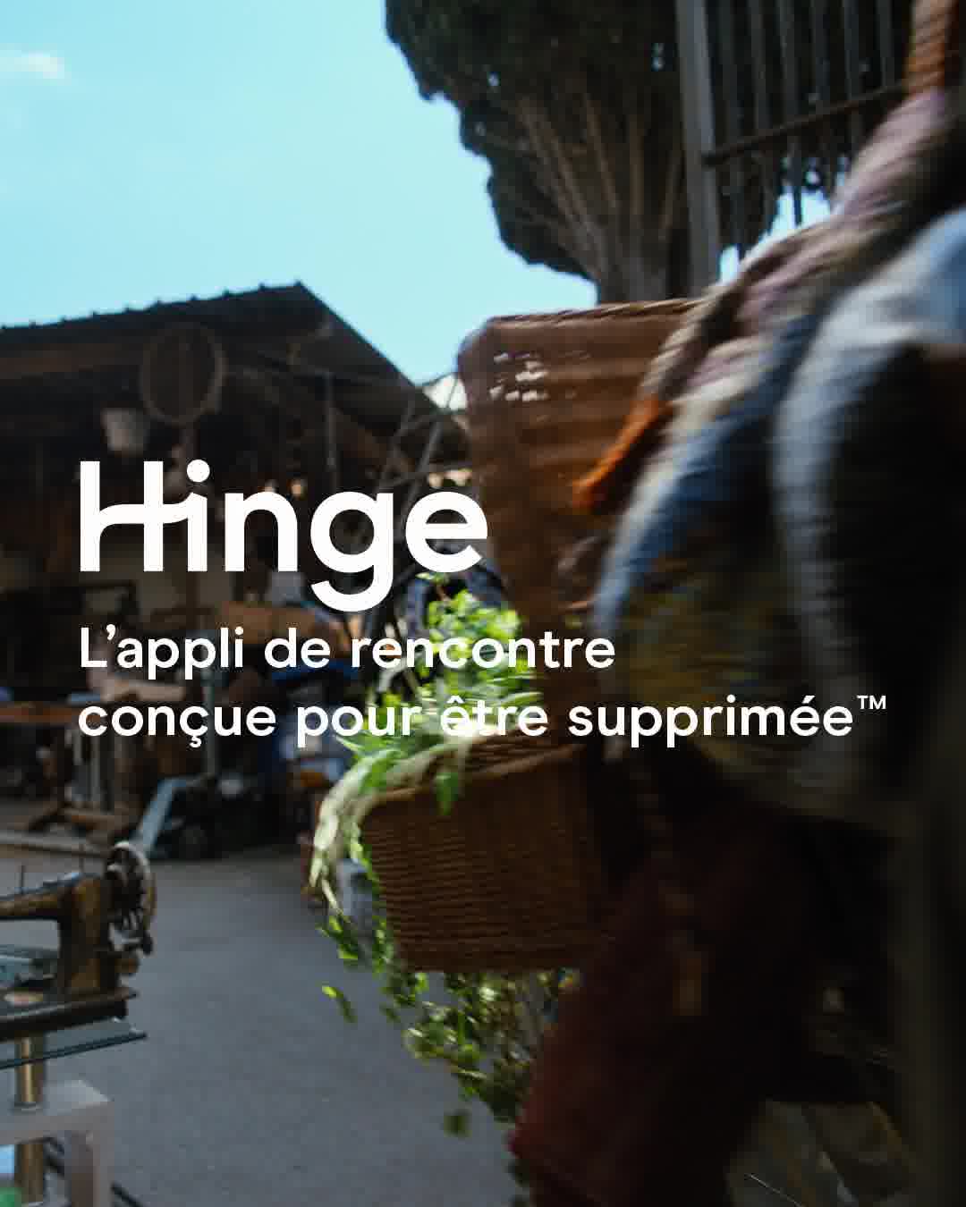
What it does. A soft, slow-motion market scene of a couple carrying a flower basket runs under the Hinge logo and the tagline The dating app designed to be deleted. The creative sells the outcome, a relationship real enough to quit the app, rather than the swiping.
Why it works. Cinematic, unbranded-looking romance plus a confident promise flips the usual dating-app pitch and makes the brand feel like the one that actually gets you off the apps.
Ad data. This cut reached 4.3M and ran for only 3 days. Gender split: 100% women / 0% men.
2. Named real-couple story
What it does. A grainy black-and-white clip of a couple embracing in a pool is captioned simply Rose & Guy, framing a specific named pair as a true Bumble love story. The copy leans on real Liebesgeschichten (love stories) worth celebrating.
Why it works. Putting first names on an intimate, documentary-style moment reads as proof rather than an ad, so the promise of finding love feels earned and believable.
Ad data. The spot pulled 4.2M reach over a short 3 day run. Gender split: 100% women / 0% men.
3. Bestie double-date demo
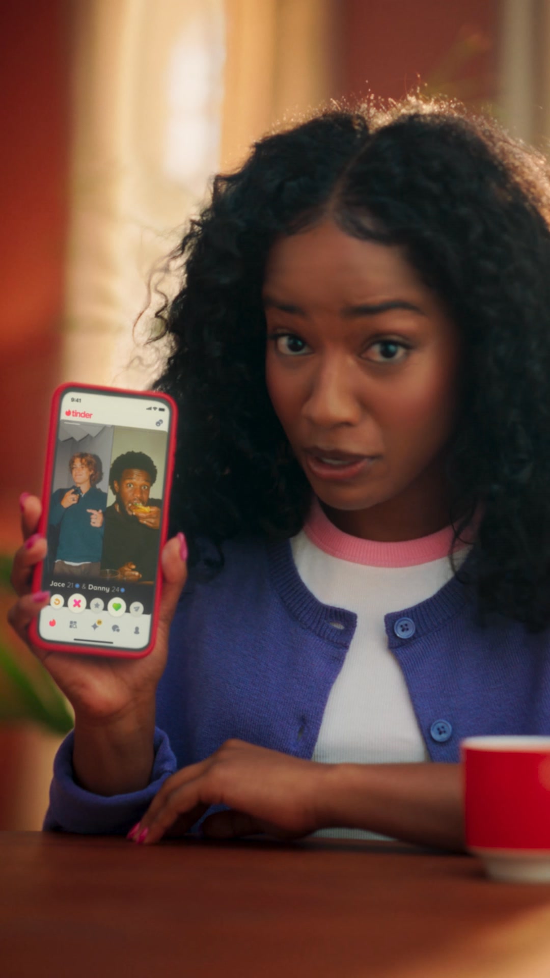
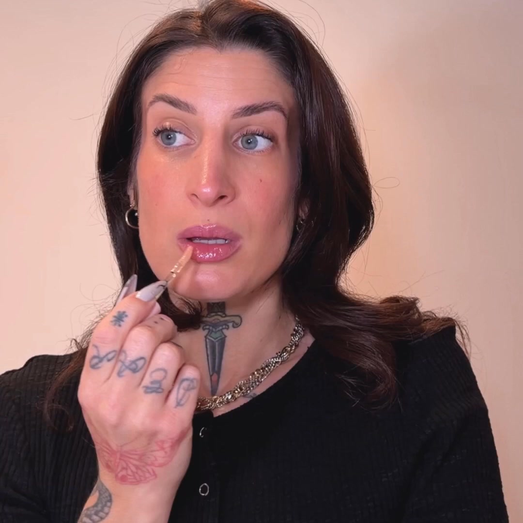
What it does. A young woman holds up a phone showing a real Tinder profile with two people, Jace and Danny, side by side, demonstrating the Double Date feature in-app. The Girlmath caption frames dating in pairs as double the fun.
Why it works. Showing the actual two-person profile on screen makes a new feature instantly legible, and the bring-your-bestie angle turns dating from scary to social.
Ad data. This feature demo reached 3.2M across a 17 day run. Gender split: 57% women / 43% men.
4. Bestie to-camera confessional
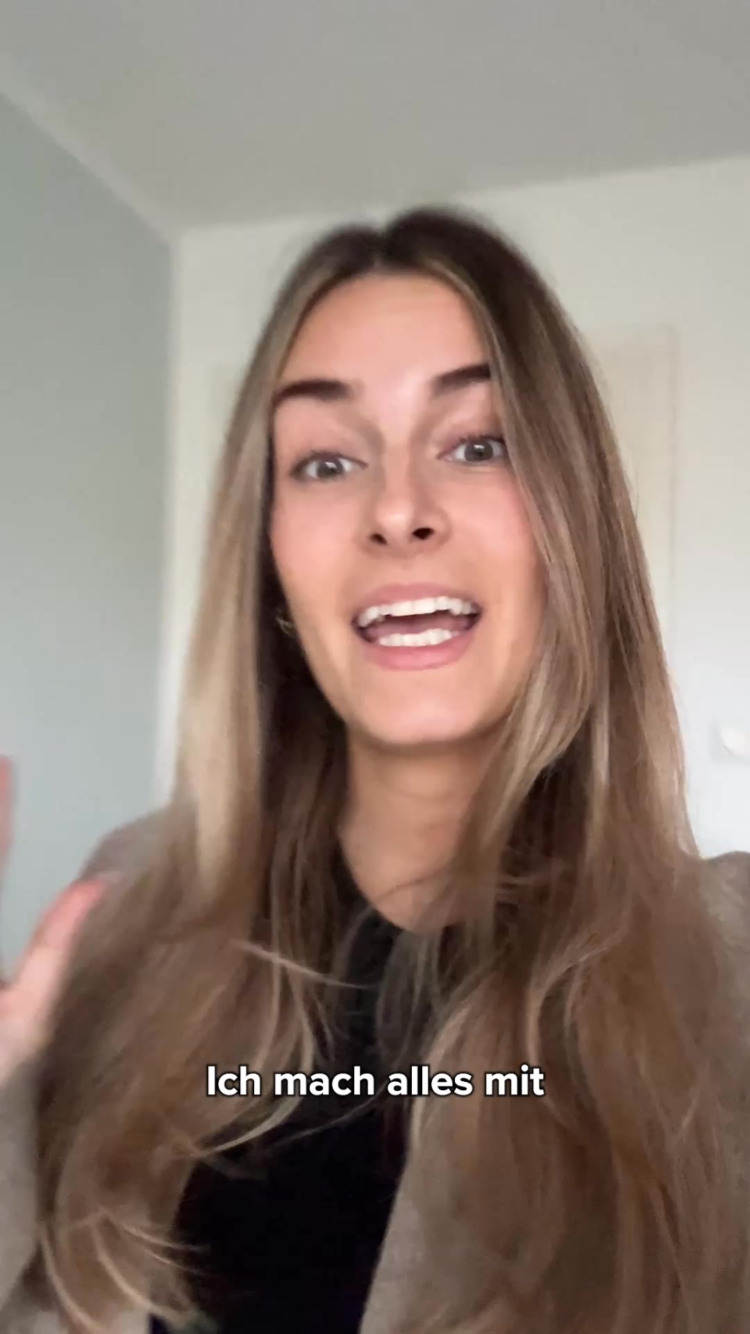
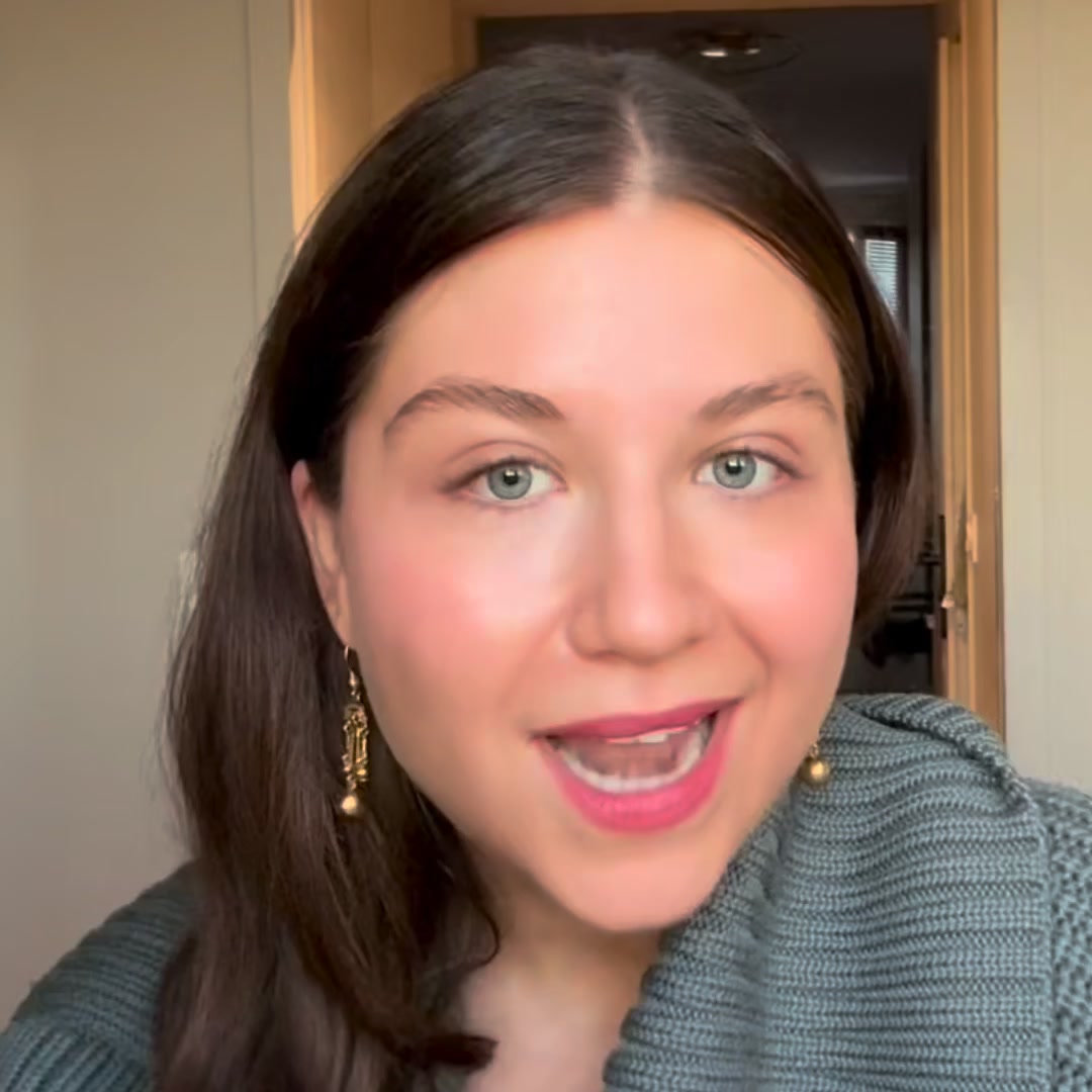
What it does. A creator films herself handheld in her flat, talking straight to camera with subtitles like Ich mach alles mit, hyping that her best friend is now part of her dates. It looks like an organic selfie video, not a produced ad.
Why it works. The unpolished, first-person delivery blends into the feed as normal content and lets a relatable voice sell the feature more persuasively than brand polish.
Ad data. The talking-head clip reached 3.7M over a 15 day run. Gender split: 57% women / 43% men.
5. Swipe-to-two-years-later arc
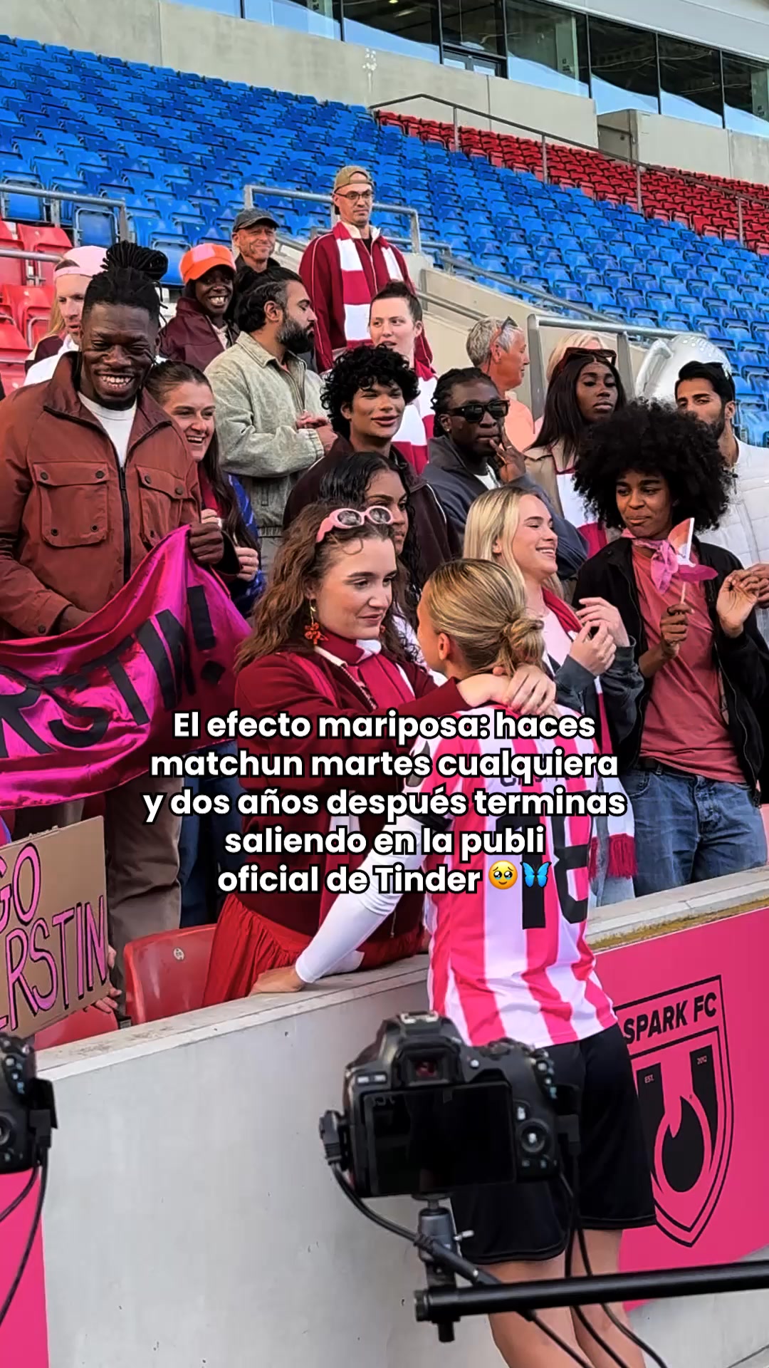
What it does. A behind-the-scenes stadium shoot is overlaid with a caption telling the whole arc: the butterfly effect is real, you match on a random Tuesday and two years later you end up in the official Tinder ad. One casual swipe is dramatized into a full relationship story.
Why it works. Compressing a tiny action into a big, meta love-story payoff makes swiping feel consequential and romantic, and the self-aware wink feels native to social.
Ad data. The narrative cut reached 3.2M during a 13 day run. Gender split: 100% women / 0% men.
6. Flat yellow logo card
What it does. A single flat yellow frame carries only bold black type, DATE SUR Bumble, with the app-store badges beneath and nothing else. It is a stripped-back, purely typographic brand card.
Why it works. The stark color block and one blunt line own the feed with brand recognition alone, giving a clean call to download without any scene to distract.
Ad data. This minimalist card reached 3.3M over a 27 day run. Gender split: 55% women / 45% men.
7. Absurd goat-date gag
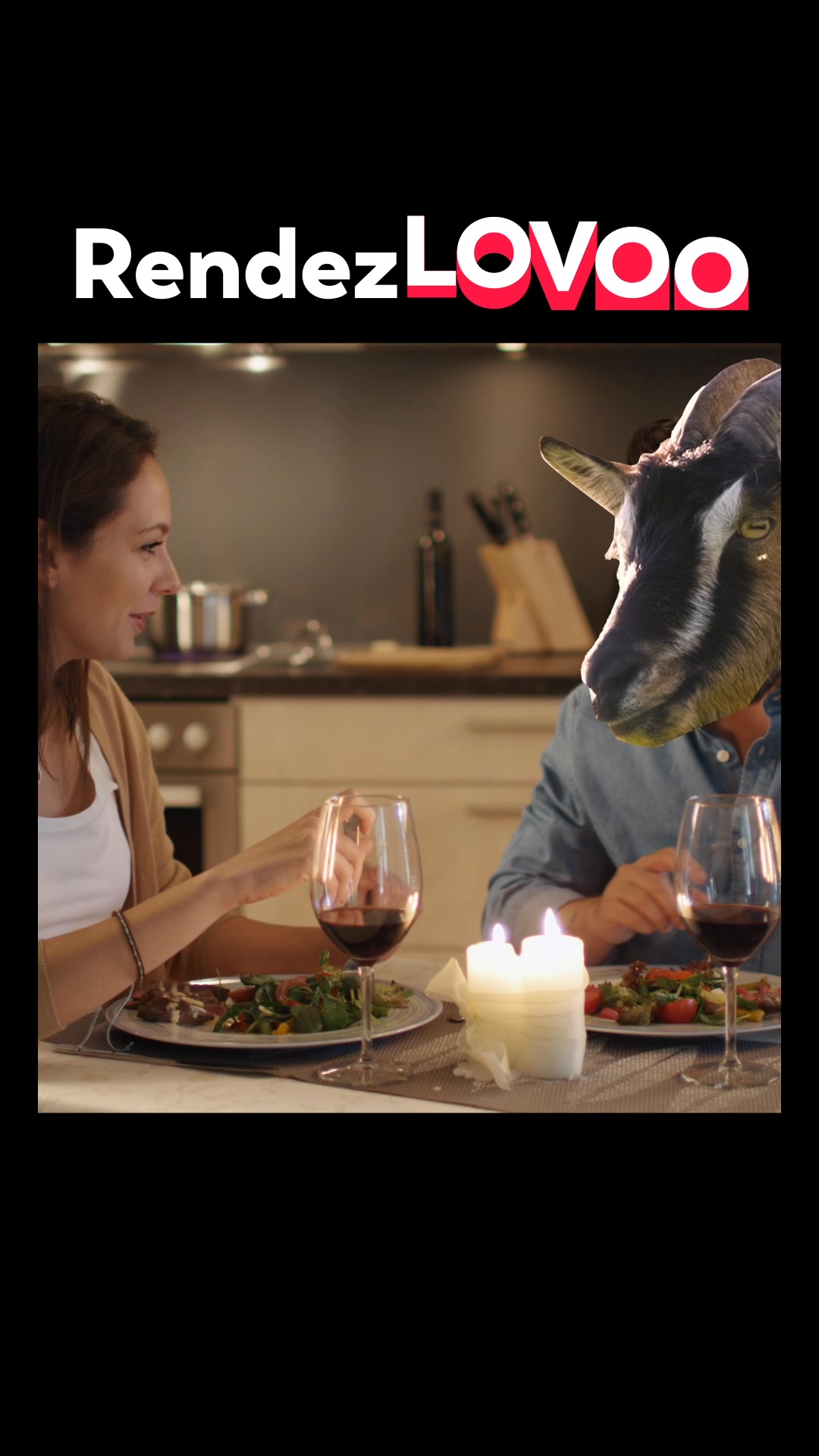
What it does. Under the pun lockup RendezLOVOO, a candle-lit dinner shows a woman smiling across the table at a man wearing a full goat mask. The visual gag mocks the bad date you get elsewhere versus real matches on LOVOO.
Why it works. A ridiculous, scroll-stopping image plus a brand pun earns a laugh and makes the message stick without a hard sell.
Ad data. The humor spot reached 2.3M across a 17 day run. Gender split: 35% women / 65% men.
8. Nearby-singles map glow
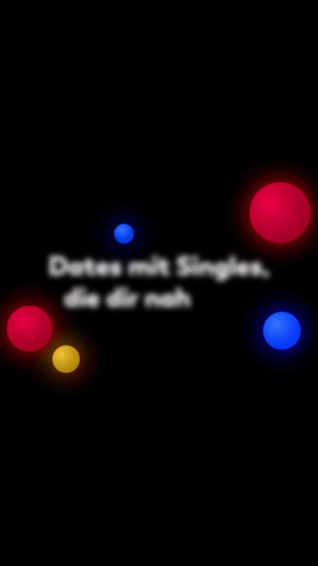
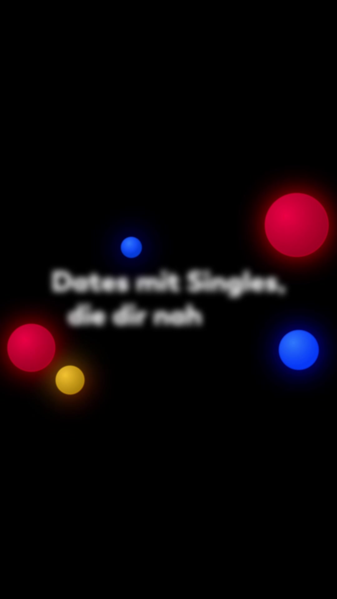
What it does. Glowing red, blue and yellow dots float on a black screen under the line Dates mit Singles, die dir nah (dates with singles close to you), visualizing matches nearby. The copy pitches finding people and date spots just around the block.
Why it works. The abstract glowing-dots motif makes the local-proximity feature feel tangible and premium, tying the whole ad to one clear benefit: dates close by.
Ad data. The feature explainer reached 2.7M over a 17 day run. Gender split: 33% women / 67% men.
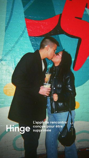
9. Real-couple success shot
What it does. A candid, film-grain street photo shows a real, loved-up couple kissing against a graffiti wall, each holding a coffee, with the brand mark and its promise that the app is built to be deleted once you meet someone.
Why it works. It sells the outcome, a real relationship, instead of the app screens, and the unposed documentary style reads as a genuine moment a friend might post rather than a produced ad.
Ad data. Reached 3.3M over a long 303-day run, a sign the aspirational real-couple angle keeps converting. Gender split: 59% women / 41% men.
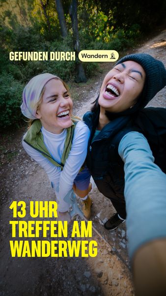
10. Shared-interest match
What it does. A phone-selfie POV catches two people mid-laugh on a sunlit hiking trail, backpacks on, framed around meeting someone through a shared outdoor activity rather than through endless swiping.
Why it works. Anchoring the app to a relatable real-world interest makes it feel less like a dating grid and more like real life, and the candid selfie reads as organic content, not marketing.
Ad data. Reached 2.9M over a 48-day run. Gender split: 100% women / 0% men.
Dating ad best practices
- Hook on emotion or a gag in one second. Open on a scroll-stopping frame, a cinematic romantic moment or an absurd visual gag like a date in a goat mask, before any logo appears. The opening image has to earn the next second of attention.
- Put real, named couples on screen. Documentary-style footage with first names captioned reads as proof, not an ad, so the promise of finding love feels earned. Grainy, handheld, or unbranded-looking clips beat a polished studio look.
- Demo the feature in-app. When you are selling something new like double dating, show the actual two-person profile or the matches on a real phone screen. Seeing the feature makes it instantly legible and turns an unfamiliar idea into an obvious benefit.
- Close on a bold, single-line card. End with a stripped-back frame: one blunt line of type over a strong brand color, app-store badges beneath, and a clear cue to download. Keep the call to action to a single action so nothing competes with it.
How the ads here are selected
This Ad Library is a curated snapshot, not a complete record of Meta advertising. We sample only the highest-reach Facebook and Instagram ads in each industry, so every count and pattern describes the top-performing ads adtribute tracks, not every advertiser on the platform. Every reach figure is Meta-reported EU-transparency data, broken down by gender, age and country; none of it is estimated on our side. Only the estimated spend is our own calculation, derived from that reported reach at an assumed 5 to 30 EUR CPM.
The raw ad data is collected via top-ads.io. The Ad Library itself is a free resource from adtribute, the marketing attribution and analytics platform that shows which of your own ads actually convert.