

The Travel & Hospitality hub gathers the highest-reach Meta ads across hotels, tourism and vacation, from early-booking cruise deals to holiday-rental rescues. Video carries the majority of the winners, and the strongest creatives pair pure escapism visuals with one sharp, bookable reason to act now. Use this snapshot to see what a scroll-stopping travel ad on Facebook and Instagram actually looks like.
Key takeaways
- Video wins the feed. The format mix is 64% video to 36% image across 251 ads, so most top travel and vacation creatives move rather than sit still.
- Big reach, patient budgets. Median reach lands at 3.1M with a top ad hitting 11M, and the average ad runs 73 days across the 12 advertisers in the set.
- Lead with a single number. The best offers reduce the whole message to one oversized figure, such as an early-booker discount or five stars at half price, so the reason to book is legible in a single scroll.
- Sell the feeling, then the deal. Winners open on sensory escapism, turquoise shallows, golden dunes, a lavish breakfast, then hand the viewer a concrete hotel, sailing or rental to book.
What makes a winning Travel & Hospitality ad
The hook is almost always a pure escapism visual: a couple in shallow water, a surfer in the dunes, an overhead spread of a hotel breakfast. Proof arrives fast, either through a named real hotel, a playful authority signal like a crowd of ship captains choosing the brand themselves, or a first-person creator walking the sun deck. The offer is stated as one clean number, an early-booking saving or a half-price stay, and the call to action is a direct invitation to book the next trip. The strongest ads also agitate a real fear, the disappointing rental, and position the brand as the safe alternative.
What the top Travel & Hospitality ads look like
Expect sunlit, wide travel scenes: turquoise beaches, golden dune grass, sun decks and pools, often with a couple or a single relaxed guest as the subject. Oversized white on-screen type carries the offer, a large discount percentage or a five-stars-at-half-price line, while other ads lean into UGC styling with torn-paper captions, native checkbox stickers and phone-shot framing that mimics an organic clip. Product is shown in context, the real hotel named on screen, the breakfast shot top-down as a flat-lay, the carry-on bag opened on airport seats. Roughly two thirds of these ads are video and one third are static images.
Prefer one format? Filter this page to Travel video ads or Travel image ads only.
Winning ad frameworks in Travel
The highest-reach Travel ads reuse a handful of proven creative frameworks. Here are the ones that stand out here, each with a real example you can play or open in full.
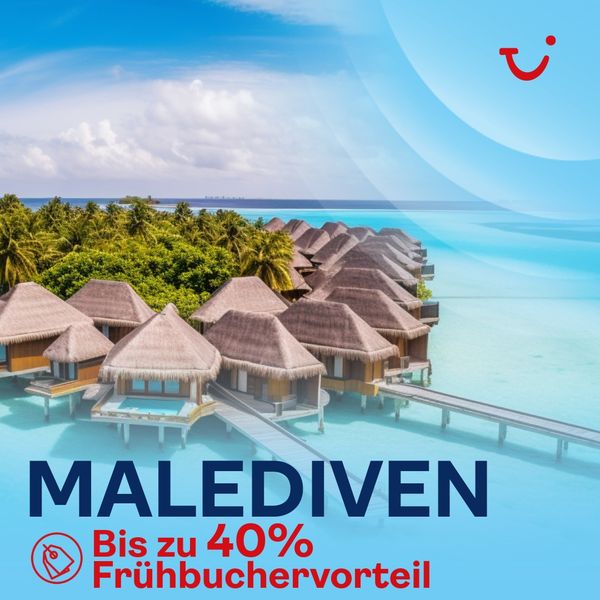
1. Giant early-booking discount hook
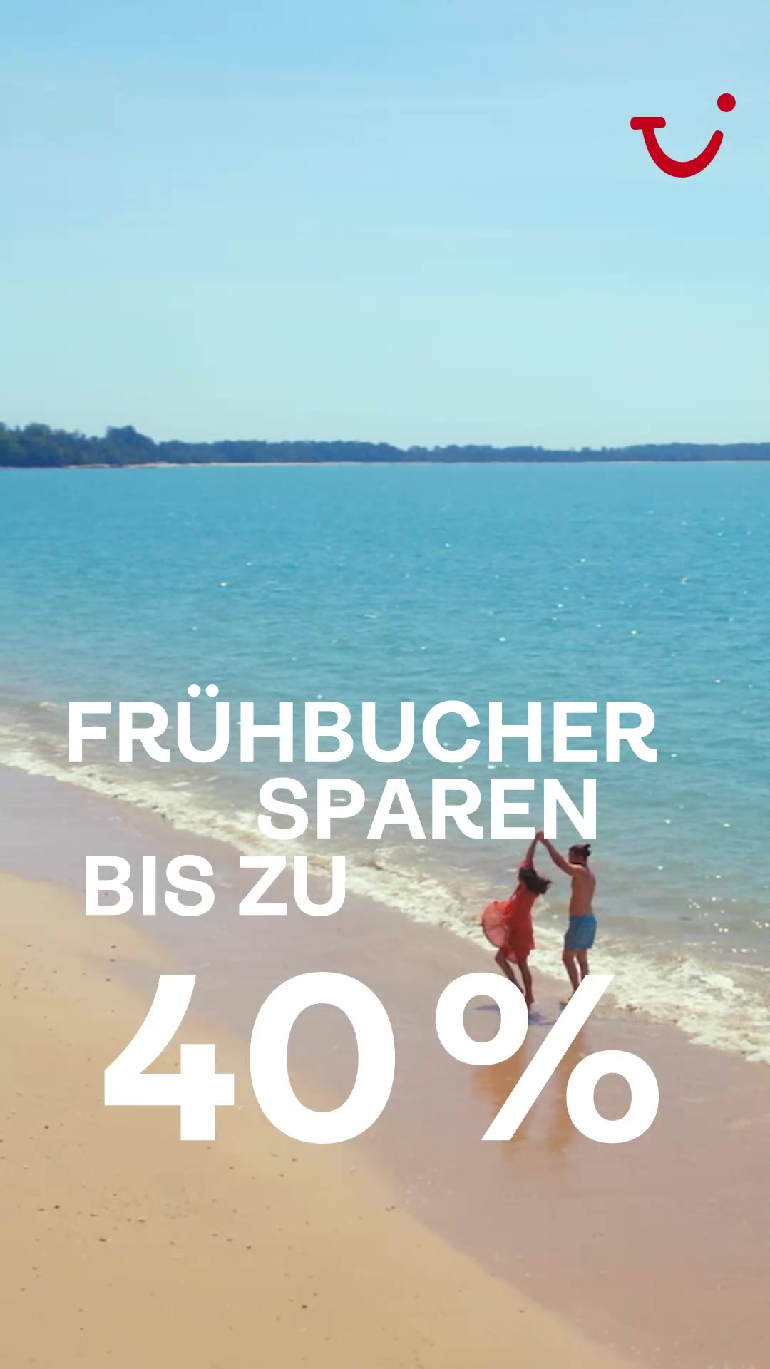
What it does. A sunlit drone-style shot of a couple playing in the shallows of a turquoise beach is overlaid with oversized white type reading FRUEHBUCHER SPAREN BIS ZU 40%, making the early-booker saving the whole message. The copy reinforces it by asking if you have already thought about summer 2025.
Why it works. Pairing a pure escapism visual with one huge percentage number gives thumb-stopping scrollers an instant reason to act now instead of later, which is exactly how travel demand gets pulled forward.
Ad data. One of the top performers in the category at 11M reach over a 75 day run. Gender split: 48% women / 52% men.
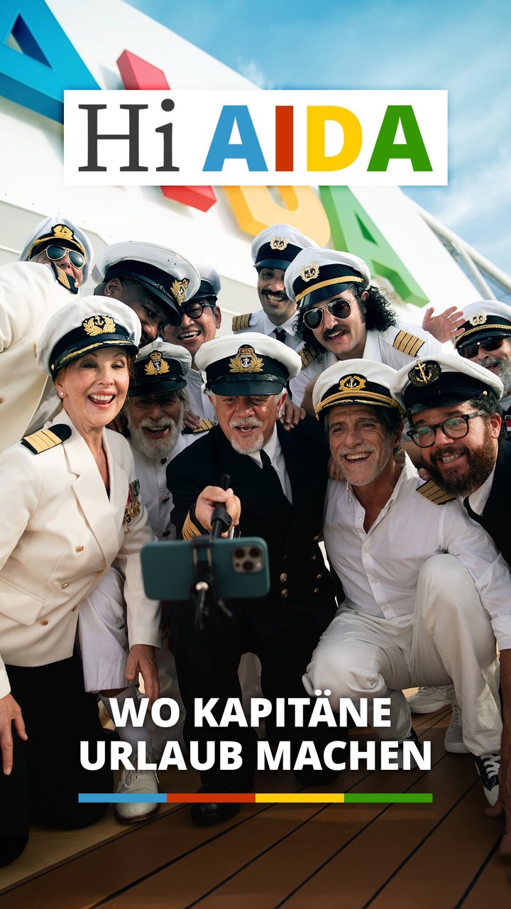
2. Captains-vacation-here casting gag
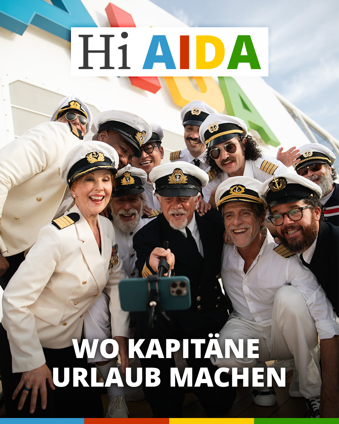
What it does. A grinning crowd of uniformed ship captains crams into a selfie under a Hi AIDA logo with the line WO KAPITAENE URLAUB MACHEN (where captains take their holiday). The joke and copy argue that even seasoned seafarers choose AIDA for their own downtime.
Why it works. Using the people who know ships best as playful endorsers is both a humour hook and an authority signal, so the ad entertains and vouches for the brand in a single frame.
Ad data. A top reach ad in the set at 11M, though on a short 8 day run. Gender split: 45% women / 55% men.
3. Chicken-coop rental nightmare metaphor
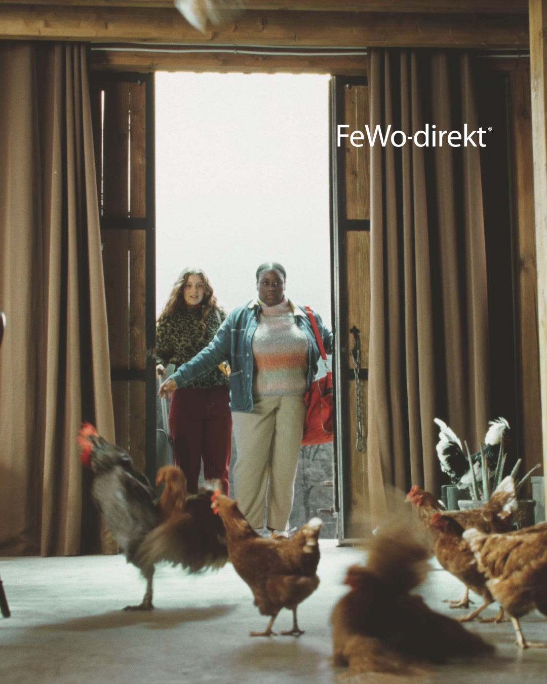
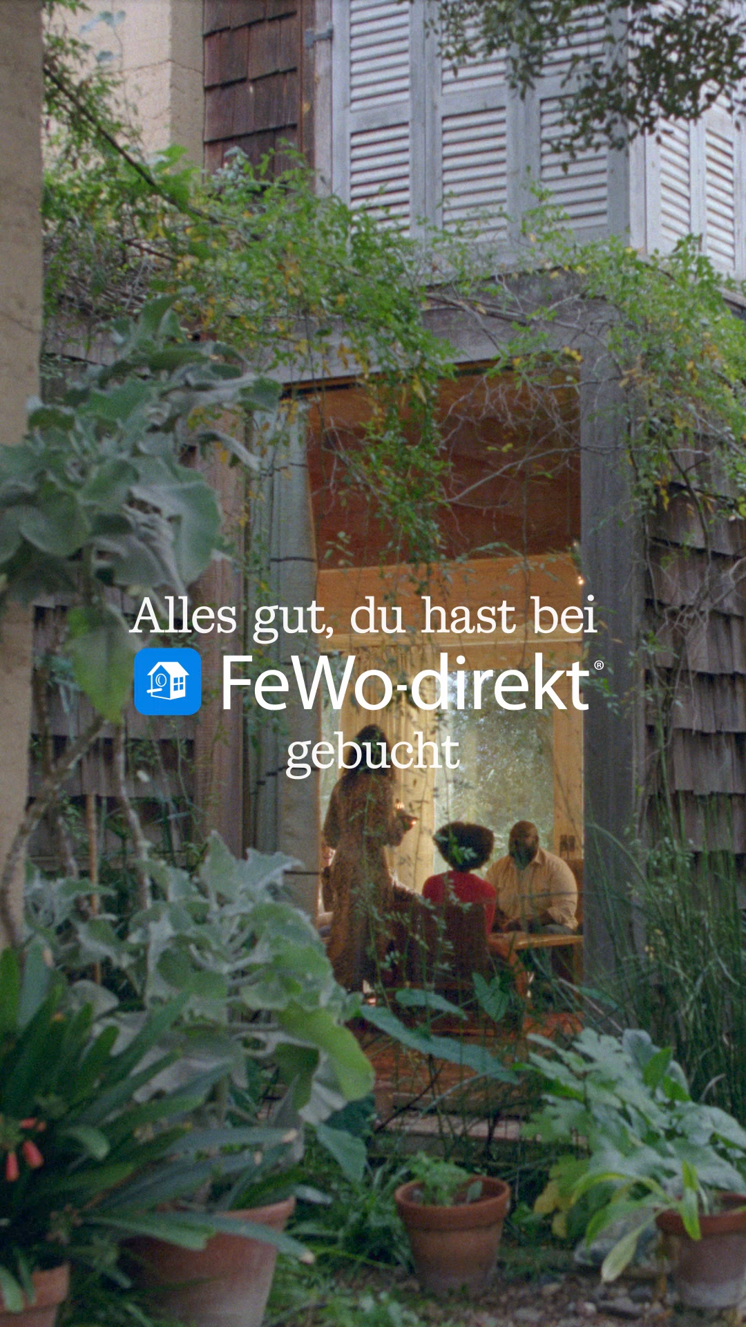
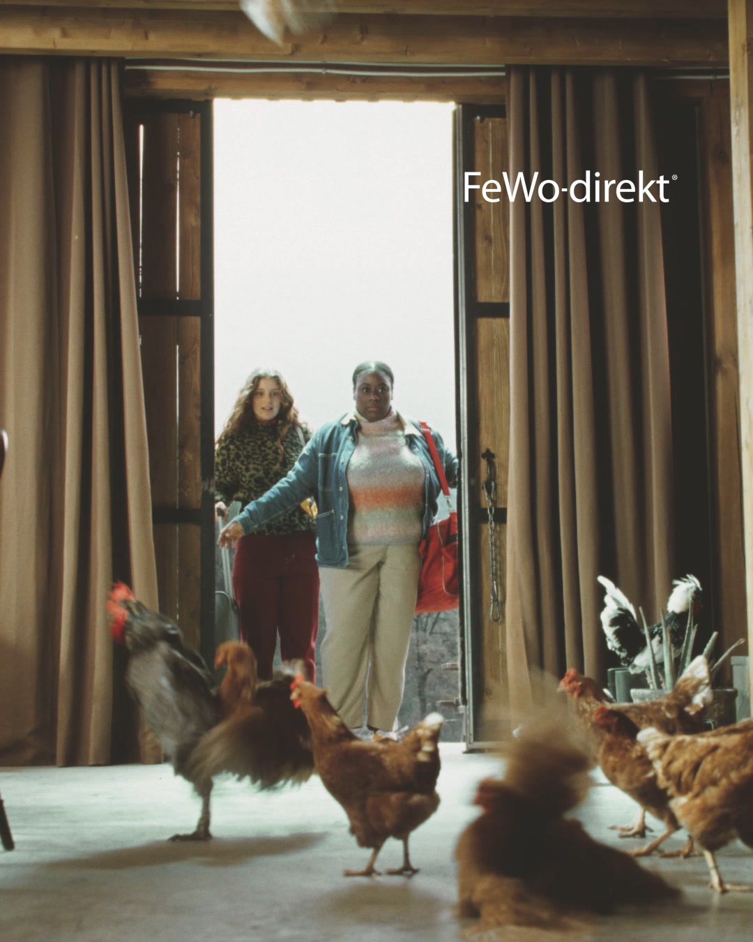
What it does. Two arriving travellers freeze in a rented interior overrun by live chickens under the FeWo-direkt logo, a literal chicken coop of a holiday home. The absurd scene dramatises the fear of booking a disappointing rental and pushes you to find one that truly matches your expectations.
Why it works. A visual gag that agitates the real anxiety of booking a disappointing rental lands the brand as the safe alternative far more memorably than a feature list.
Ad data. Strong reach at 9.5M across a 69 day run. Gender split: 38% women / 62% men.
4. Sun-worship sensory brand mood
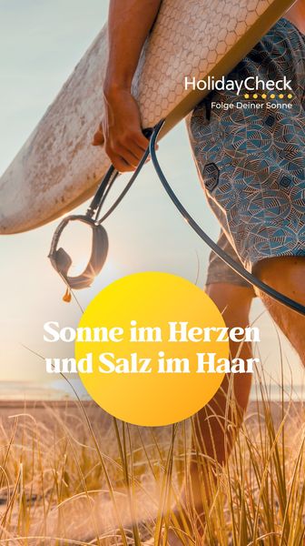
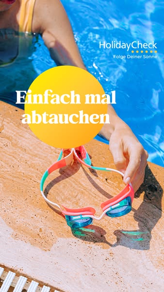
What it does. A backlit close-up of a surfer carrying a board through golden dune grass carries only a warm sun-circle line, Sonne im Herzen und Salz im Haar (sun in your heart and salt in your hair), under the HolidayCheck Folge Deiner Sonne banner. It sells the feeling of holiday rather than any product or price.
Why it works. Pure sensory, mood-first imagery builds brand warmth and desire, giving the audience an emotional pull toward vacation without a hard offer.
Ad data. Reached 8.4M over a 27 day run. Gender split: 43% women / 57% men.
5. Overhead hotel-breakfast flat-lay
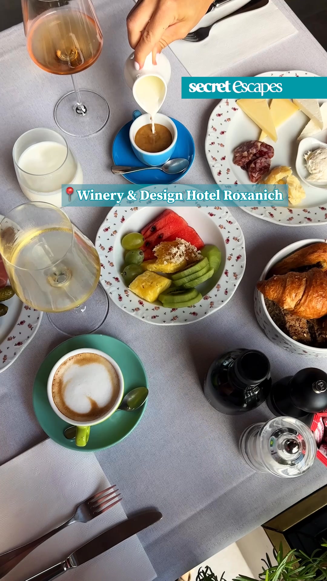
What it does. A top-down flat-lay of a lavish hotel breakfast, coffee being poured, wine, fruit and a cheese board, is pinned with the named location Winery and Design Hotel Roxanich. The copy adds that five stars at half price are twice as good.
Why it works. The satisfying overhead spread is a scroll-stopping POV that makes the luxury tangible, while naming the real hotel and the half-price angle turns aspiration into a bookable deal.
Ad data. Reached 8.1M over an 81 day run. Gender split: 37% women / 63% men.
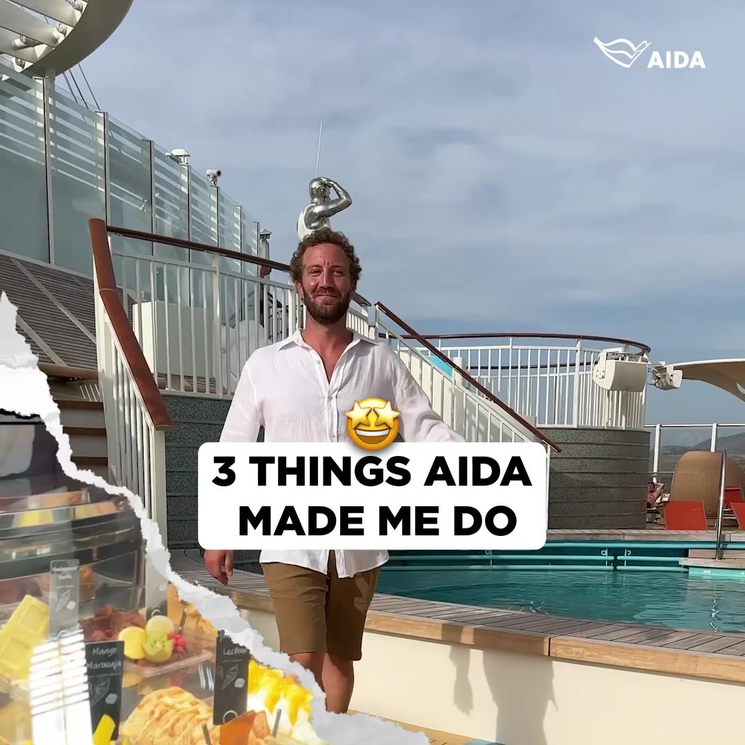
6. On-deck creator reasons listicle
What it does. A relaxed guest walks the sun deck to camera in torn-paper UGC styling with the caption 3 THINGS AIDA MADE ME DO, teasing a numbered rundown of onboard moments. It reads like an organic creator clip rather than a polished brand film.
Why it works. A first-person creator hook plus a numbered promise feels native to the feed and invites viewers to keep watching for each reason, which builds credible word-of-mouth appeal.
Ad data. Reached 7.3M over an 18 day run. Gender split: 50% women / 50% men.
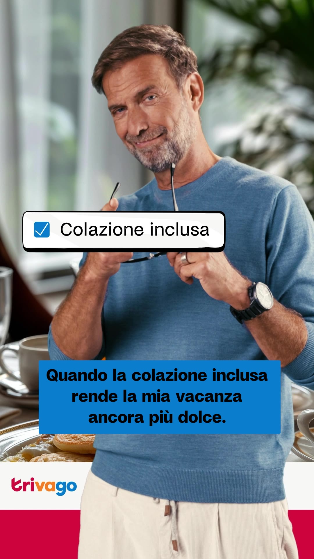
7. Spokesperson native-comment sticker
What it does. The trivago spokesperson smiles to camera holding his glasses while a native-style checkbox sticker reading Colazione inclusa (breakfast included) sits over the frame, echoed by a caption about breakfast making his holiday sweeter. The overlay mimics an in-feed UI element.
Why it works. A recognisable, likeable face combined with a native-style checkbox sticker blends familiarity with a scroll-native format, making the benefit feel like a personal, platform-native tip.
Ad data. Reached 4.7M over an 8 day run. Gender split: 43% women / 57% men.
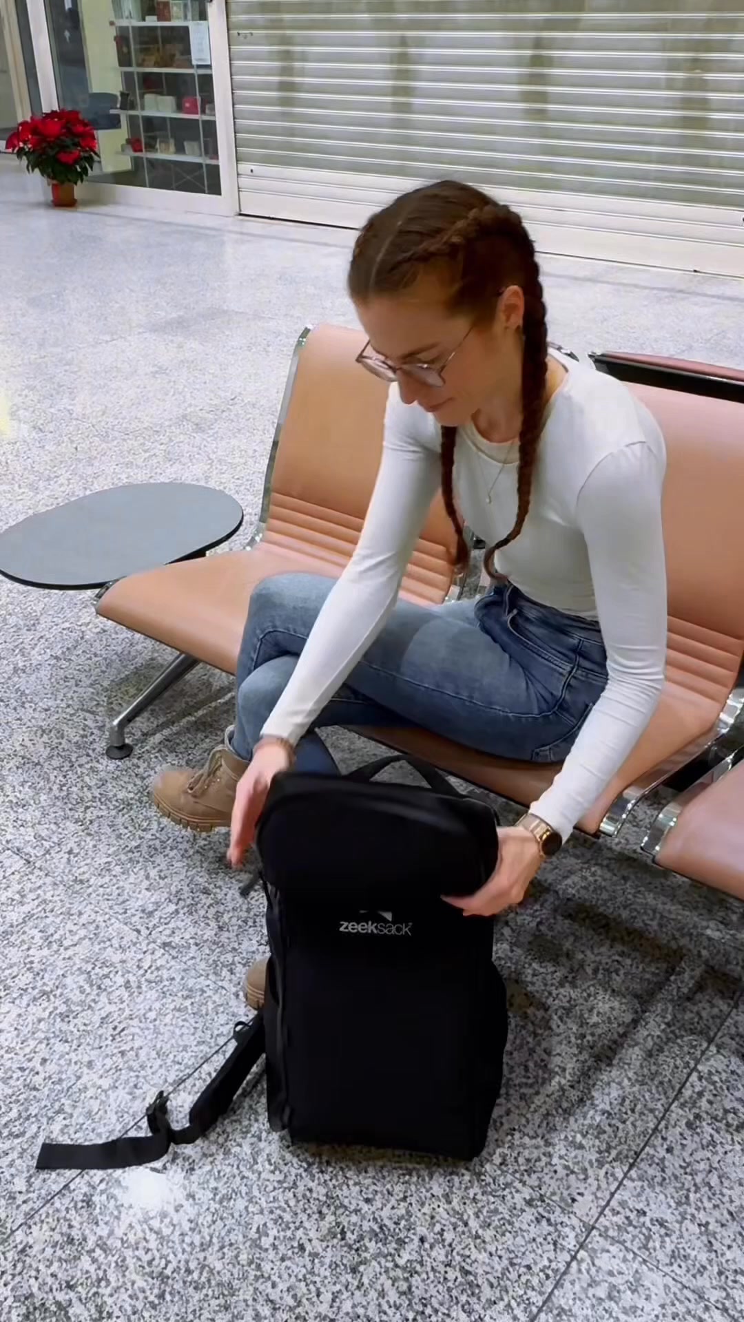
8. Airport carry-on unboxing demo
What it does. A phone-shot traveller sits on airport terminal seats and opens up the branded Zeeksack backpack, with copy promising nearly a month of travel with only carry-on plus a 100 day satisfaction guarantee. It looks like an organic first-person product review.
Why it works. An authentic UGC unboxing in a real travel setting proves the bag in context, and the guarantee removes purchase risk, a combination built to convert practical travellers.
Ad data. Reached 5.1M reach for this creative. Gender split: 66% women / 34% men.
9. Property-tour hero shot
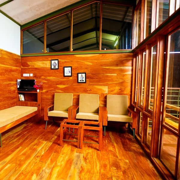
What it does. A warm, well-lit interior photo of an actual rental, all teak walls, soft seating and a sunlit mezzanine, sells the stay by showing the space itself, with no model and no text overlay.
Why it works. The space is the product, so an inviting real interior lets the viewer picture being there, and it mirrors the organic listing photos travellers already trust more than a polished ad.
Ad data. Reached 7.3M over a 113-day run. Gender split: 55% women / 45% men.
Travel & Hospitality ad best practices
- Open on escapism, not the logo. Lead the first frame with the destination fantasy, water, dunes, a deck view, so the scene stops the thumb before any branding or offer appears.
- Make one number the whole message. Overlay a single oversized figure, an early-booking discount or a half-price stay, in bold type so the deal reads instantly without the viewer pausing to parse copy.
- Shoot it native to the feed. Use torn-paper captions, checkbox stickers, phone-shot framing and a numbered listicle hook so the ad reads like an organic creator clip rather than a polished brand film.
- Name the place and show the proof. Pin the real hotel or ship on screen and demonstrate the experience directly, the breakfast flat-lay, the carry-on unboxing, so aspiration turns into something concrete and bookable.
How the ads here are selected
This page draws on a curated dataset rather than a complete archive of every Meta ad. Only the highest-reach Facebook and Instagram ads per industry make it in, which means the figures describe the top performers we track rather than the platform as a whole. Reach comes straight from Meta: it is the figure the Meta Ad Library reports under EU transparency rules, with its gender, age and country breakdown, and we do not model or adjust it. Only the estimated spend is our own calculation, derived from that reported reach at an assumed 5 to 30 EUR CPM.
The raw ad data is collected via top-ads.io. The Ad Library itself is a free resource from adtribute, the analytics platform that answers the follow-up question with marketing attribution: which of your own ads made the sale.