



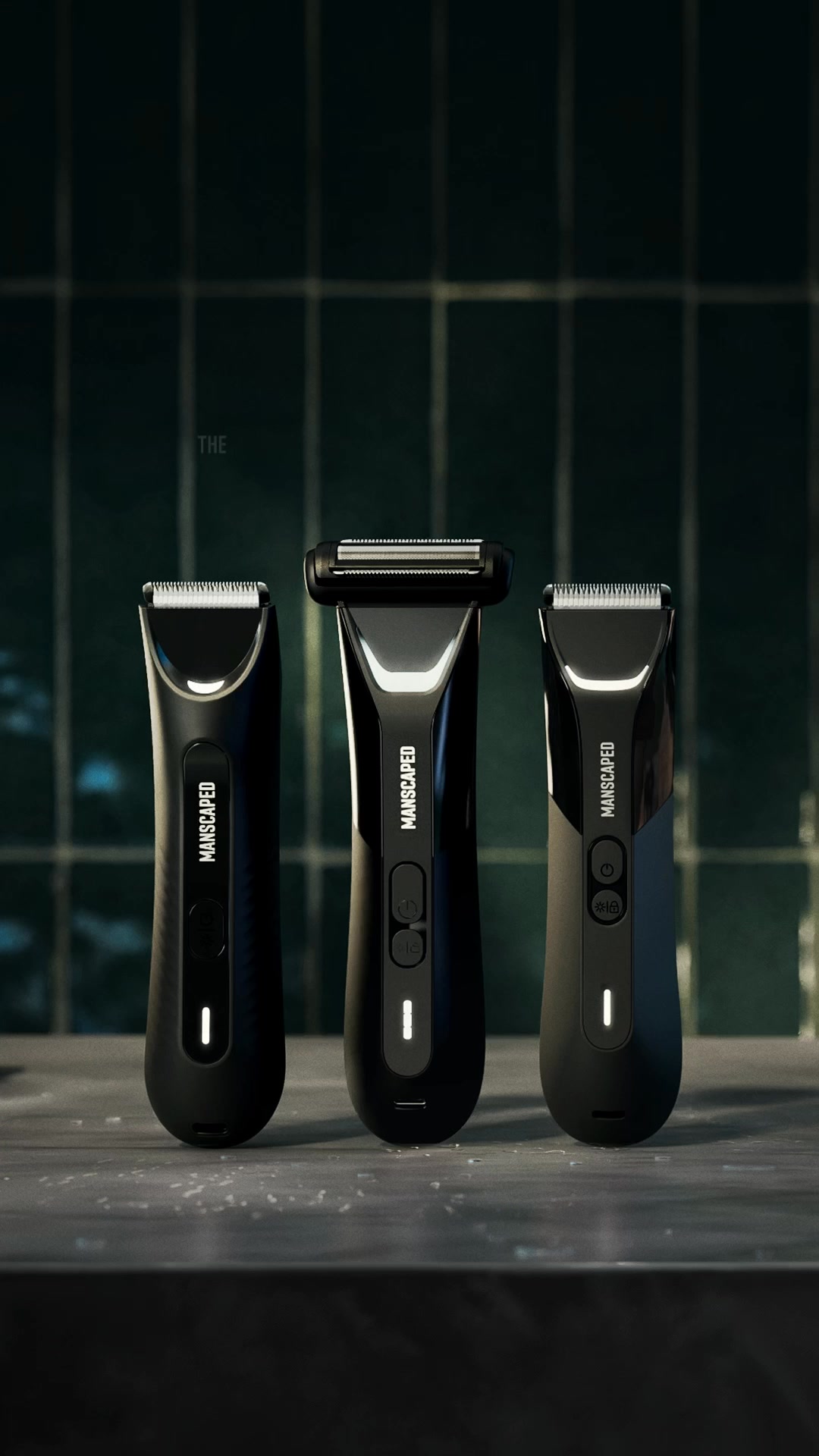

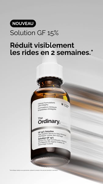

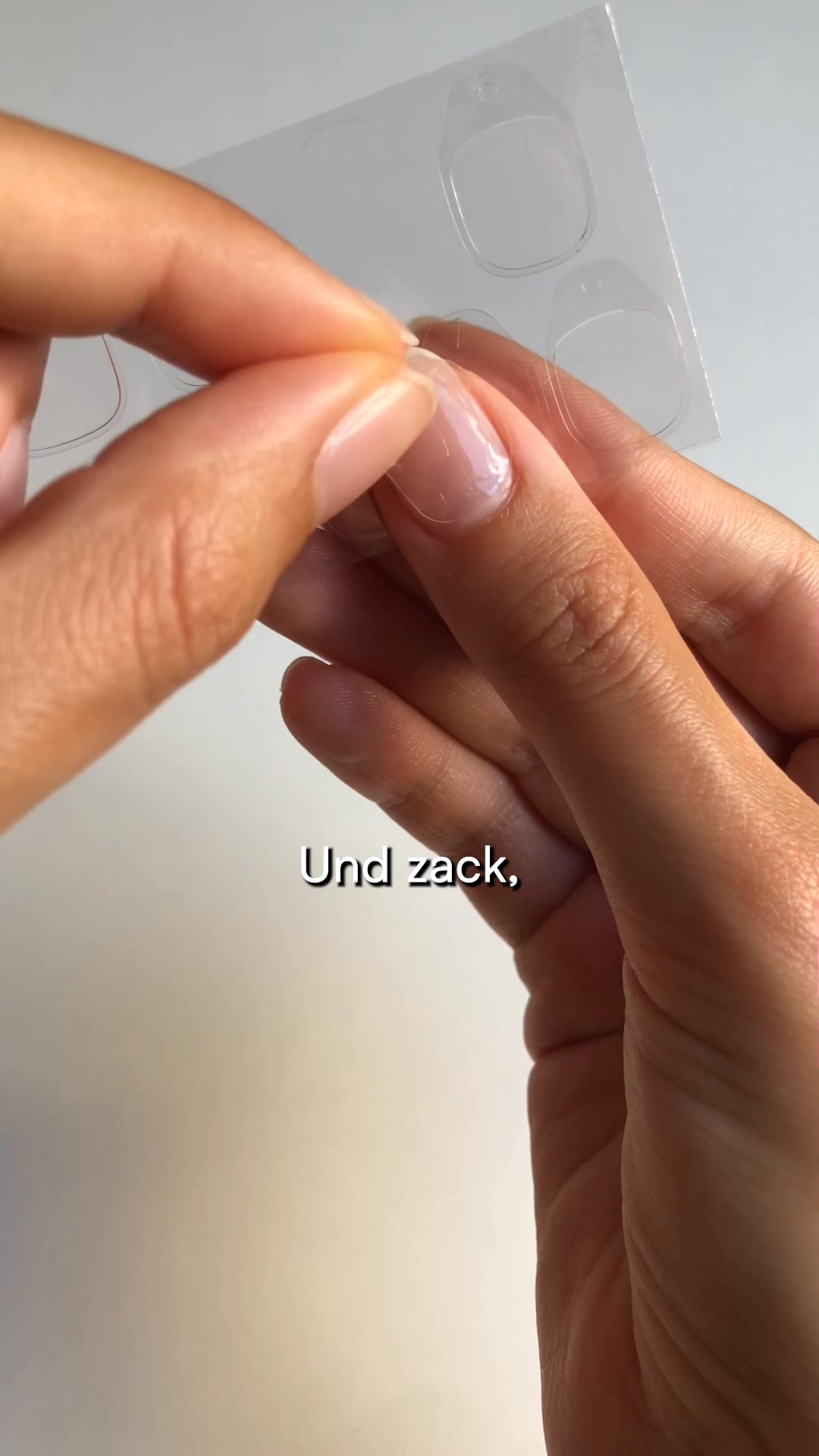



The highest-reach Beauty & Personal Care ads on Meta win by showing a visible result, not just claiming one. Across this curated snapshot of skincare, cosmetics, makeup and grooming creatives, the pattern is consistent: a scroll-stopping hook, a live demonstration or side-by-side proof, and a clear next step. This showcase pulls together the top performers so you can see what a proven winner actually looks like.
Key takeaways
- Video is the majority format. The mix here runs 65% video to 35% image across 136 ads. Motion suits this vertical because so much of the sell is a demonstration, but static images still win when a single visual gag or side-by-side lands instantly.
- A wide field of advertisers, deep reach. The snapshot spans 33 distinct advertisers, with a median reach of 6.1M and a top ad reaching 26M. Average run length lands at 117 days, and the longest-running creative has stayed live for 681 days, a strong signal it keeps earning its budget.
- The demo is the message. Winning creatives show the transformation on screen: a wrapping mask peeled off glossy skin, a temporary tattoo placed beside a real one. The tactile action doubles as believable before and after proof.
- Problem-first hooks disarm sensitive topics. Many top ads open on the pain point, from thinning hair to a grooming worry, framed with humor or raw honesty. That opening makes an awkward category feel light and relatable before the product is ever pitched.
What makes a winning Beauty & Personal Care ad
The anatomy is dependable. The hook lands in the first frame with an arresting visual or a blunt confession, like a man pulling back his curls to reveal a thinning crown, or an absurd beard-hair gag that stands in for grooming. Proof follows fast through a live demonstration or direct comparison: a peel that reveals dewy, glass-like skin, or a subtle result shown next to the real thing so the buyer's main doubt answers itself. The offer is specific and the call to action is low friction, often a simple prompt to comment a keyword or tap through to details.
What the top Beauty & Personal Care ads look like
Scan these creatives and a few visual patterns repeat. Skin and body are shown in tight, close-up framing so the glossy, dewy result or the treated area fills the screen, and product is demonstrated in the hand or on the face rather than sitting on a shelf. On-screen text is heavy and functional: short punchy headlines for the humor plays, and editorial mastheads with before and after illustrations for the advertorial-styled ads that mimic a neutral product-comparison article. Many lean on side-by-side layouts and first-person, phone-shot moments that read as organic rather than produced. Overall the mix is 65% video and 35% image.
Prefer one format? Filter this page to Beauty video ads or Beauty image ads only.
Winning ad frameworks in Beauty
The highest-reach Beauty ads reuse a handful of proven creative frameworks. Here are the ones that stand out here, each with a real example you can play or open in full.
1. Beard-hair grooming gag
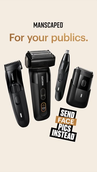
What it does. Three men on a beach are shot so two of their faces are buried in another man's flowing beard hair, with the headline "Give your boys the love they deserve" and a small Lawn Mower trimmer icon in the corner. The visual gag stands in for grooming without ever showing the body area, letting the joke sell the tool.
Why it works. The absurd hair metaphor is instantly scroll-stopping and disarming, so a sensitive grooming category feels light and shareable rather than clinical or embarrassing.
Ad data. This image ad reached 26M, the highest in the category, in a short 23 day run. Gender split: 46% women / 54% men.
2. Glass-skin peel demo
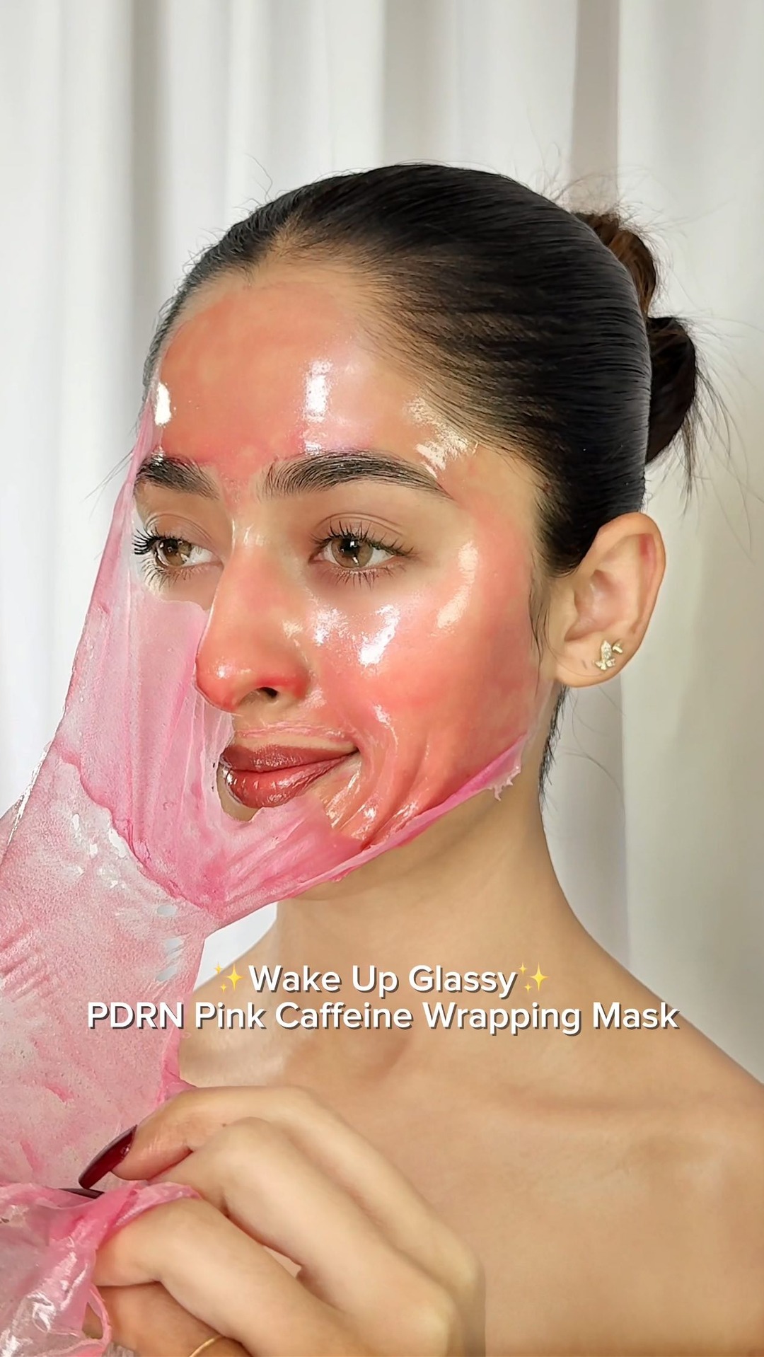
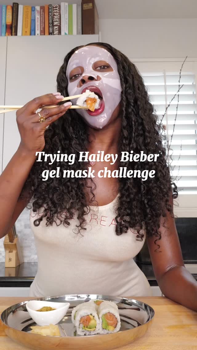
What it does. A model slowly peels a translucent pink PDRN wrapping mask off her glossy, dewy face with the caption "Wake Up Glassy, PDRN Pink Caffeine Wrapping Mask." The satisfying peel action doubles as a live demo of the glass-skin result.
Why it works. The tactile peel and visibly luminous skin give an immediate, believable before and after payoff that stops the scroll and shows the benefit rather than just claiming it.
Ad data. This video reached 13M in a fast 19 day run. Gender split: 50% women / 50% men.
3. Two-week tattoo side-by-side
What it does. Two forearms are shown next to each other and labeled: the left arm tagged "Inkster" wears a subtle "Take risks" line design, the right tagged "Echtes Tattoo" shows a dense real sleeve, under "Tattoos von Inkster." The framing invites a direct comparison of the temporary tattoo against a permanent one.
Why it works. Placing the product beside the real thing makes the natural, realistic look self-evident and answers the buyer's main doubt without needing a hard claim.
Ad data. This video reached 9.1M over a long 431 day run, signaling a durable performer. Gender split: 38% women / 62% men.
4. First-person hair-loss confession
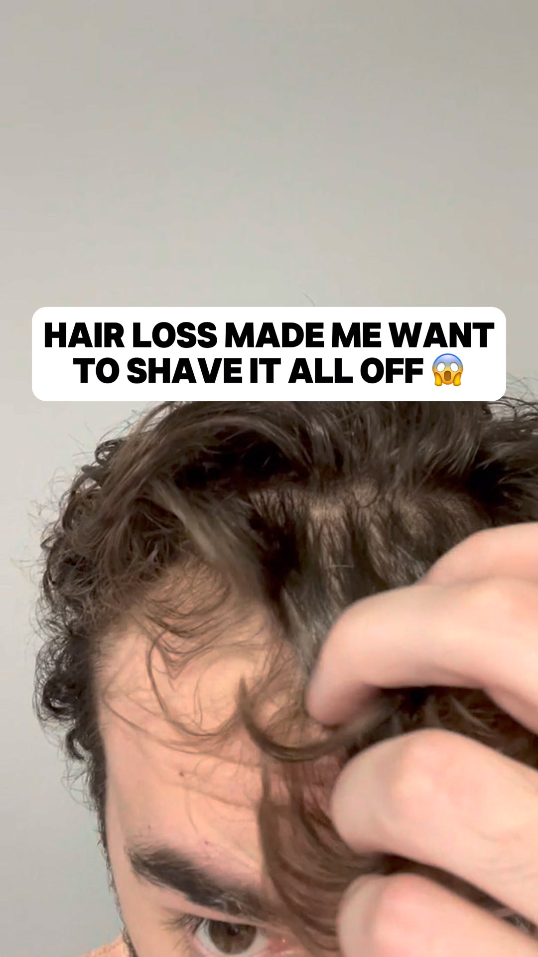
What it does. A phone-shot man pulls back his curls to expose a thinning crown under the blunt caption "Hair loss made me want to shave it all off," opening on the problem before the routine is pitched as the fix. It reads as an organic, unpolished personal moment rather than a produced ad.
Why it works. The raw confession and visible scalp create instant relatability for men worried about thinning, agitating the pain point before offering the clinically tested routine as relief.
Ad data. This video reached 7.7M over a sustained 166 day run. Gender split: 16% women / 84% men.
5. Consumer-test collagen advertorial
What it does. A "Verbraucher Vergleich" masthead sits above a drugstore shelf of collagen boxes with the headline "Kollagen aus der Drogerie?", and the copy frames it as "we tested it for 90 days" citing TV shows and celebrity users. It is styled as an independent consumer-test article, not a brand ad.
Why it works. Borrowing the look of a neutral product-comparison magazine lends third-party credibility and pulls curious readers into a long-form article that pre-sells before the pitch.
Ad data. This image ad reached 9.0M across an exceptionally long 531 day run. Gender split: 100% women / 0% men.
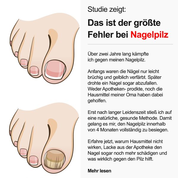
6. Nail-fungus health-article testimonial
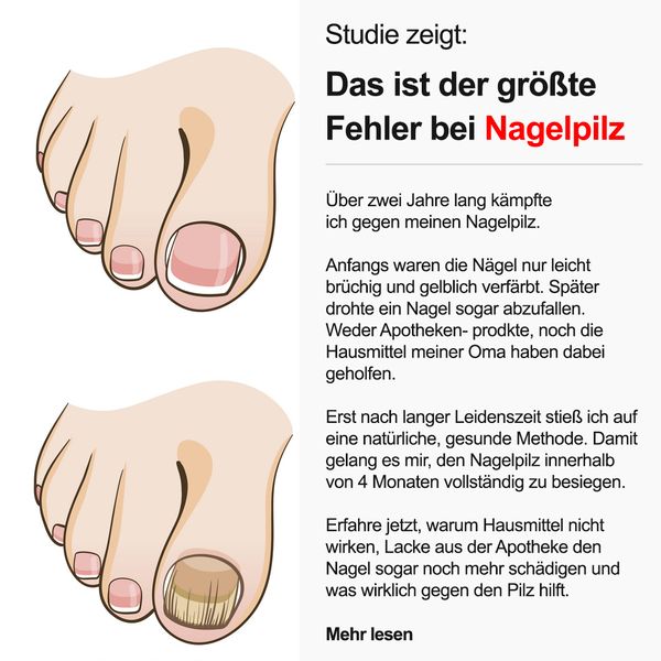
What it does. An illustrated healthy toe sits above an infected, discolored toenail under "Studie zeigt: Das ist der groesste Fehler bei Nagelpilz," beside a first-person recovery story and a "Mehr lesen" link. It fuses a before and after illustration with a testimonial styled as an editorial health article.
Why it works. The alarming problem visual plus a relatable personal recovery story reads as helpful advice rather than an ad, driving clicks from people quietly searching for a fix.
Ad data. This image ad reached 17M, second highest in the category, over a long 331 day run. Gender split: 61% women / 39% men.
Beauty & Personal Care ad best practices
- Open on a visible transformation. Put the result on screen in the first frame, a peel revealing luminous skin or a treated area shown up close. Show the benefit rather than describing it, so the payoff is believable before any claim is made.
- Answer the main doubt with a side-by-side. Place the product next to the real thing or a before and after, as with the temporary tattoo shown beside a permanent sleeve. Direct comparison makes a natural, realistic look self-evident without a hard sell.
- Disarm sensitive categories with a hook. Use humor or a raw, first-person confession to open on grooming, hair loss or other awkward topics. An absurd metaphor or an unpolished phone-shot moment makes the creative feel shareable and relatable instead of clinical.
- Borrow an editorial layout for problem-led products. For treatment-style products, style the creative like an independent article with a masthead, a problem visual, and a testimonial. This advertorial framing reads as helpful advice and earns the click before the pitch arrives.
How the ads here are selected
This Ad Library is a curated snapshot, not a complete record of Meta advertising. Each industry contributes its highest-reach Facebook and Instagram ads and nothing else, so the numbers reflect that top slice, not all of Meta. Reach comes straight from Meta: it is the figure the Meta Ad Library reports under EU transparency rules, with its gender, age and country breakdown, and we do not model or adjust it. Only the estimated spend is our own calculation, derived from that reported reach at an assumed 5 to 30 EUR CPM.
The raw ad data is collected via top-ads.io. The Ad Library itself is a free resource from adtribute, a marketing analytics platform built around attribution: this library shows what scales for others, adtribute shows what converts for you.