






The Diet hub collects the highest-reach weight loss ads running on Facebook and Instagram, from prescription slimming injections to metabolism shakes and points-based nutrition programs. These 255 ads share a clear playbook: lead with a visible transformation or a surprising mechanism, make the science feel concrete, then attach a discount or a free resource. Use this snapshot to see what actually earns reach in slimming and nutrition creative before you brief your next campaign.
Key takeaways
- Video does most of the heavy lifting. The format mix runs 68% video to 32% image across 255 ads. Video suits the explainer and before-to-after storytelling that this weight loss category leans on, while static images carry the discount and result-note angles.
- Reach concentrates fast. Median reach sits at 2.4M with a top ad hitting 16M across just 12 distinct advertisers. A single strong slimming creative can outrun an entire content calendar of weaker ones.
- The hook is a mechanism, not a promise. Many top nutrition ads open by blaming a hidden cause, a sluggish liver or a stalled metabolism, rather than shouting a benefit. Naming the culprit creates an open loop that pulls viewers toward the product as the fix.
- Proof is staged as real, not polished. Winners use handwritten result notes, held-up oversized jeans, and man-on-the-street reveals to make the before-to-after feel like a genuine customer rather than brand copy. The offer then lands as a discount badge or a free guide.
What makes a winning Diet ad
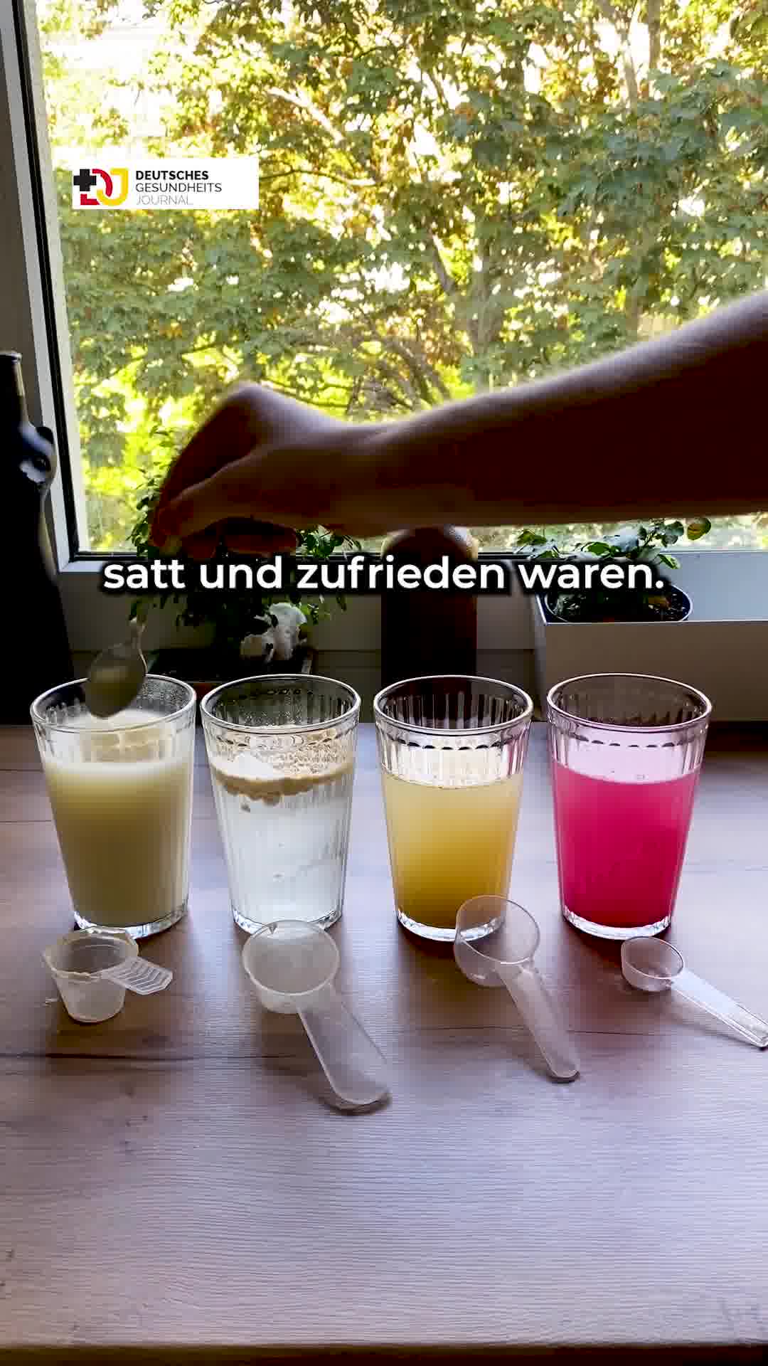
A high-performing slimming ad opens on a single sharp hook: a surprising cause of stubborn belly fat, a candid transformation, or a bold percentage-off badge. It then earns belief with a concrete proof device, an anatomical organ model, a whiteboard quiz, four shaker bottles lined up for a taste test, or a handwritten testimonial propped beside the bottle. The offer is specific and time-bound, pairing an outcome like a set weight loss over a set number of weeks with a discount or a free resource. The call to action is low-friction, walking the viewer through an eligibility check or a simple next step so a sensitive purchase feels safe.
What the top Diet ads look like
Scan the highest-reach diet ads and you see recurring visual cues: a creator or coach on camera beside a physical prop, a life-size anatomical torso or a flipchart listing organs, dramatizing an internal mechanism. Product shots are clean and studio-lit, a creamy shake poured into a glass next to the pouch, often stamped with a red starburst discount and an on-screen weight-loss number. A second cluster stages proof as everyday reality: a woman holding up her old oversized jeans on the street, a colorful handwritten sticky note behind the bottle, or a frame dressed as an editorial health-journal article or a native chat thread. Bold text overlays carry the claim in almost every frame. Across the hub, roughly two thirds of these ads are video and one third are static images.
Prefer one format? Filter this page to Weight Loss video ads or Weight Loss image ads only.
Winning ad frameworks in Weight Loss
The highest-reach Weight Loss ads reuse a handful of proven creative frameworks. Here are the ones that stand out here, each with a real example you can play or open in full.
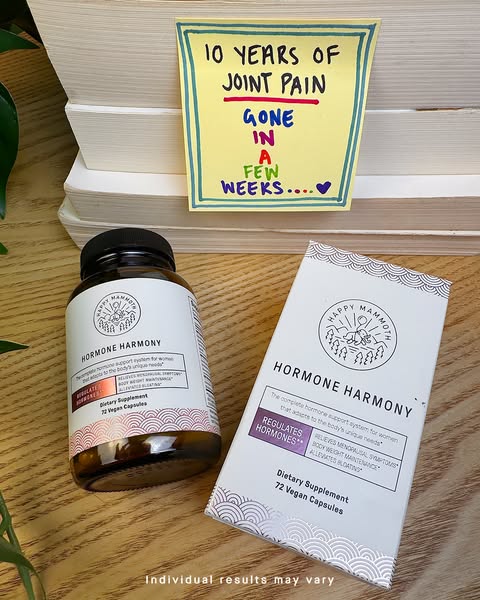
1. Handwritten result sticky note
What it does. A colorful hand-lettered sticky note reads "10 years of joint pain gone in a few weeks" propped behind the Hormone Harmony bottle and box, with a small "Individual results may vary" line at the bottom. The whole ad is a customer result staged as a handwritten note rather than a polished claim.
Why it works. The handwritten, imperfect note reads like a real person's testimonial rather than brand copy, so the before to after result feels credible and personal next to the clean product shot.
Ad data. This image ad reached 16M and ran for 92 days, the highest reach in the Diet set. Gender split: 44% women / 56% men.
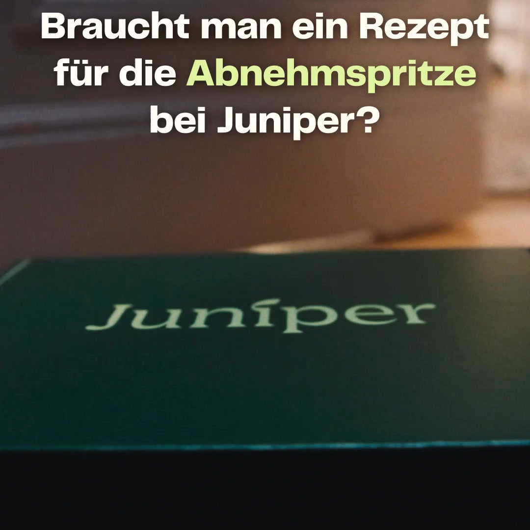
2. Online-Rx injection explainer
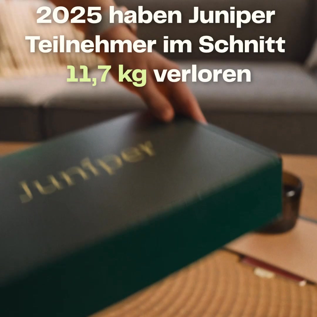
What it does. The video opens on the branded green Juniper box with a bold question overlay "Braucht man ein Rezept fuer die Abnehmspritze bei Juniper?" and the copy walks through the online eligibility check, doctor review, and discreet home delivery. It turns the prescription weight-loss injection process into a simple step-by-step explainer.
Why it works. Leading with the exact objection most people have about the injection (do I need a prescription and a doctor visit) and answering it calmly with a clear process lowers friction for a sensitive purchase.
Ad data. This video reached 14M in just 2 run days, the second highest reach in the set. Gender split: 46% women / 54% men.
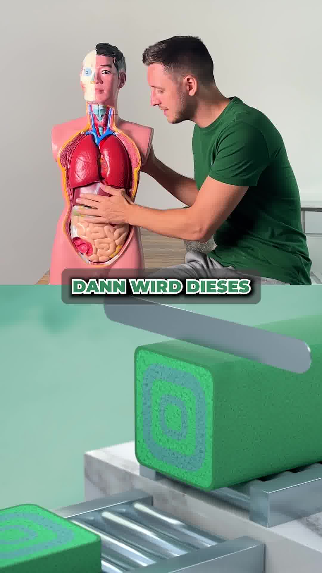
3. Anatomy-model organ metaphor
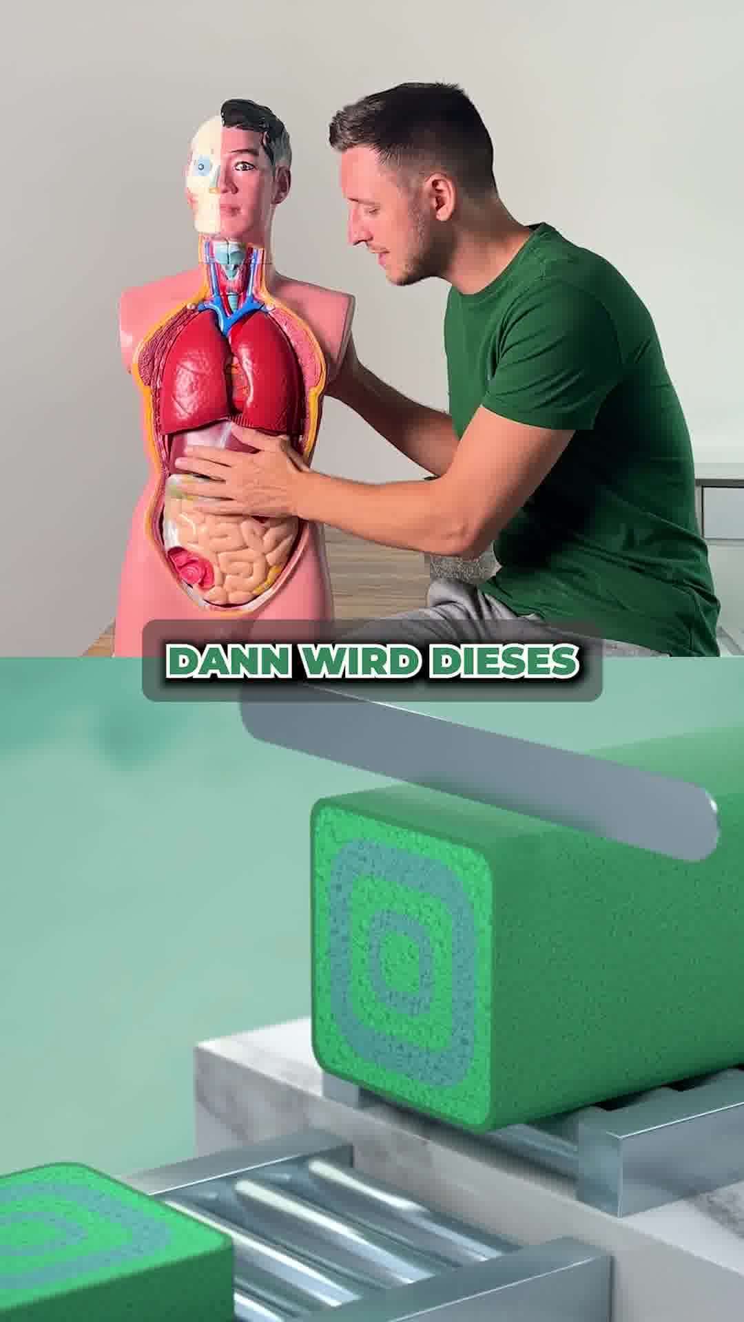
What it does. A creator sits beside a life-size anatomical torso model and presses on its belly and organs, then the video cuts to an animated green tablet, dramatizing the claim that a sluggish liver, not diet, drives stubborn belly fat. The organ prop turns an abstract mechanism into a visual metaphor.
Why it works. Using a physical organ model makes an invisible internal cause feel concrete and scientific, so the "fix the liver" premise lands before the product is even shown.
Ad data. This video reached 9.3M and ran for 198 days, a long-lived performer. Gender split: 48% women / 52% men.
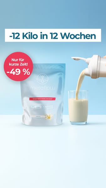
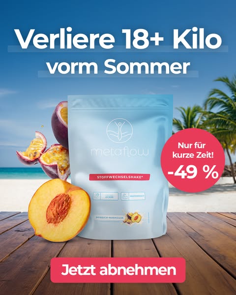
4. Discount shake pour badge
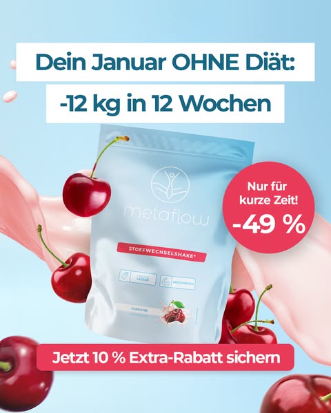
What it does. A clean studio shot pours a creamy shake into a glass next to the MetaFlow pouch, headlined "-12 Kilo in 12 Wochen" with a red "Nur fuer kurze Zeit -49%" starburst. The discount and the time-bound promise are the hook.
Why it works. Pairing a concrete outcome with a large percentage-off badge and urgency gives a scrolling viewer an immediate reason to act, while the appetizing pour keeps the product appealing.
Ad data. This image ad reached 7.6M and ran for 112 days. Gender split: 69% women / 31% men.
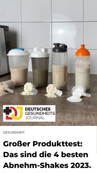
5. Health-journal shaker test
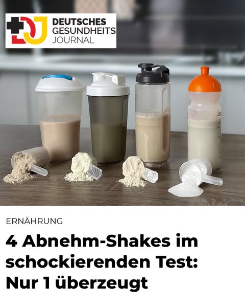
What it does. The ad is styled as an editorial article from "Deutsches Gesundheits Journal," showing four filled shaker bottles and scoops of powder lined up on a counter under an "Ernaehrung" section label and the headline "4 Abnehm-Shakes im schockierenden Test: Nur 1 ueberzeugt." It reads like a journalistic taste and quality test rather than an ad.
Why it works. The editorial masthead, section label, and neutral test setup borrow the credibility of a health publication, disarming ad skepticism and making the eventual product recommendation feel like reporting.
Ad data. This image ad reached 7.2M and ran for 197 days, one of the longest runs in the set. Gender split: 66% women / 34% men.
6. Whiteboard organ quiz
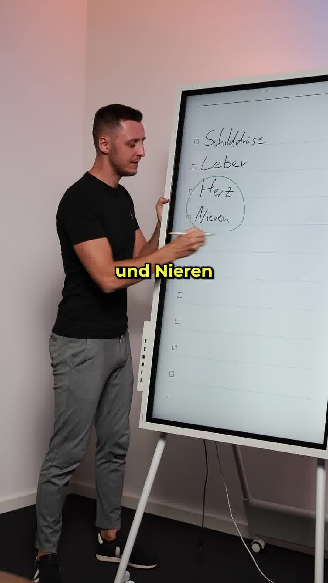
What it does. A nutrition coach stands at a flipchart and writes out a checklist of organs (Schilddruese, Leber, Herz, Nieren), circling the answer, turning the ad into a which-organ-drives-weight-loss quiz. The copy poses the same multiple-choice question before revealing the liver.
Why it works. The quiz format and physical whiteboard create an open loop that pulls viewers in to learn the answer, positioning the coach as a teaching authority before any pitch.
Ad data. This video reached 7.0M and ran for 388 days, the longest run in the set. Gender split: 49% women / 51% men.
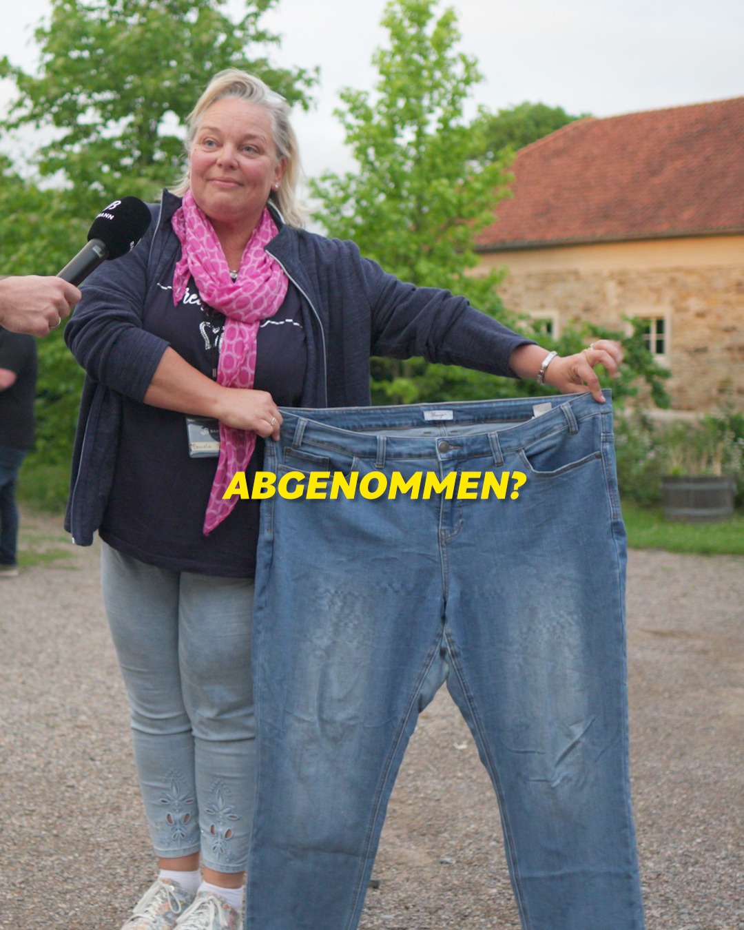
7. Old-jeans street before-after
What it does. An outdoor interview clip shows a woman holding up a huge pair of her old jeans with a microphone in frame and the caption "ABGENOMMEN?", making the visible size difference the whole story. It plays like a candid man-on-the-street transformation reveal.
Why it works. Holding the oversized former jeans is an instant, undeniable before to after proof, and the interview setup makes it feel like a real customer rather than a staged model.
Ad data. This video reached 4.2M and ran for 266 days. Gender split: 87% women / 13% men.
8. Recipe chat-sticker card
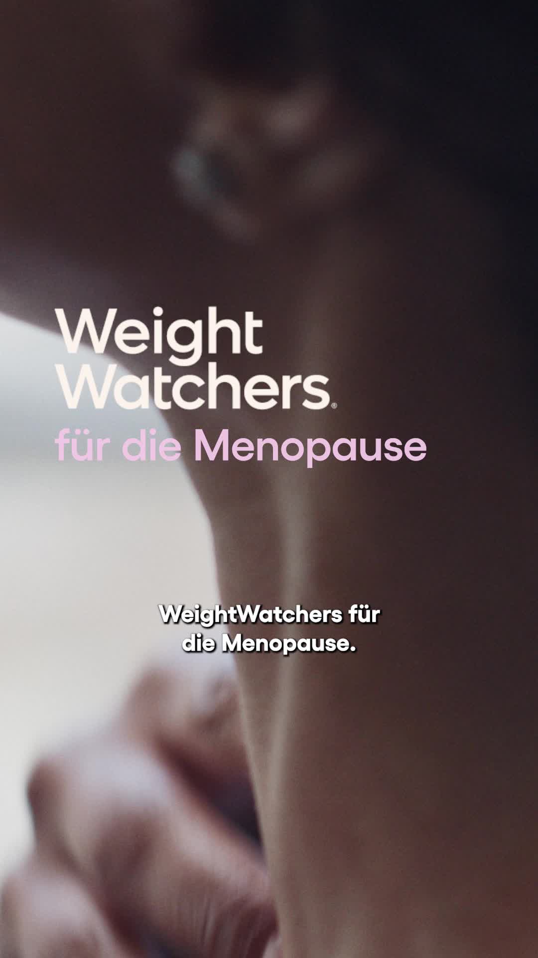
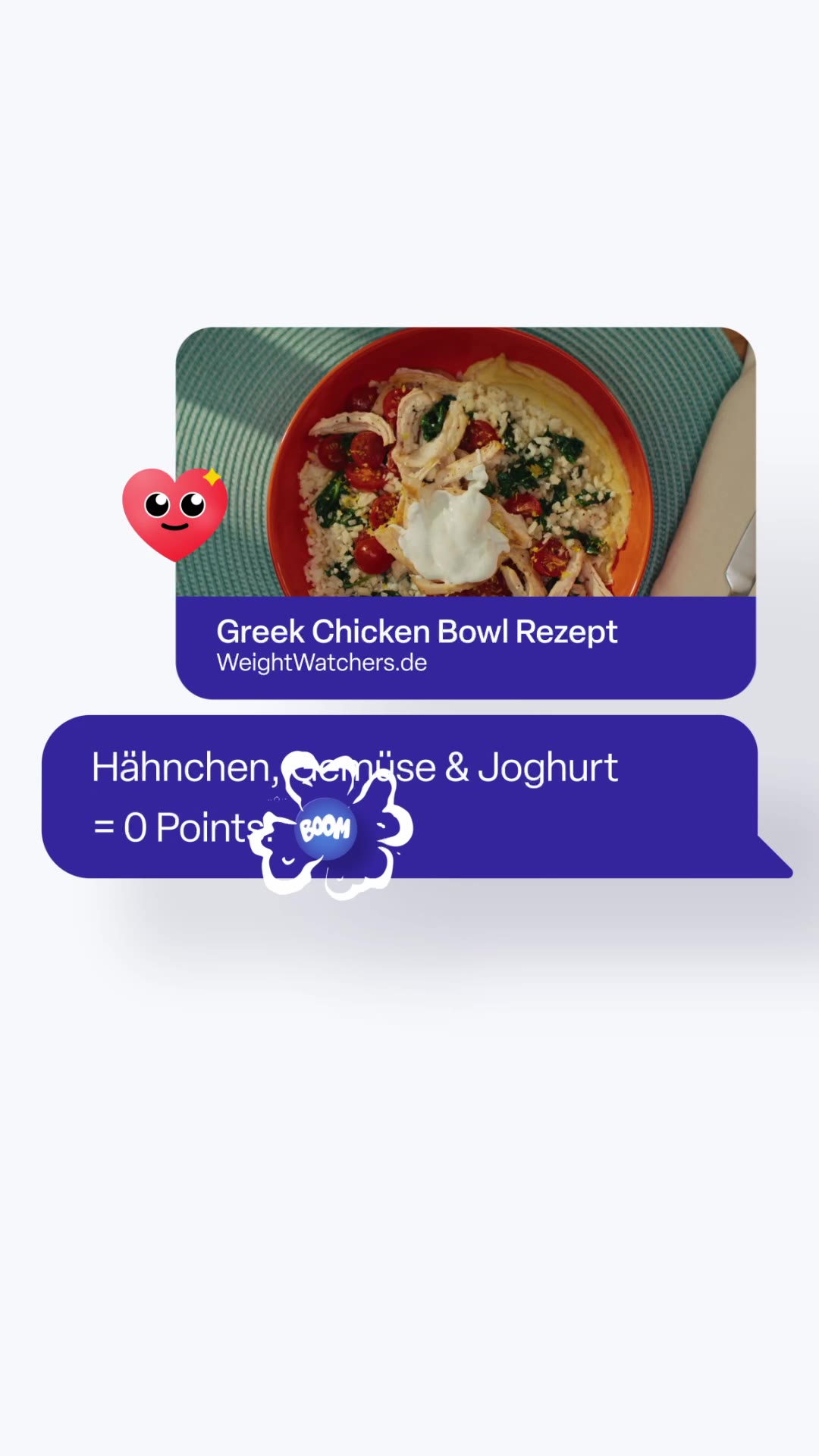
What it does. The frame mimics a native messaging thread: a recipe card image of a Greek Chicken Bowl in a chat bubble captioned "WeightWatchers.de," followed by a purple message bubble reading "Haehnchen, Gemuese und Joghurt = 0 Points" with a heart reaction and a "BOOM" sticker. It dresses the recipe as an organic social message rather than an ad.
Why it works. The chat-bubble and reaction stickers make the ad blend into the feed as native content, and the punchy "0 Points" payoff frames the diet program as effortless and food-positive.
Ad data. This video reached 4.0M and ran for 27 days. Gender split: 100% women / 0% men.
Diet ad best practices
- Open on the hidden cause. Lead your first frame by naming the culprit behind stubborn weight, a sluggish liver or a stalled metabolism, before you show the product. This mechanism hook creates curiosity that a plain benefit claim cannot.
- Stage proof as unpolished reality. Use a handwritten result note, a held-up pair of oversized old jeans, or a candid interview clip so the before-to-after reads as a real person, not a model. Imperfect, human framing beats a glossy studio testimonial for credibility.
- Make the invisible visual. Turn an abstract nutrition claim into a physical prop: an anatomical organ model to press on, a whiteboard quiz listing organs, or four shaker bottles lined up for a test. A concrete object makes the science land before the pitch begins.
- Stamp the offer on the frame. Pair a concrete outcome with a large percentage-off badge or a free-guide label and keep it on screen with the product. An appetizing shake pour plus a bold discount starburst gives a scrolling viewer an immediate reason to stop and act.
What is behind these numbers
Everything on this page comes from a curated snapshot, so it is a selection, never the whole market. Only the highest-reach Facebook and Instagram ads per industry make it in, which means the figures describe the top performers we track rather than the platform as a whole. Every reach figure is Meta-reported EU-transparency data, broken down by gender, age and country; none of it is estimated on our side. The one number we derive ourselves is estimated spend, which we back out of the reported reach at an assumed 5 to 30 EUR CPM.
The raw ad data is collected via top-ads.io. The Ad Library itself is a free resource from adtribute, a marketing analytics platform built around attribution: this library shows what scales for others, adtribute shows what converts for you.