









The DTC Brands hub gathers the highest-reach Meta ads from direct-to-consumer advertisers on Facebook and Instagram, the kind of creative that keeps earning budget and stays live. Across 1,369 ads from 109 distinct advertisers, the winning pattern is proven creative: scroll-stopping hooks, clear proof, and a single obvious next step. Use it as a working reference for what a strong ecommerce ad actually looks like right now.
Key takeaways
- Video does the heavy lifting. The format split runs 65% video to 35% image, so most of the highest-reach direct-to-consumer creative is motion-first. Image ads still earn their place when the concept is a single strong idea, but video is the default here.
- A wide field of advertisers. The snapshot spans 1,369 ads from 109 distinct D2C advertisers, with median reach of 2.9M and a top ad hitting 26M. The average ad runs 133 days, a signal that these creatives keep returning enough to stay funded.
- The hook is a device, not a product shot. The strongest ecommerce creatives open on a gag, a fake comment thread, or an editorial headline rather than the product itself. The concept stops the scroll first, then the online store and offer arrive.
- One product, one clear next step. Winning ads map the range to a viewer's situation and end on a single call to action, whether that is a quiz, a read-more prompt, or a discount button. Clarity beats clever stacking of features.
What makes a winning DTC Brands ad
It opens with a hook that earns attention on its own: a visual pun, a mock reply-to-comment overlay, or an editorial-style headline that reads like a news column rather than a paid message. The proof follows fast, usually a demonstration or a first-person story that shows the product working, as in a before-and-after or a use-case lineup that lets the viewer self-select. The offer is specific and the frame closes on one call to action, such as Take the quiz or a discount prompt. The tightest direct-to-consumer creatives keep the product supporting the idea, not fighting it for space.
What the top DTC Brands ads look like
Scanning the highest-reach ads, you see two recurring visual modes. One is the concept-led frame: absurd or funny imagery like two bearded men peering up beside a grooming tagline, or a native social overlay that mimics an Instagram reply-to-comment thread stacked over a split-screen of the product in use. The other is the editorial or minimalist frame: a mock article layout with a bold headline, a patient story, and an illustrated before-and-after diagram, or a single clean hero shot of the product floating on a plain pastel background with just the logo and product name. On-screen text carries the pitch, whether as a punchline, a fake comment, a study-style headline, or a use-case label tagged to each item in a lineup. About two thirds of these ads are video and one third are image.
Prefer one format? Filter this page to DTC Brand video ads or DTC Brand image ads only.
Winning ad frameworks in DTC Brand
The highest-reach DTC Brand ads reuse a handful of proven creative frameworks. Here are the ones that stand out here, each with a real example you can play or open in full.
1. Humour or metaphor hook
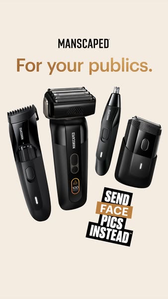
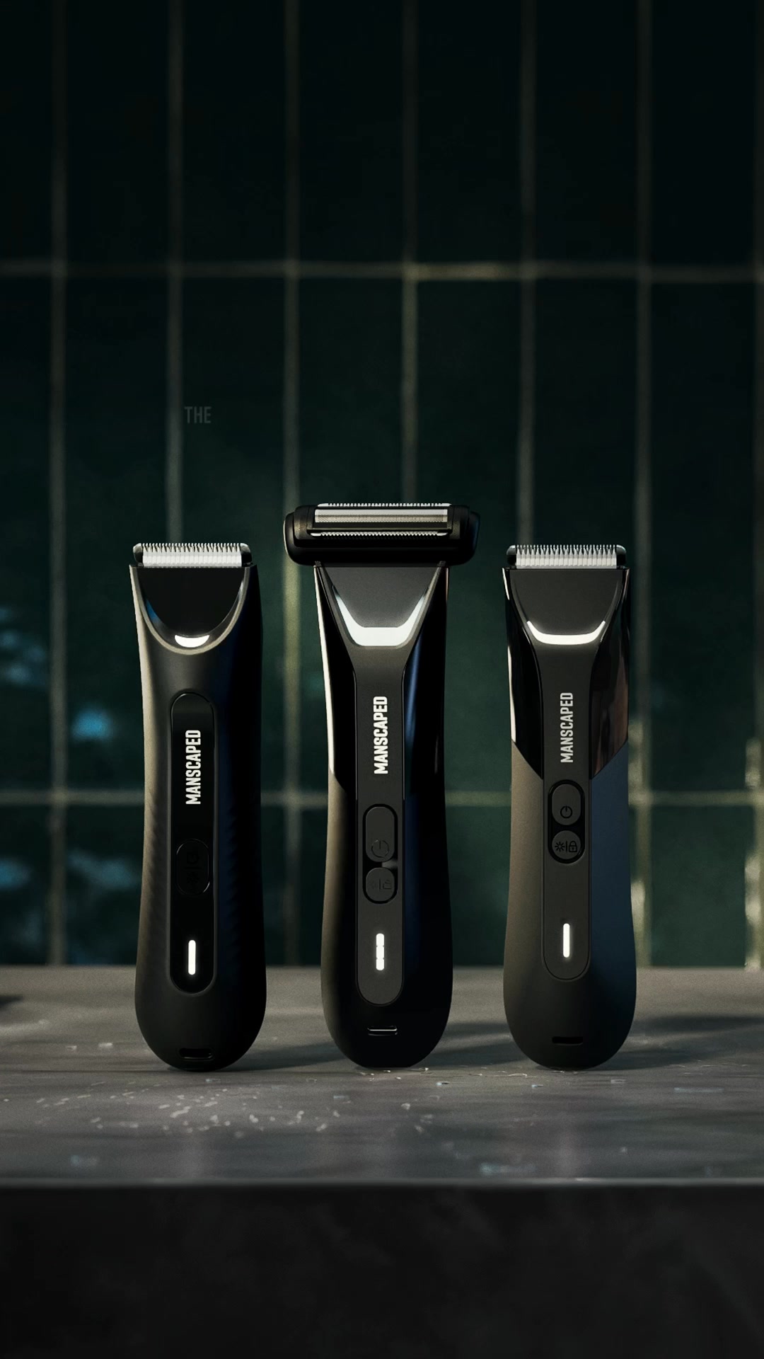
What it does. MANSCAPED runs a visual gag where two very hairy, bearded men peer up alongside the tagline "Give your boys the love they deserve," turning the pun about grooming into the whole hook. The joke, not the product, carries the frame, with the trimmer tucked into the corner.
Why it works. The double meaning and the absurd bearded-men visual stop the scroll and make the grooming pitch memorable without a hard sell.
Ad data. This image ad reached 26M and ran for 23 days, the highest reach of any ad on this page. Gender split: 46% women / 54% men.
2. Native advertorial
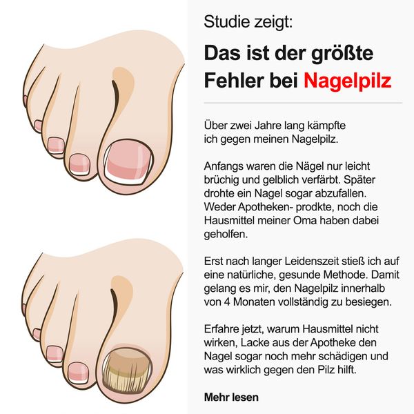
What it does. Health Routine styles the ad as an editorial article headed "Studie zeigt: Das ist der groesste Fehler bei Nagelpilz," with a first-person patient story, an illustrated before-and-after nail diagram, and a "Mehr lesen" prompt at the foot. It reads like a health column rather than an ad.
Why it works. The journalistic layout and personal story lower the reader's guard and pull them into clicking through as if reading news.
Ad data. This image ad reached 17M and ran for 331 days, one of the longest-running ads on this page. Gender split: 61% women / 39% men.
3. Question sticker
What it does. prepmymeal opens with a native Instagram "reply to comment" overlay reading "Du hattest recht! Die XL Gerichte von prepmymeal sind zum Abnehmen wirklich unschlagbar!" then answers it with a split-screen of a man pulling meals from the freezer and eating a plate. The comment-reply overlay is the hook.
Why it works. Mimicking a real comment thread makes the claim feel like organic social proof answered in the ad rather than a paid message.
Ad data. This video ad reached 12M and ran for 527 days, by far the longest run among these picks. Gender split: 22% women / 78% men.
4. Use-case callout
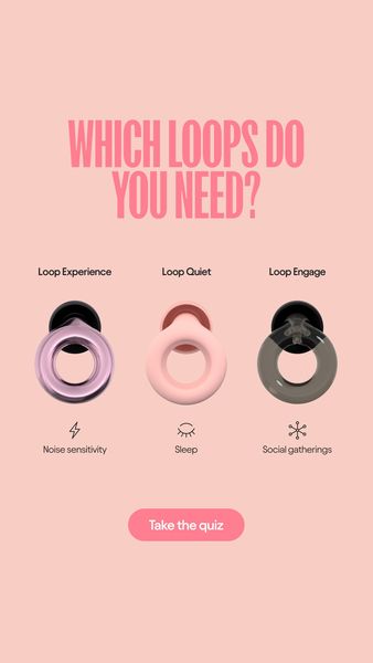
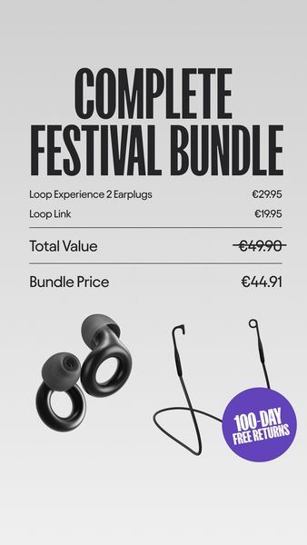
What it does. Loop Earplugs lines up three products under "Which Loops do you need?" and tags each to a distinct occasion: Loop Experience for noise sensitivity, Loop Quiet for sleep, and Loop Engage for social gatherings, ending with a "Take the quiz" button. One frame maps the range to multiple uses.
Why it works. Pairing each earplug with a clear situation helps the viewer instantly self-select and drives them into the quiz.
Ad data. This image ad reached 14M and ran for 126 days. Gender split: 77% women / 23% men.
5. Minimalist product shot
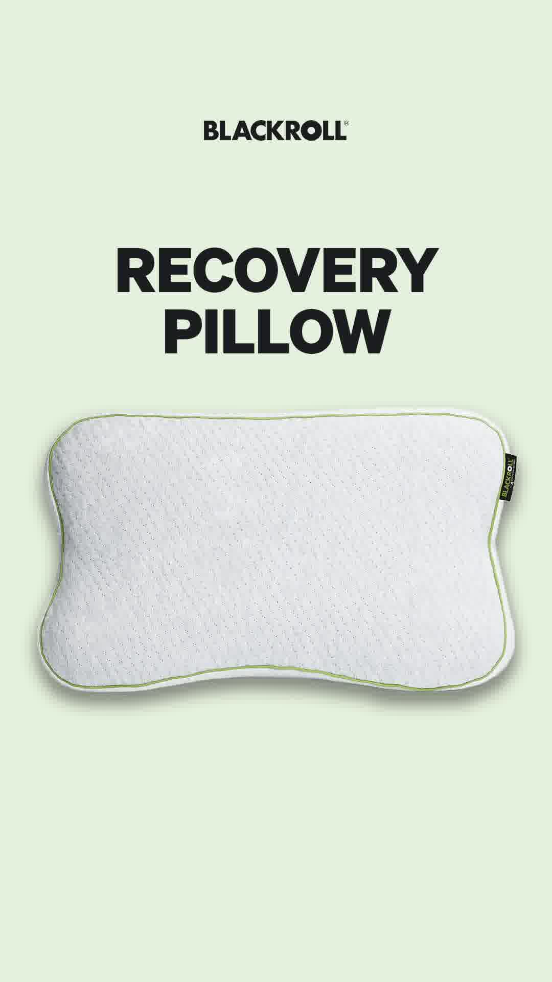
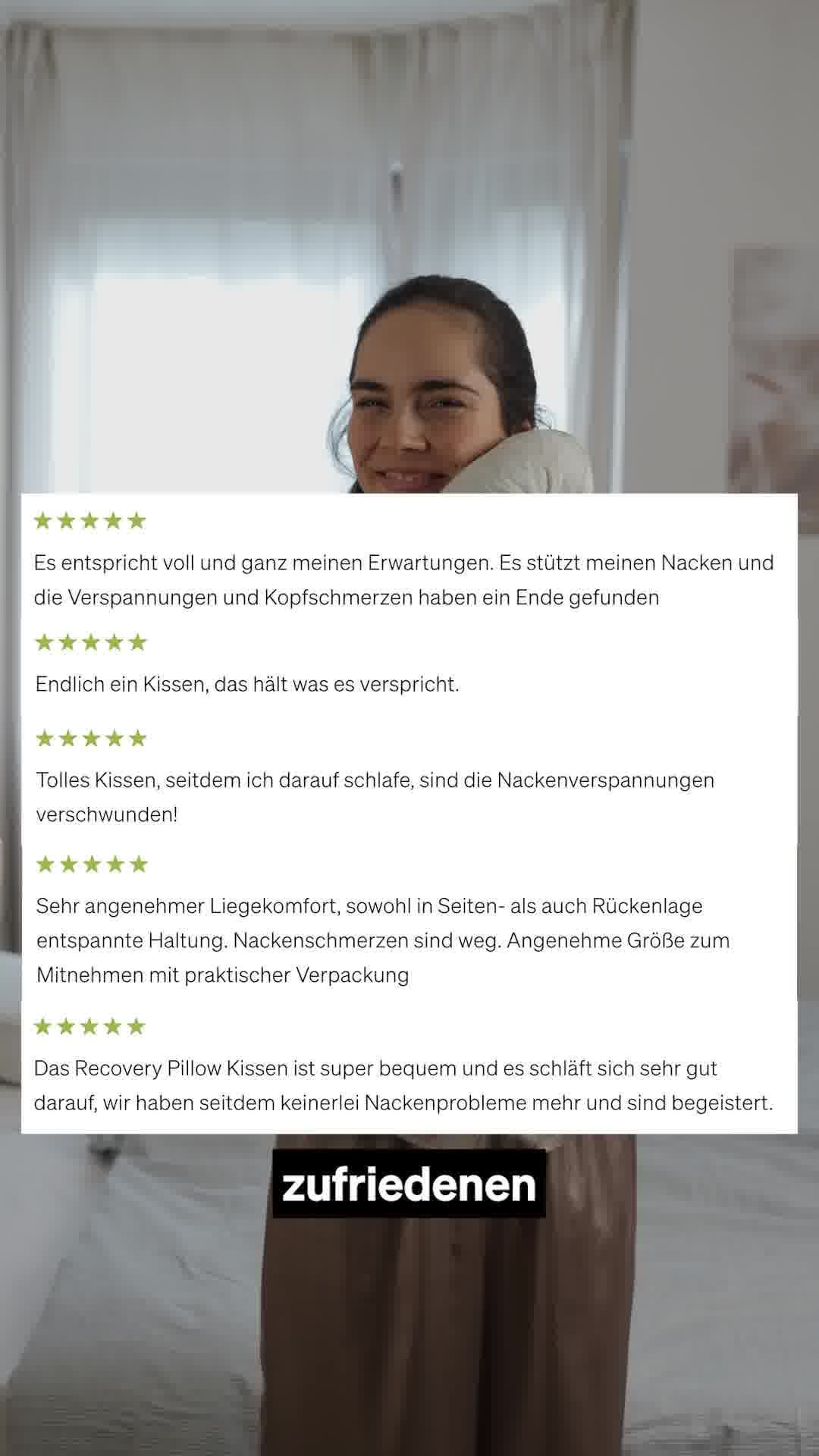
What it does. Blackroll presents a single clean shot of its Recovery Pillow floating on a pale green background, with just the logo and the words "Recovery Pillow." There is no clutter, model, or busy copy in the frame.
Why it works. The stripped-back hero shot lets the product's shape and premium feel do all the selling and reads as a confident, established brand.
Ad data. This video ad reached 12M and ran for 571 days. Gender split: 56% women / 44% men.
DTC Brands ad best practices
- Lead with a concept, not the product. Open on a joke, a metaphor, or a bold claim so the first frame stops the scroll on its own. Tuck the product into the corner and let the idea carry the hook.
- Borrow native social and editorial layouts. Style the creative as a reply-to-comment overlay, a comment-thread reaction, or an article with a study-style headline and a read-more prompt. The familiar format lowers the viewer's guard and makes the claim feel organic.
- Show proof you can see. Put a demonstration on screen: a before-and-after diagram, a first-person patient story, or the product being pulled out and used in a split-screen. Visible evidence sells harder than a spec list.
- Map the range to a use case, then close on one CTA. Tag each product to a distinct situation so the viewer can self-select at a glance, as in a Which one do you need? lineup. End on a single button such as Take the quiz or a discount prompt rather than several competing asks.
Where this data comes from
What you see here is a curated slice of Meta advertising, not a full census of it. Only the highest-reach Facebook and Instagram ads per industry make it in, which means the figures describe the top performers we track rather than the platform as a whole. Every reach figure is Meta-reported EU-transparency data, broken down by gender, age and country; none of it is estimated on our side. Estimated spend is the exception: we compute it from the reported reach using an assumed 5 to 30 EUR CPM.
The raw ad data is collected via top-ads.io. The Ad Library itself is a free resource from adtribute, an attribution and analytics platform that shows which channels and touchpoints actually drive your revenue.