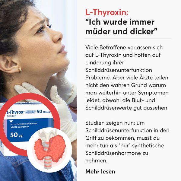
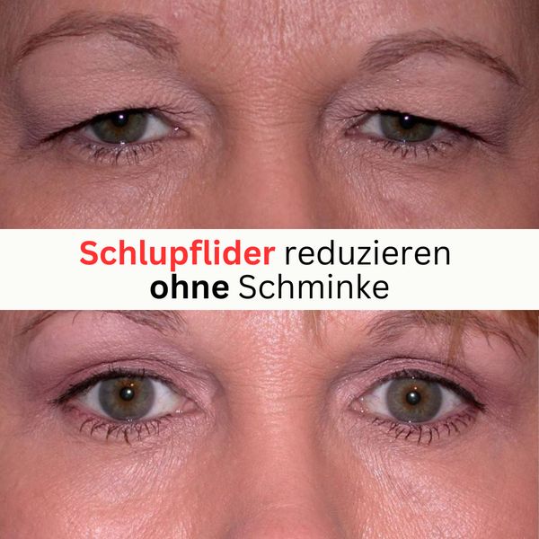
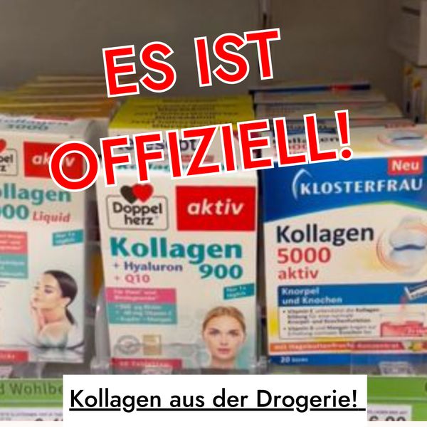
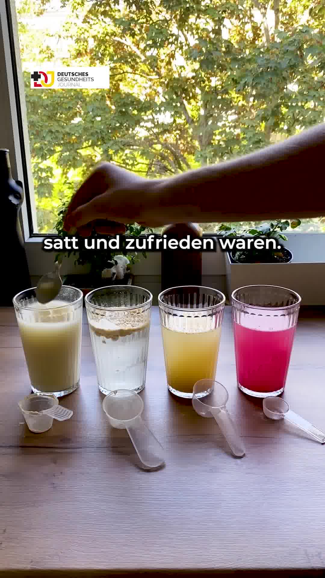

The Advertorial hub collects the highest-reach Meta ads that dress up like editorial content: story-style ads and native ads that read as a health article or first-person column rather than a sales pitch. Across 259 ads from 27 advertisers, the winning formula pairs a curiosity-gap headline with a simple problem-to-solution payoff, then hands the reader a soft 'read more' style link before the product is ever named.
Key takeaways
- A near-even video and image split. The format mix runs 47% video and 53% image, so static advertorials and talking-head videos each carry roughly half the top reach here.
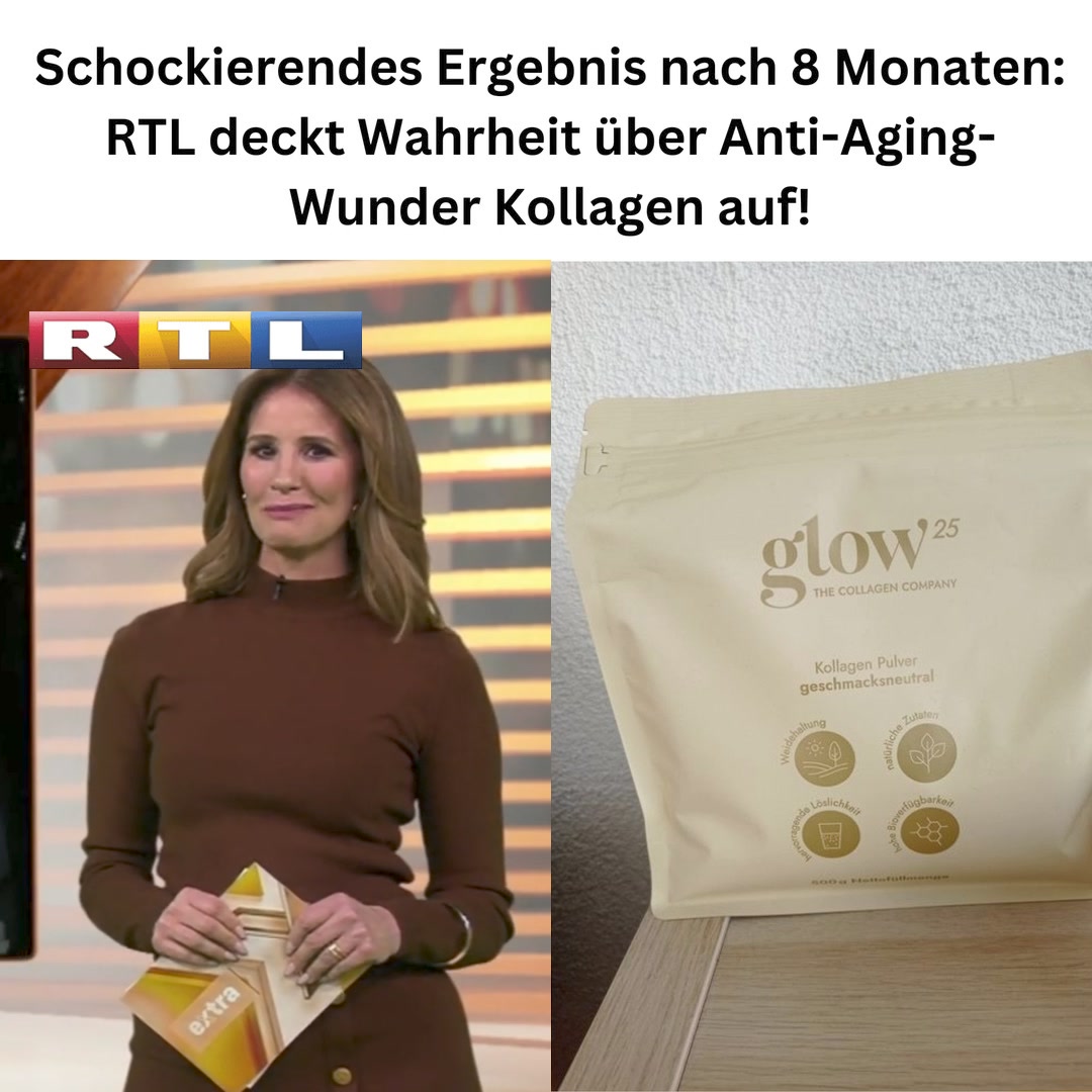
- Deep reach from a tight advertiser pool. Just 27 distinct advertisers produced these 259 ads, and reach is heavy: a median of 2.8M with a top ad hitting 17M. The average run length lands at 155 days, with proven winners like Glow25 staying live for 681 days.
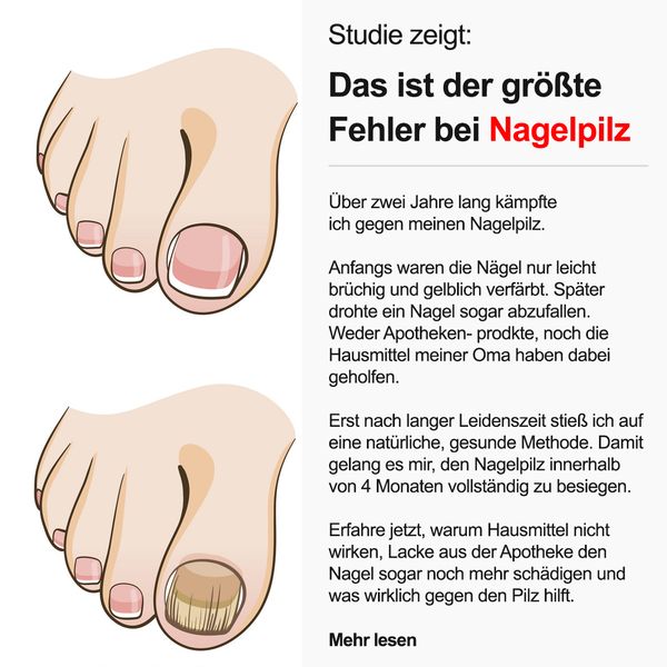
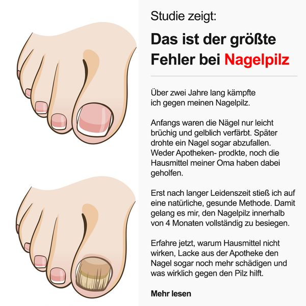
- The hook mimics a headline, not an offer. The best creatives open on a curiosity gap framed as journalism: a 'study shows' kicker over a 'the biggest mistake with X' headline, pulling the click before any product appears.
- Proof is shown, not claimed. Winners lean on visual before-and-after transformations and numbered day-by-day result timelines that make the payoff instant and scannable rather than asking the reader to trust a paragraph of text.
What makes a winning Advertorial ad
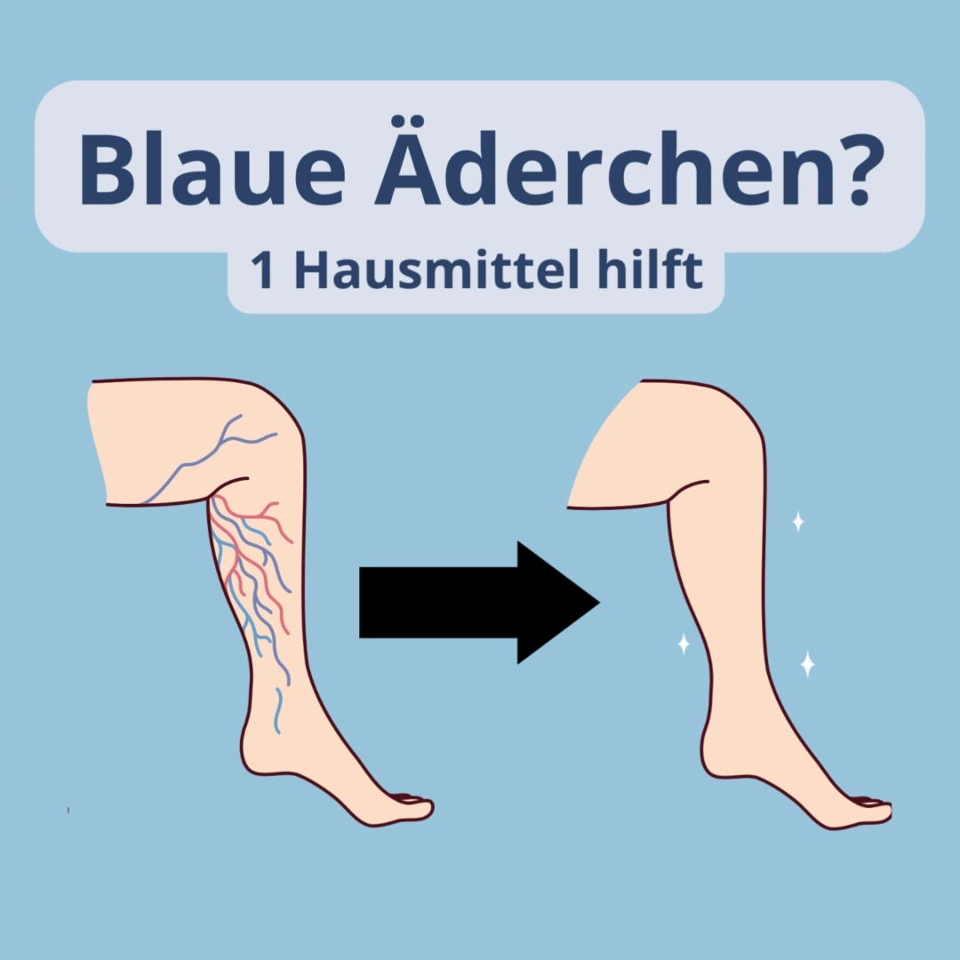
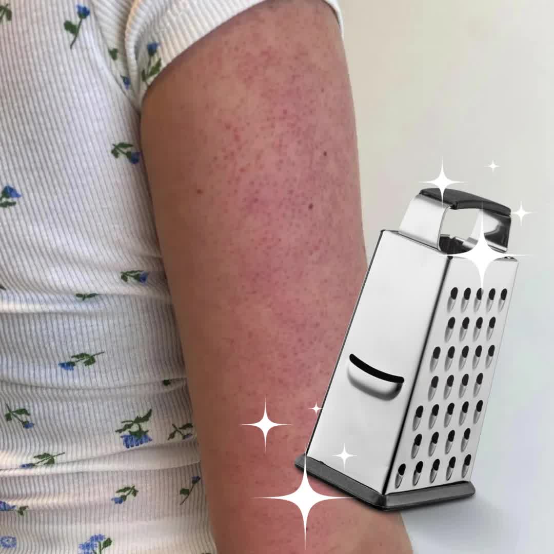
The anatomy is consistent. The hook is an editorial-style headline that opens a curiosity gap, such as a 'study shows' kicker paired with 'the biggest mistake with nail fungus', so the reader leans in before a brand is named. Proof arrives as a demonstration rather than a claim: a side-by-side before-and-after leg, a bumpy skin patch next to a literal cheese grater, or a numbered timeline counting off results at day 7, 14, 21 and 30. The offer stays simple, often a single remedy or a powder stirred into one glass of water, and the call to action is a low-friction 'read more' link that continues the article feel instead of shouting 'buy now'.
What the top Advertorial ads look like
Scan these ads and you see layouts built to pass as journalism: a small kicker line above a bold headline, an illustrated body part showing the problem (an infected toe, spider veins, grater-textured skin), and a 'read more' style link at the bottom that mimics a news column. Videos are typically one person talking straight to camera from a plain, bright living room with no studio polish, gesturing while on-screen captions deliver the how-to in the first person. Static ads favor illustrated before-and-after pairs joined by a bold arrow and sparkle marks, or numbered rows of stacked milestones each tagged with a small icon. The format mix is close to even, at 47% video and 53% image.
Prefer one format? Filter this page to Advertorial video ads or Advertorial image ads only.
Winning ad frameworks in Advertorial
The highest-reach Advertorial ads reuse a handful of proven creative frameworks. Here are the ones that stand out here, each with a real example you can play or open in full.
1. Native advertorial
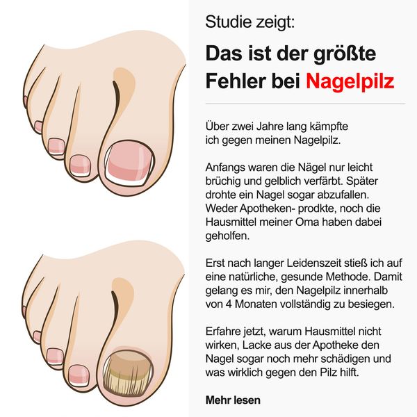
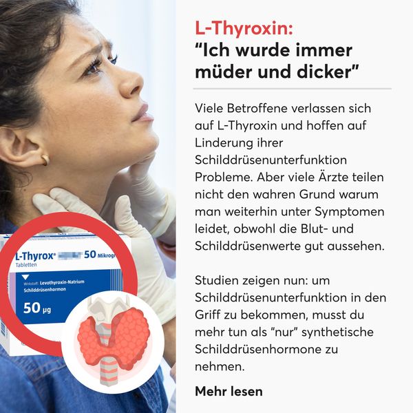
What it does. This Health Routine ad is built to read as a health article, not an ad. A 'Studie zeigt:' kicker sits above the headline 'Das ist der groesste Fehler bei Nagelpilz', beside an illustrated infected big toe. The body runs as a first-person editorial column ('Ueber zwei Jahre lang kaempfte ich gegen meinen Nagelpilz') and closes with a 'Mehr lesen' link, exactly mimicking a journalistic layout.
Why it works. The study framing and 'Mehr lesen' link borrow the credibility of editorial content, so readers process it as advice rather than advertising. Opening on a curiosity gap (the biggest mistake) pulls the click before any product is named.
Ad data. Reach 17M, ran 331 days. Gender split: 61% women / 39% men.
2. Before and after
What it does. This Biovolen ad leads entirely on a visual transformation. One illustrated leg is covered in tangled blue and red spider veins, a bold arrow points right, and the second leg is smooth and clean with sparkle marks. The headline 'Blaue Aederchen? 1 Hausmittel hilft' frames the before state as the problem the after state solves.
Why it works. The side-by-side before and after makes the promised result instant and obvious with no reading required, and the single-remedy claim keeps the payoff simple and believable.
Ad data. Reach 7.7M, video. Gender split: 82% women / 18% men.
3. Humour or metaphor hook
What it does. This Biovolen ad carries its message with a visual metaphor: a bumpy, red keratosis-covered upper arm ('Reibeisenhaut', literally grater skin) is placed right next to a shiny stainless steel cheese grater, sparkles drawing the eye between them. The image makes the 'grater skin' pun literal before the copy explains what it is.
Why it works. The grater-next-to-skin gag stops the scroll and instantly communicates the condition in one glance, turning an unglamorous skin issue into a memorable, shareable visual.
Ad data. Reach 7.5M, video, ran 78 days. Gender split: 74% women / 26% men.
4. X reasons why
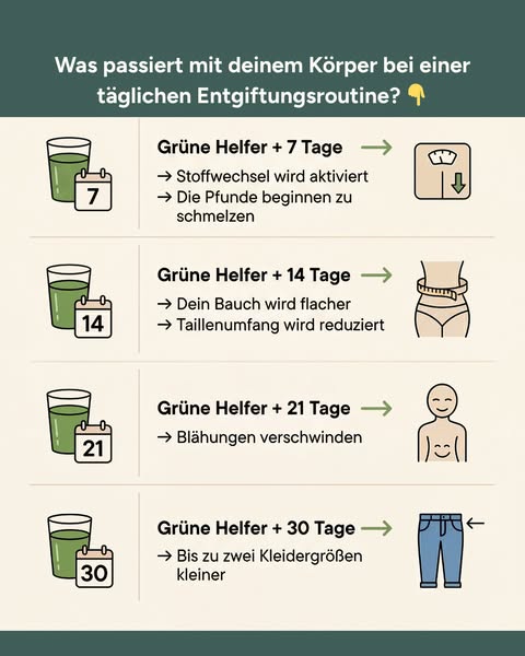
What it does. This Vitafant ad lays out a numbered timeline of results. Under 'Was passiert mit deinem Koerper bei einer taeglichen Entgiftungsroutine?', four stacked rows count up green-drink milestones: Tag 7 (Stoffwechsel aktiviert, Pfunde schmelzen), Tag 14 (flacherer Bauch), Tag 21 (Blaehungen verschwinden), Tag 30 (bis zu zwei Kleidergroessen kleiner), each paired with an icon.
Why it works. The numbered day-by-day list turns a vague detox promise into a concrete, scannable sequence of wins, and the escalating milestones let the reader project their own progress week by week.
Ad data. Reach 8.2M. Gender split: 77% women / 23% men.
5. Founder to camera
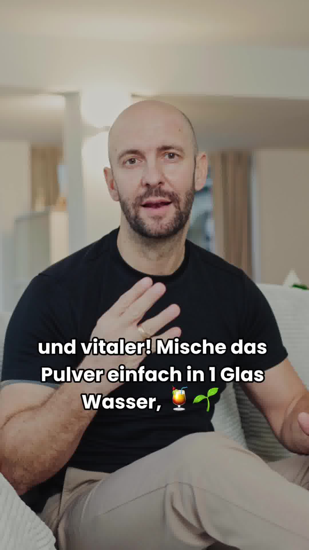
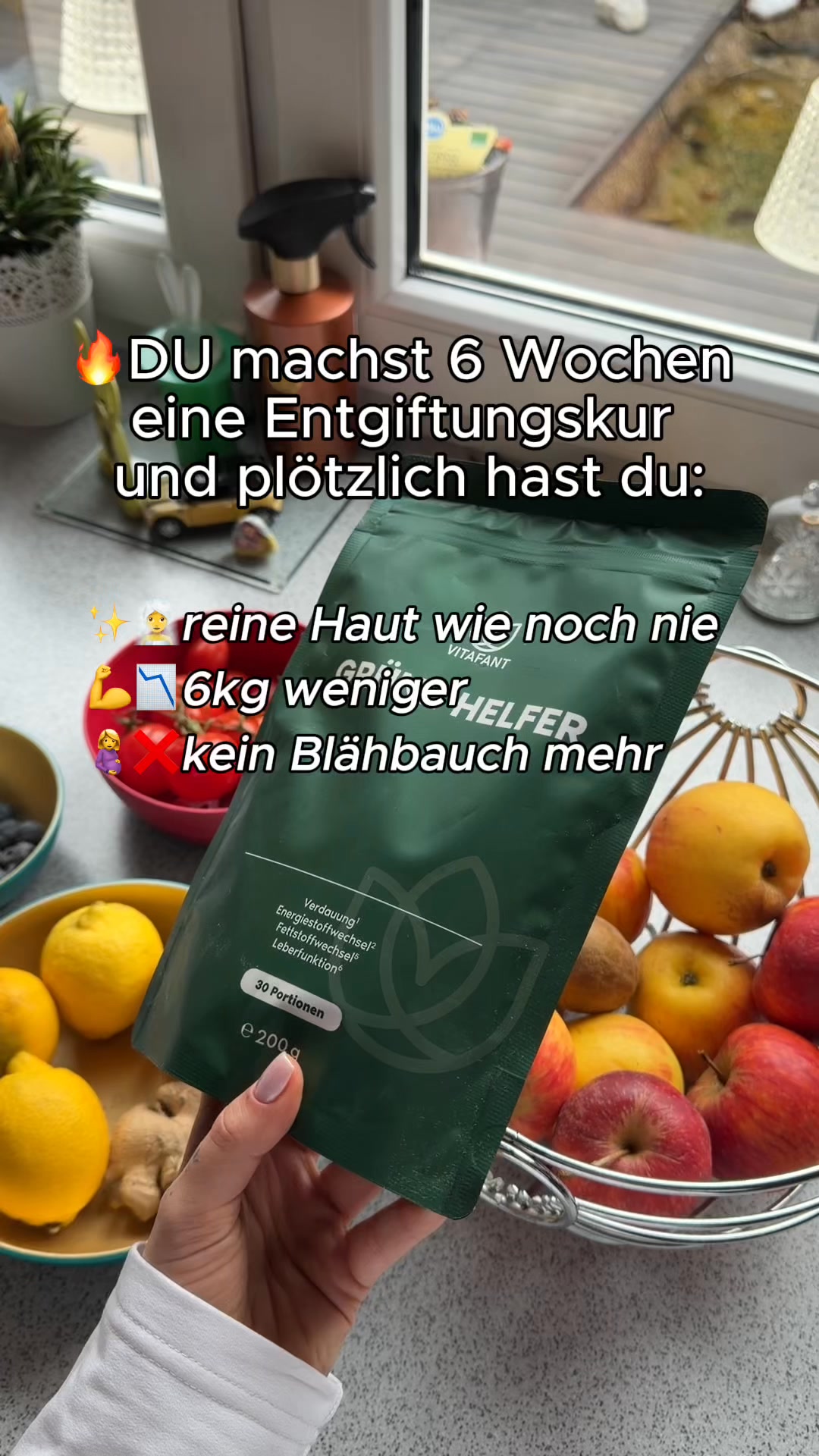
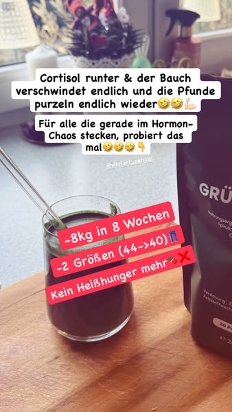
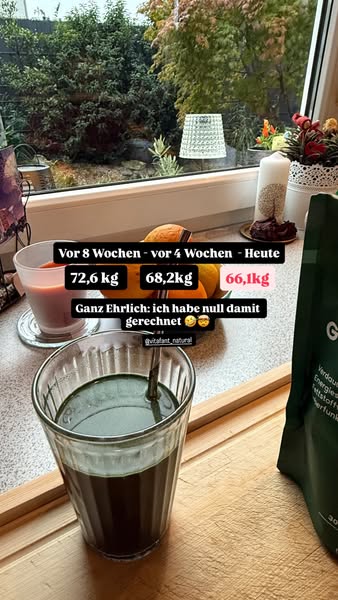
What it does. This Vitafant video is shot as one person talking straight to camera from a bright living room, no studio polish. He gestures to his chest while the caption 'und vitaler! Mische das Pulver einfach in 1 Glas Wasser' delivers the how-to in first person, matching the confessional 'Natuerlich Abnehmen?' body copy.
Why it works. A single person speaking directly and unscripted to the viewer reads as personal advice rather than a produced ad, and the plain living-room setting makes the routine feel simple and doable.
Ad data. Reach 14M, video. Gender split: 59% women / 41% men.
Advertorial ad best practices
- Open on a curiosity gap, not the product. Lead with an editorial headline that names a problem or a 'biggest mistake' and withholds the answer, so the reader clicks to close the gap. Save the product name for after the hook has landed.
- Borrow the layout of an article. Use a small 'study shows' kicker above the headline, run the body as a first-person column, and close with a soft 'read more' link. The journalistic frame gets the ad processed as advice rather than advertising.
- Show the transformation in one glance. Put a before-and-after side by side with a bold arrow and sparkle marks so the promised result needs no reading. Pairing an unglamorous problem with a literal visual metaphor also stops the scroll and makes the condition instantly clear.
- Turn the promise into a numbered sequence. Replace a vague benefit with a scannable timeline of milestones, for example day 7, day 14, day 21 and day 30, each with its own icon. The escalating steps let the reader project their own week-by-week progress.
How the ads here are selected
This Ad Library is a curated snapshot, not a complete record of Meta advertising. Each industry contributes its highest-reach Facebook and Instagram ads and nothing else, so the numbers reflect that top slice, not all of Meta. The reach numbers are the exact figures Meta publishes in its Ad Library under EU transparency rules, including the breakdown by gender, age and country, so reach is reported by Meta, not modelled by us. Estimated spend is the exception: we compute it from the reported reach using an assumed 5 to 30 EUR CPM.
The raw ad data is collected via top-ads.io. The Ad Library itself is a free resource from adtribute, the analytics platform that answers the follow-up question with marketing attribution: which of your own ads made the sale.