






The Supplements hub gathers the highest-reach Meta ads for vitamins, nutrition and everyday wellness products across Facebook and Instagram. These are the creatives that kept earning budget and stayed live long enough to build serious reach, so the patterns here are proven rather than guessed. Use them to see what a scroll-stopping supplements ad actually looks like before you brief your next round.
Key takeaways
- A near-even video and image split. The 250 top ads break down to 52% video and 48% image, so neither format wins by default. Motion and static both earn reach when the hook and proof are strong.
- Deep reach from a focused field. 38 distinct advertisers produced these 250 ads, with a median reach of 2.8M and a top ad hitting 16M. The average run stretches to 99 days, a strong signal that the best creatives kept delivering returns.
- Symptom-first hooks pull sufferers in. The strongest creatives open on a specific complaint, tiredness, sciatic pain, gut trouble, then position the supplement as the targeted fix. Naming the problem out loud does the qualifying work in the first frame.
- Editorial and news framing beats the hard sell. Many winners disguise the pitch as a health article, a ranked comparison test, or a broadcast-style news segment. Borrowed authority earns the click that an obvious product ad would lose.
What makes a winning Supplements ad
A high-performing supplements creative opens on a concrete problem or a single vivid claim, one spoon that holds amino acids, protein and collagen at once, or a blunt sugar callout over a pile of sweets. It then supplies proof: an annotated diagram mapping micronutrients to the nerve behind the pain, a developed-with-athletes badge, or a first-person recovery story from a founder. The offer is framed as the simple swap or the targeted fix, and a plain call to action like Order now or Try it now turns the interest into a click. The best ads never feel like a sales pitch, they feel like advice, a test result, or news.
What the top Supplements ads look like
Scan these creatives and you see a recurring cast of visual devices: a presenter talking straight to camera in a bright home kitchen surrounded by fresh vegetables, the product tub or box held front and centre, and a spoon or scoop shown mid-pour. Others lean editorial, an article-style headline over a clinical photo with a Read more link, or a split screen pairing an athlete with an ordinary hard-working day beside the whey tub. Bold on-screen text carries the message, from an oversized sugar question to benefit callouts labelling ingredients with lines pointing at the body, and some mimic a TV-news frame with an anchor and channel logo beside the pouch. Across the hub the format mix runs 52% video to 48% image.
Prefer one format? Filter this page to Supplement video ads or Supplement image ads only.
Winning ad frameworks in Supplement
The highest-reach Supplement ads reuse a handful of proven creative frameworks. Here are the ones that stand out here, each with a real example you can play or open in full.
1. One-spoon everything explainer
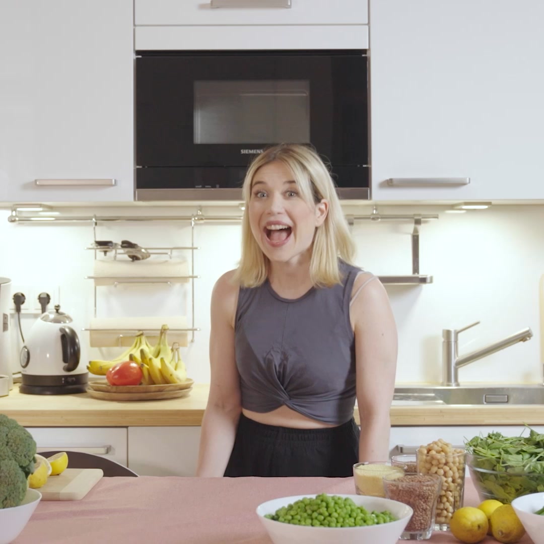
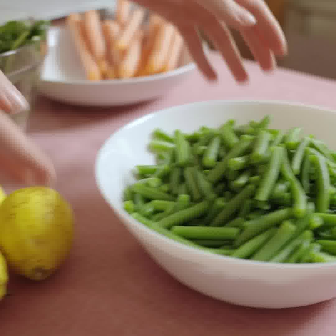
What it does. A bright presenter to camera stands in a home kitchen surrounded by fresh vegetables and the copy frames a single spoon of bone broth as holding amino acids, protein and collagen all at once. The pitch collapses a whole nutrition routine into one concentrated scoop.
Why it works. Reducing a complex supplement stack to one simple spoonful is easy to grasp and the wholesome kitchen setting makes it feel like everyday food rather than a pill.
Ad data. Reached 16M and ran 147 days as a video, the highest reach in this set. Gender split: 46% women / 54% men.
2. Health-magazine symptom advertorial
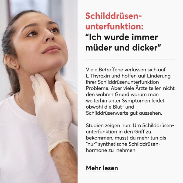
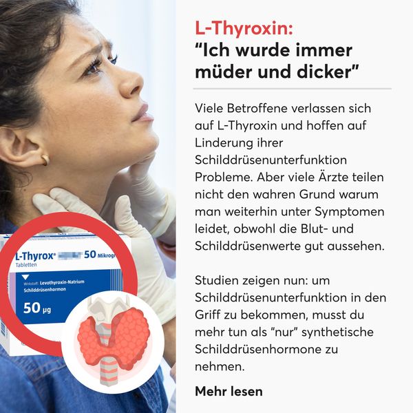
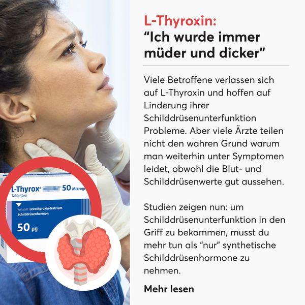
What it does. The ad is styled as an editorial health article with a headline quote about becoming tired and heavier, a clinical photo of a gloved hand examining a thyroid, body text about what doctors do not tell you, and a Mehr lesen read-more link. It reads like journalism, not an ad.
Why it works. Dressing the pitch as a health article about a specific condition earns clicks from sufferers who trust editorial content more than an obvious product ad.
Ad data. Reached 13M over a 309 day run, the longest run in this set, as an image. Gender split: 79% women / 21% men.
3. Annotated nerve mechanism callout
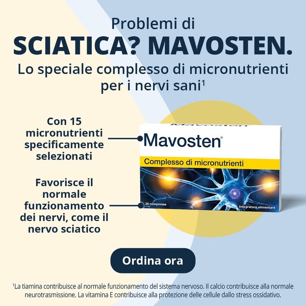
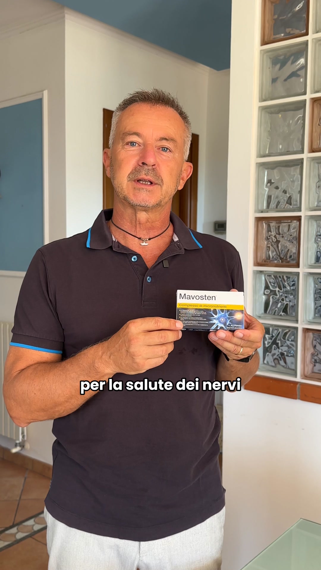
What it does. A clean layout puts the product box beside a glowing nerve illustration with lines pointing to two benefit callouts, 15 selected micronutrients and support for normal nerve function like the sciatic nerve, plus an Ordina ora button. It visually maps the ingredients to the body part they act on.
Why it works. Diagramming how the product works on the exact nerve behind the pain makes an abstract supplement feel targeted and credible for a specific complaint.
Ad data. Reached 13M as an image. Run days were not recorded in the data. Gender split: 48% women / 52% men.
4. Sugar-swap problem hook
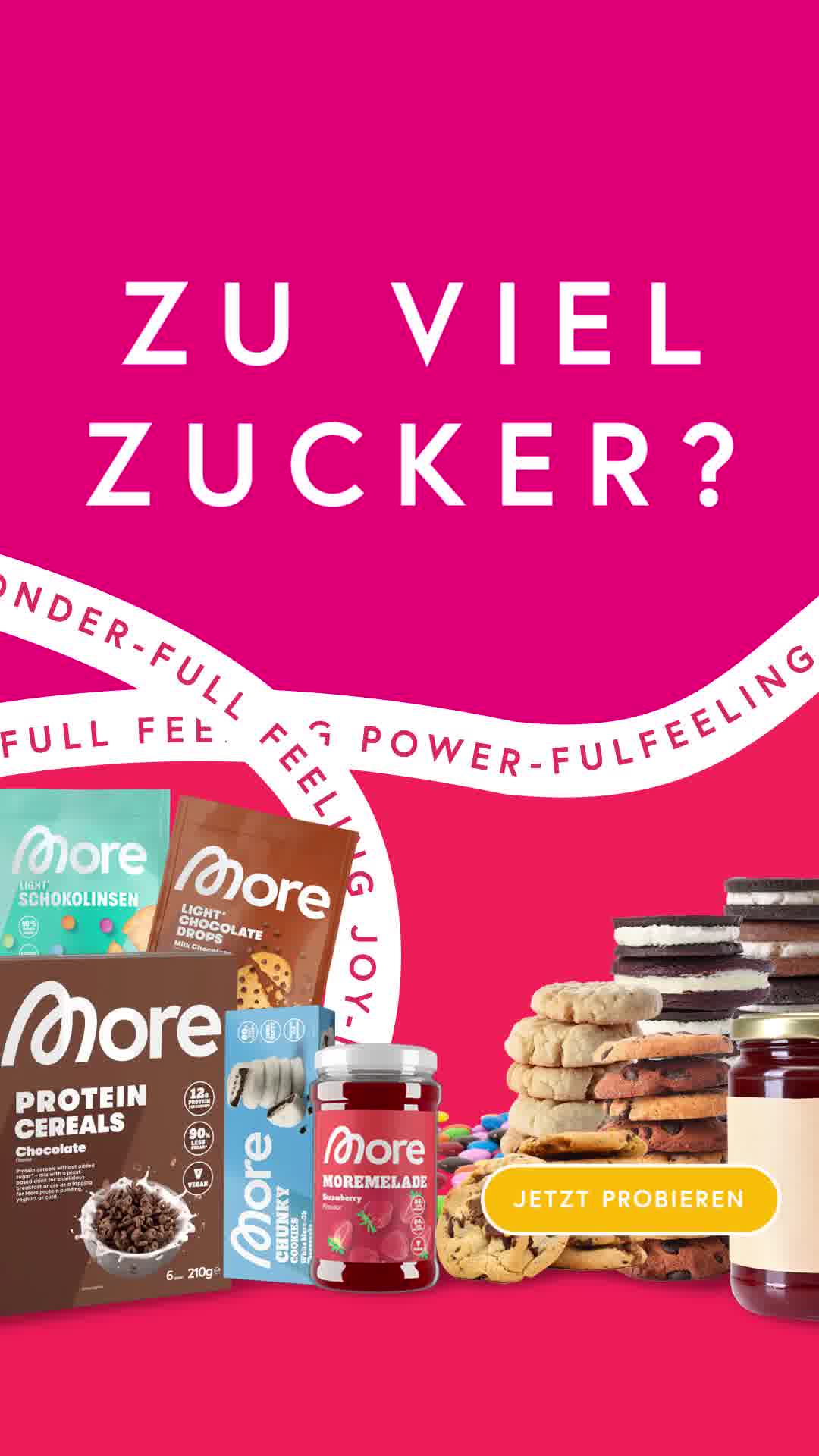
What it does. A hot-pink frame shouts ZU VIEL ZUCKER over a towering pile of cookies and sweets next to the brand's protein cereals, drops and spread, with a try-now button. It names the sugar problem loud then lines up the low-sugar swaps.
Why it works. The blunt oversized question stops the scroll and the junk-food pile beside the products instantly frames the range as the guilt-free replacement.
Ad data. Reached 10M in just 11 days as a video, one of the shortest runs in this set. Gender split: 37% women / 63% men.
5. Top-5 collagen comparison test
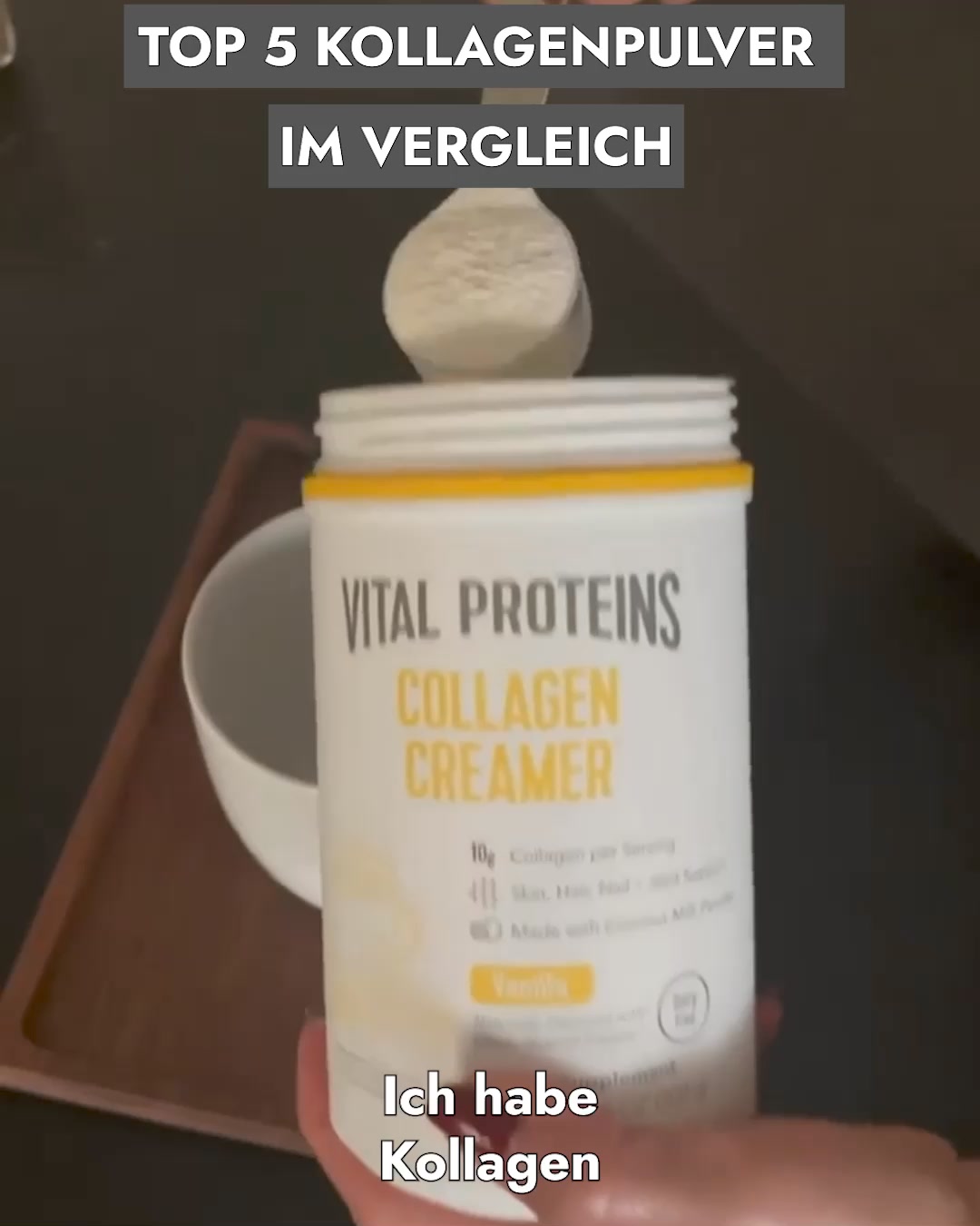
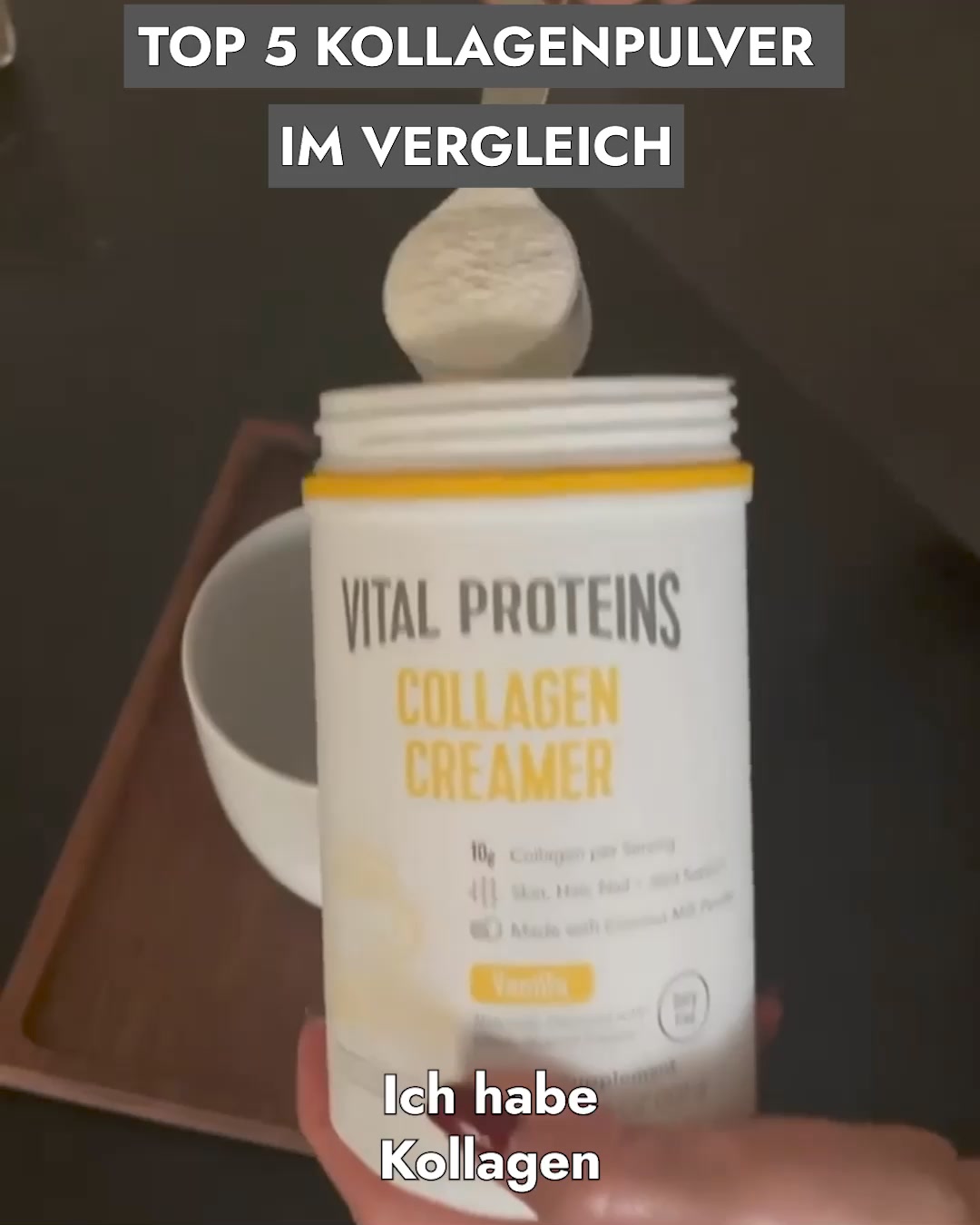
What it does. The top-5 collagen comparison video opens on a hand scooping powder into a Vital Proteins tub with the caption TOP 5 KOLLAGENPULVER IM VERGLEICH and a spoken review, then sets up a ranked test that lands on the brand's own collagen. It stages the ad as an even-handed roundup.
Why it works. A test-and-compare framing feels like impartial research rather than a sales pitch, so the brand winning its own roundup reads as an earned recommendation.
Ad data. Reached 7.1M over a 464 day run, the longest running video in this set. Gender split: 100% women / 0% men.
6. TV-news expose mockup
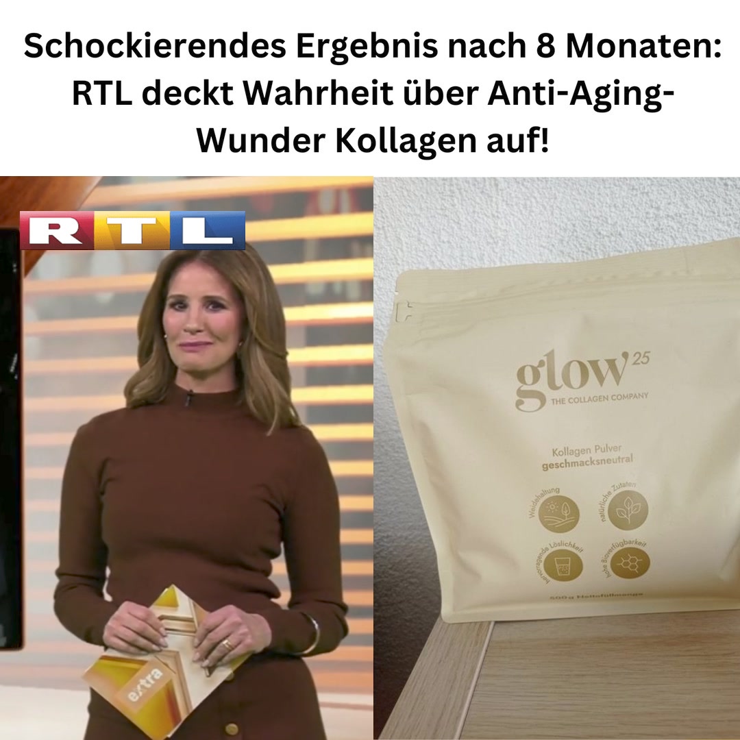
What it does. The creative mimics an RTL news segment, splitting a screengrab of an anchor in a TV studio with the RTL logo against a photo of the Glow25 collagen pouch, under a headline about a shocking result after 8 months. It borrows the look of a broadcast news story.
Why it works. Wrapping the product in a recognizable TV-news frame transfers the channel's authority and the shock-result headline drives curiosity clicks.
Ad data. Reached 5.6M in 35 days as a video. Gender split: 100% women / 0% men.
7. Split-screen real-life performance
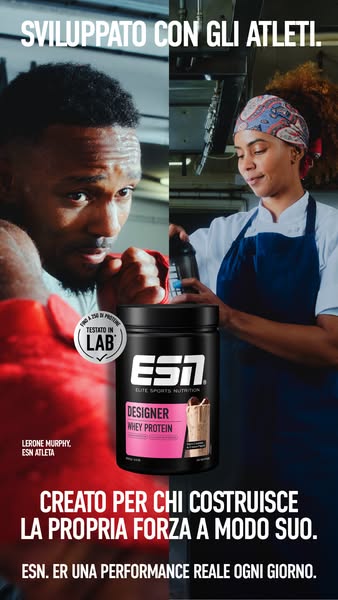
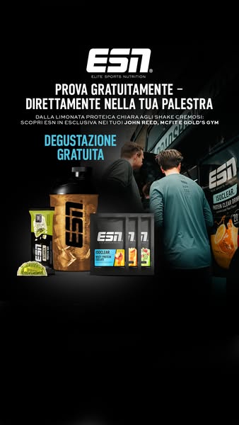
What it does. A vertical frame is split between a boxer training and a chef working a long shift, with SVILUPPATO CON GLI ATLETI up top, the whey protein tub centered, and copy that performance is not just in the gym but in everyday life. Two worlds share one product.
Why it works. Pairing an athlete with an ordinary hard-working day widens the audience beyond gym-goers while the developed-with-athletes claim keeps the credibility.
Ad data. Reached 5.8M in 27 days as an image. Gender split: 41% women / 59% men.
8. Lakeside founder gut-health confession
What it does. A man stands shirtless and dripping by a lake speaking to camera under the fairment logo, with the caption und ich habe mich nie besser gefuhlt, after copy that asks why your gut fights you and tells his own recovery story. It is a raw first-person testimonial.
Why it works. An unpolished founder-style confession about a personal gut-health turnaround feels authentic and lets viewers see themselves in the same starting point.
Ad data. Reached 5.0M over a 133 day run as a video. Gender split: 39% women / 61% men.
Supplements ad best practices
- Lead with the symptom, not the ingredient. Open on the specific complaint your buyer feels, low energy, joint or nerve pain, poor gut health, so sufferers self-select in the first second. Save the ingredient list for the proof section once you have their attention.
- Show the product being used, not just displayed. Put a scoop mid-pour, a spoon of powder, or a hand mixing the drink on screen so the supplement reads as everyday food rather than a pill. A warm home-kitchen setting with fresh produce reinforces the wholesome cue.
- Diagram how it works on the body. Place the product beside a clean illustration with lines pointing to two or three benefit callouts, tying named micronutrients to the exact area they support. This visual mapping makes an abstract supplement feel targeted and credible.
- Borrow a trusted format for the frame. Style the creative as a health-article advertorial, a ranked comparison test, or a news-style segment so it earns editorial trust before it sells. Keep the call to action simple and direct, an Order now or Try it now button that leaves no doubt about the next step.
What is behind these numbers
What you see here is a curated slice of Meta advertising, not a full census of it. We sample only the highest-reach Facebook and Instagram ads in each industry, so every count and pattern describes the top-performing ads adtribute tracks, not every advertiser on the platform. Reach comes straight from Meta: it is the figure the Meta Ad Library reports under EU transparency rules, with its gender, age and country breakdown, and we do not model or adjust it. The one number we derive ourselves is estimated spend, which we back out of the reported reach at an assumed 5 to 30 EUR CPM.
The raw ad data is collected via top-ads.io. The Ad Library itself is a free resource from adtribute, a marketing attribution and analytics platform: browsing winners is step one, measuring your own is step two.