
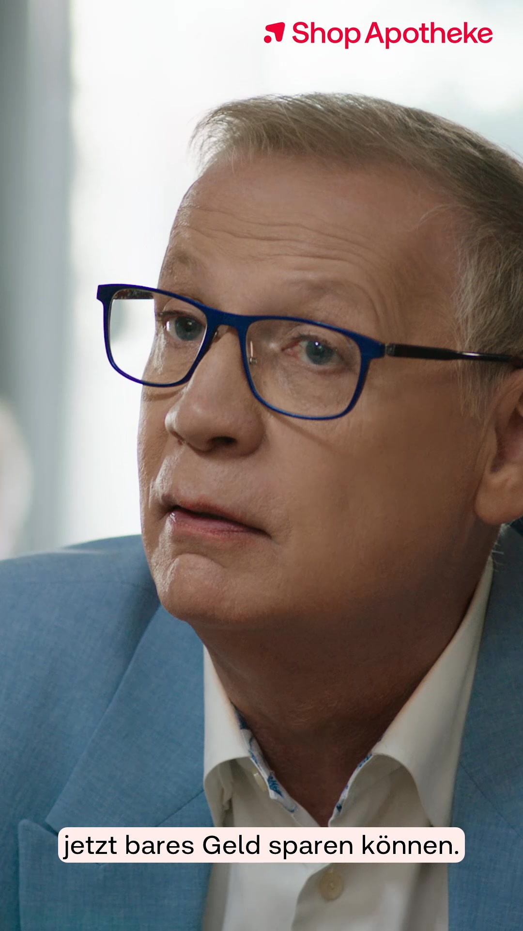
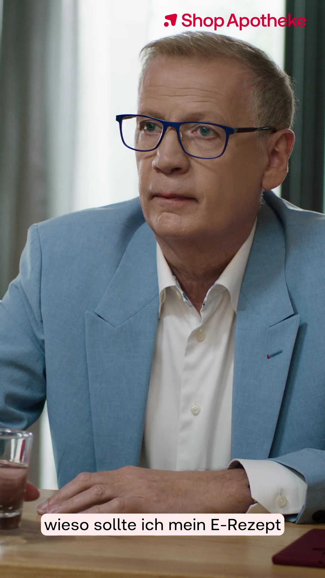
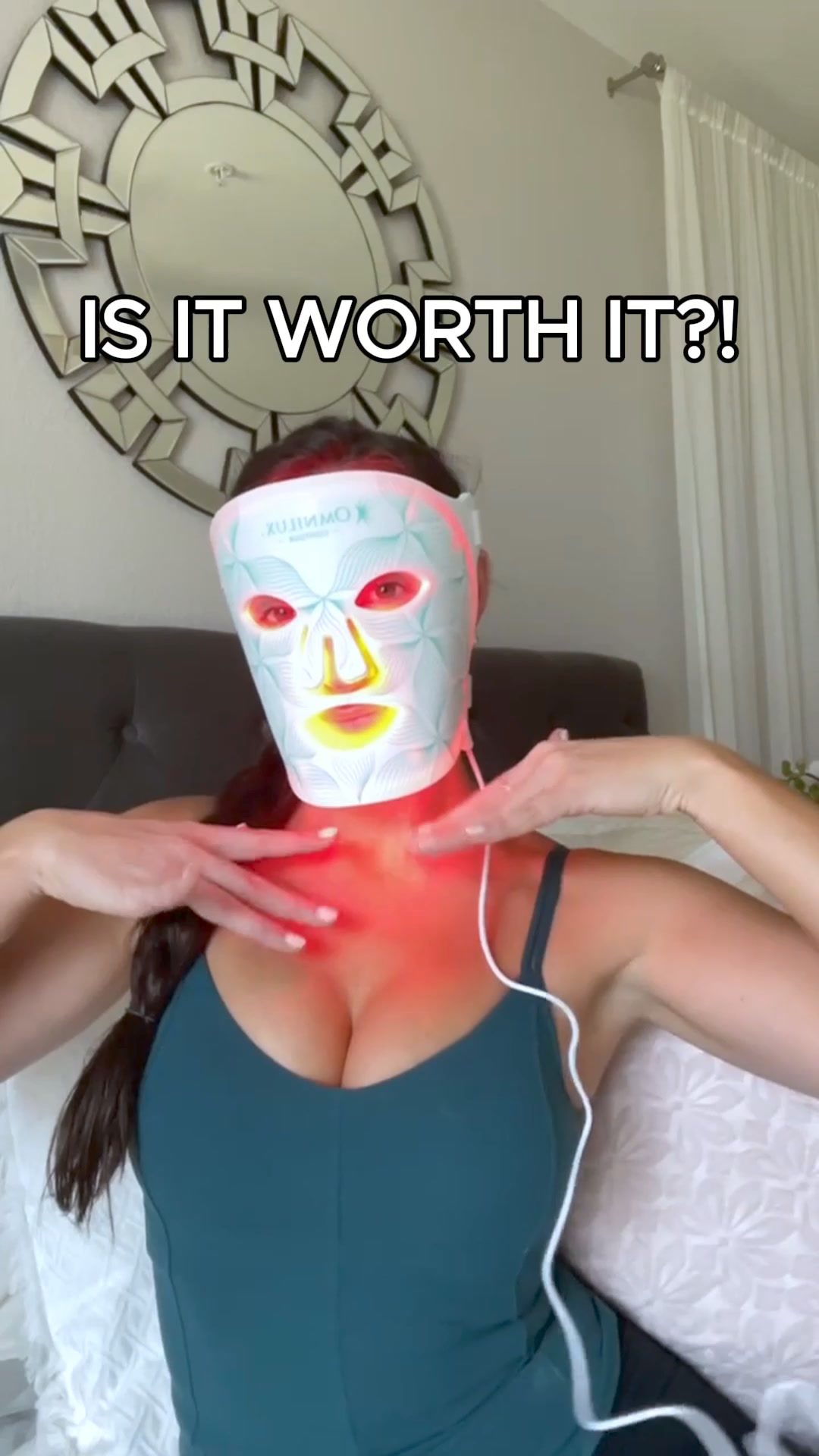

The Health, Medical & Wellness hub gathers the highest-reach Meta ads across health, wellness, medical and healthcare products, from earplugs and dental devices to supplements and skincare. These are the creatives pulling millions of impressions on Facebook and Instagram, so the patterns here show what actually stops the scroll in this vertical. Use them as a working reference for building your own health and wellness ad campaigns.
Key takeaways
- Video edges out image, 56% to 44%. Just over half of the top health and wellness ads are video, with the rest static images. Both formats earn heavy reach here, so the split is close to even rather than one-sided.
- 298 ads from 25 advertisers. This snapshot spans 298 winning creatives from 25 distinct advertisers, with a median reach of 3.2M and a top ad hitting 14M. The average winner runs about 163 days, a strong signal that these proven creatives keep earning budget.
- Interactive quizzes and remedies replace the hard sell. Many top performers frame the purchase as a guided quiz or a single home remedy for a named complaint, turning a pitch into helpful health advice. This lowers decision friction and pulls the scroller into an interactive step.
- Believable proof beats brand claims. The strongest creatives lean on real photos, before-and-after transformations, and first-person results rather than polished brand copy. Unretouched close-ups and concrete numbers read as genuine customer stories, which builds trust fast.
What makes a winning Health, Medical & Wellness ad
A high-performing creative in this vertical opens by naming a specific, visible complaint or need, whether that is spider veins, hooded lids, neck tension or snoring, so the right sufferer feels spoken to instantly. It then delivers believable proof: a split before-and-after photo, a grimy device cleaning up in water, a falling weight number, or a product worn on a real person with an arrow pointing straight at it. The offer is framed as an easy fix or a guided match, a 60-second quiz or one simple home remedy, which lowers the perceived risk of buying. A clear, blunt call to action, such as starting the quiz or getting the bundle, closes the loop while the promised outcome is still front of mind.
What the top Health, Medical & Wellness ads look like
Scan the highest-reach ads here and you see recurring visual devices: split-screen before-and-after close-ups of eyes, skin or legs; real people wearing a device on camera with a bold red arrow calling it out; and phone-shot home photos of a green drink on a windowsill that read as a customer's own snapshot. On-screen text is blunt and benefit-led, pairing a symptom question with a one-line promise, while charts and timelines map results against day counts or dress sizes. Products appear mid-demonstration, an aligner lifted grimy from its cleaning pod or three earplug variants lined up under a quiz headline, so the benefit is self-evident. Clinical staging also appears, with a white lab coat and a hospital hallway borrowing medical authority. Overall the format mix leans slightly to video at 56% versus 44% image.
Prefer one format? Filter this page to Health & Wellness video ads or Health & Wellness image ads only.
Winning ad frameworks in Health & Wellness
The highest-reach Health & Wellness ads reuse a handful of proven creative frameworks. Here are the ones that stand out here, each with a real example you can play or open in full.
1. Which-pair quiz finder
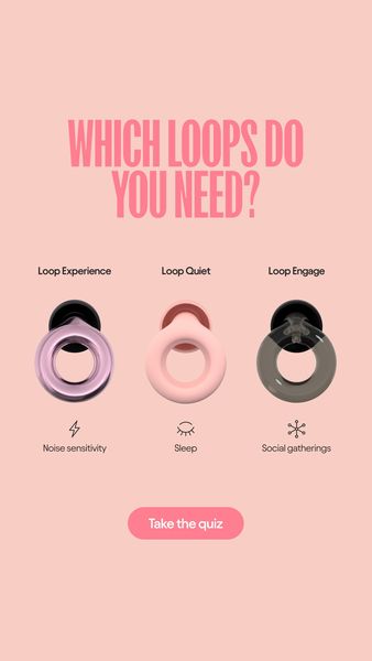
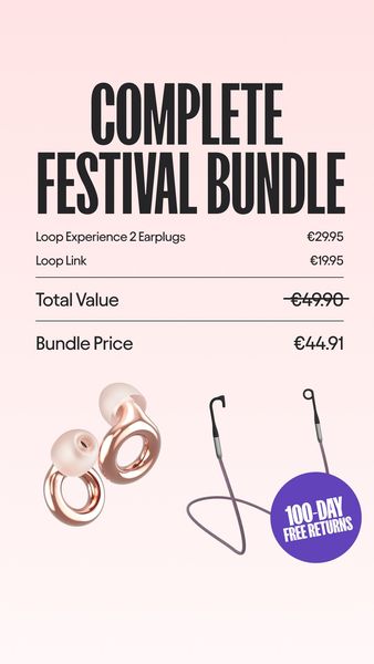
What it does. The static frame lines up three earplug variants (Loop Experience, Loop Quiet, Loop Engage) each tagged to a need (noise sensitivity, sleep, social gatherings) under the headline WHICH LOOPS DO YOU NEED, with a Take the quiz button. It turns choosing a product into a guided 60-second quiz rather than a hard sell.
Why it works. Framing the buy as a personalized match lowers decision friction and pulls the scroller into an interactive step, and the three-way comparison teaches the range in one glance.
Ad data. Reached 14M with a long 126 day run, tied for the highest reach in this category, signaling a durable evergreen winner. Gender split: 77% women / 23% men.
2. One-home-remedy symptom explainer
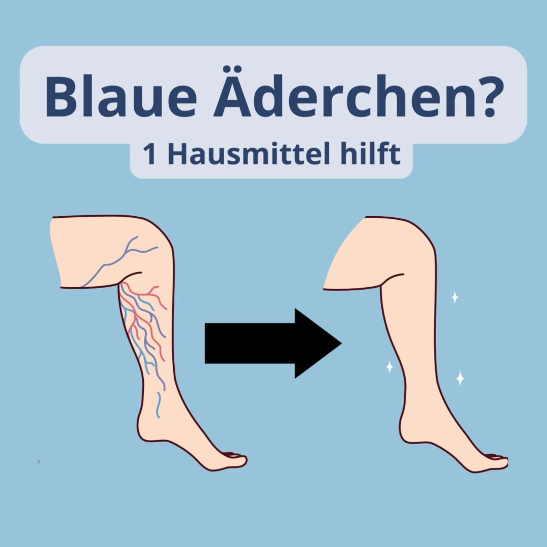
What it does. The frame opens on a blunt symptom question, Blaue Aederchen (spider veins), with the promise 1 Hausmittel hilft, and an illustrated leg shows veins clearing to smooth skin via an arrow. It positions the product as a simple pharmacy-style home remedy for a named complaint.
Why it works. Naming a specific visible ailment and promising a single easy fix speaks straight to sufferers and reads like helpful health advice rather than an ad.
Ad data. Reached 7.7M over a long 349 day run, showing the symptom-explainer angle held up for nearly a year. Gender split: 82% women / 18% men.
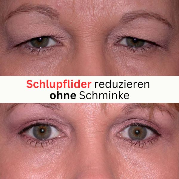
3. Real-photo eye before and after
What it does. A split real-photo close-up stacks the same eyes, hooded on top and visibly lifted below, with the line Schlupflider reduzieren ohne Schminke (reduce hooded lids without makeup). The transformation itself is the whole pitch.
Why it works. An unretouched top-versus-bottom photo gives instant, believable proof of a cosmetic result, and the without-makeup claim widens the appeal.
Ad data. Reached 5.2M over a 177 day run, a solid multi-month performer built purely on the visual transformation. Gender split: 90% women / 10% men.
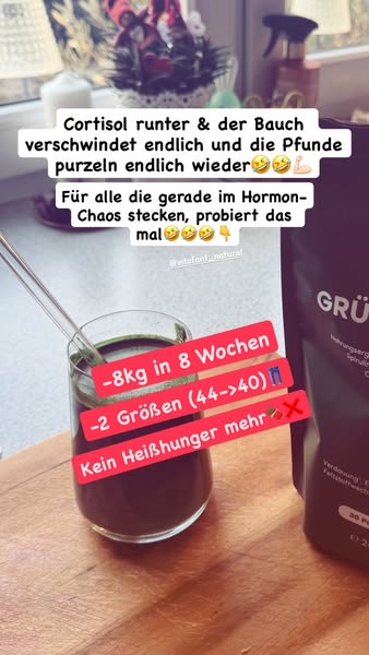
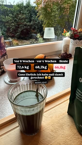
4. Scale-number drop testimonial
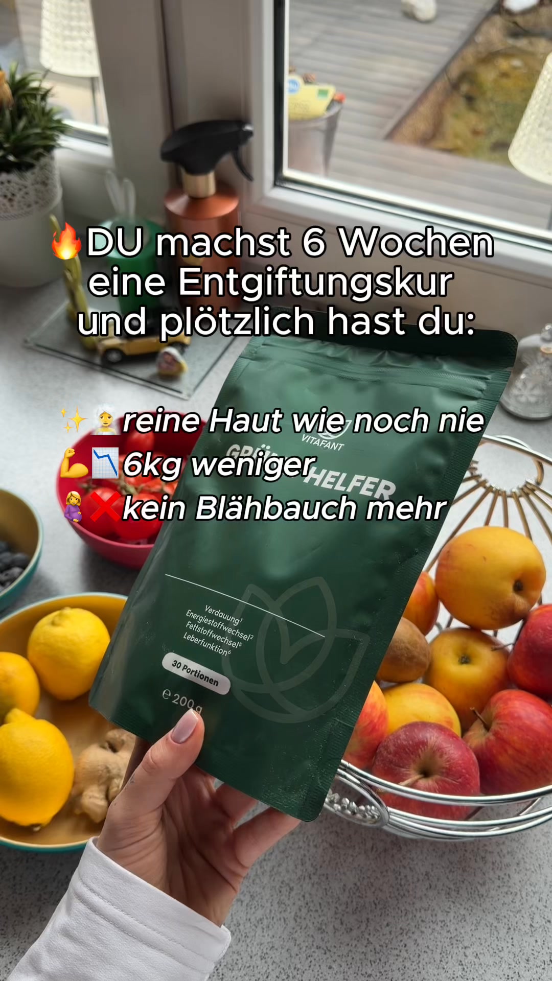
What it does. A phone-shot green drink on a windowsill carries a first-person caption and a weight progression, 72,6 to 68,2 to 66,1 kg, with Ganz ehrlich, ich habe null damit gerechnet (honestly I never expected this). A personal result becomes the proof.
Why it works. Concrete falling numbers plus a humble organic-looking home photo read as a real customer story, not a brand claim, which builds trust fast.
Ad data. Reached 5.7M in just a 44 day run, unusually fast accumulation that flags a strong hook. Gender split: 90% women / 10% men.
5. White-coat clinic explainer
What it does. A man in a white lab coat stands in a clinic hallway under a large question mark and the caption DAS ERGEBNIS (the result), while the copy warns that neck tension from screens can lead to serious problems. It stages the pitch as a clinical, expert-led verdict.
Why it works. The lab coat and clinic setting borrow medical authority, and the problem-then-result buildup makes the recommendation feel diagnosed rather than advertised.
Ad data. Reached 8.6M over a long 263 day run, one of the top reaches here and a durable evergreen. Gender split: 52% women / 48% men.
6. Day-by-day results timeline
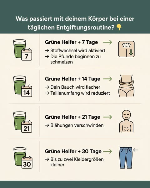
What it does. A clean chart lists Gruene Helfer +7, +14, +21 and +30 Tage, each row pairing a glass icon with the change to expect (metabolism activated, flatter stomach, bloating gone, up to two dress sizes smaller). It maps out the routine as a numbered progression.
Why it works. Sequencing benefits against day counts sets clear expectations and makes the result feel systematic and inevitable, which pre-sells the daily habit.
Ad data. Reached 8.2M, among the strongest reaches in the category for a still-image asset. Gender split: 77% women / 23% men.
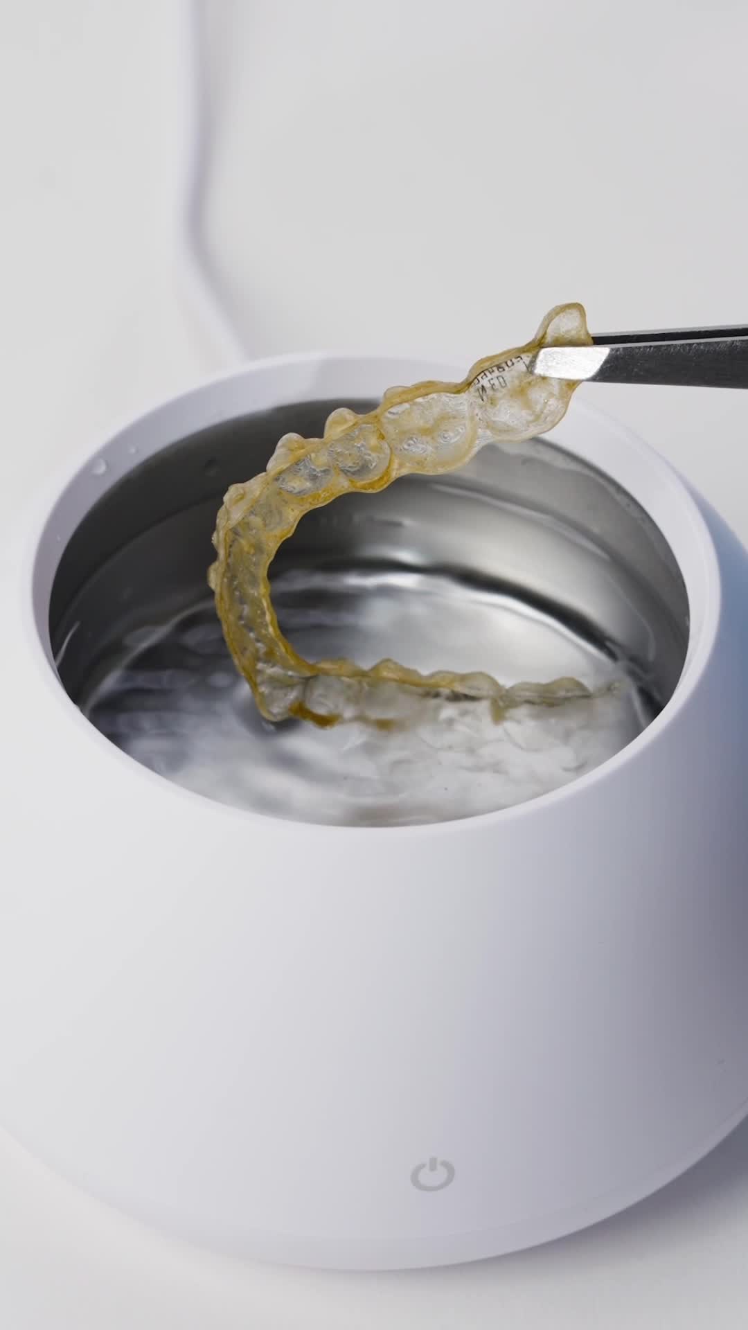
7. Grimy-aligner clean demo
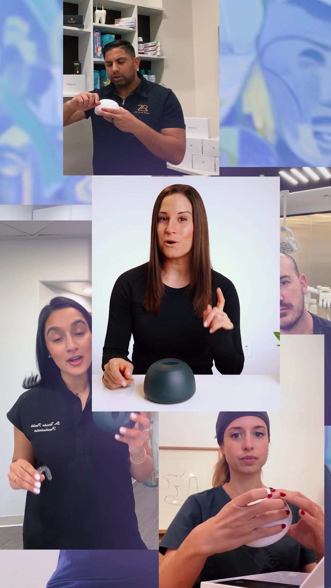
What it does. The video frame shows tweezers lifting a yellowed, grimy clear aligner out of the white cleaning pod filled with agitating water, with a five-star title. It simply shows the device doing its dirty job.
Why it works. The visible before-state of the aligner plus the satisfying in-water clean makes the product benefit self-evident with no argument needed.
Ad data. Reached 6.3M over an exceptional 779 day run, the longest-running ad in this set and a proven evergreen demo. Gender split: 48% women / 52% men.
8. Point-at-the-brace wearing callout
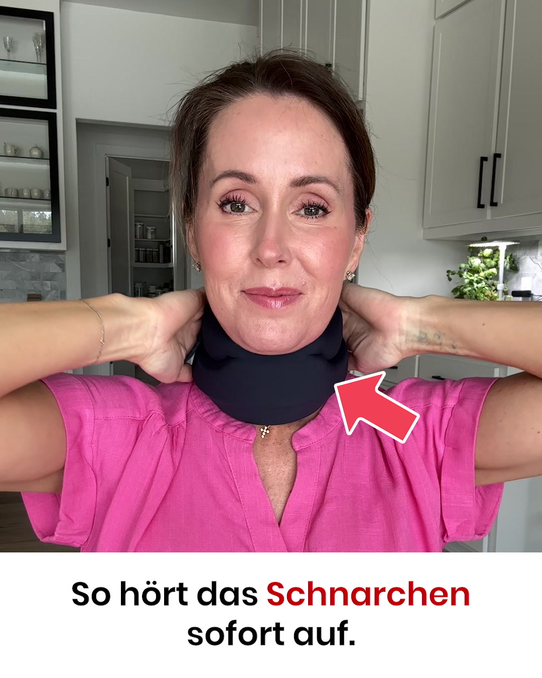
What it does. A woman wears the dark neck support on camera with a bold red arrow pointing at it and the caption So hoert das Schnarchen sofort auf (this is how snoring stops immediately), backed by a five-star testimonial in the copy. It shows the product worn and literally points to it.
Why it works. Seeing the device on a real person plus a blunt arrow-and-claim makes the solution tangible and the promised outcome impossible to miss.
Ad data. Reached 7.5M over a long 409 day run, a durable performer built on the worn-product demonstration. Gender split: 47% women / 53% men.
Health, Medical & Wellness ad best practices
- Lead the first frame with a named symptom. Open on a blunt question about a specific, visible complaint rather than a generic wellness promise. Naming the exact ailment makes the ad feel like targeted health advice and speaks straight to the people who have it.
- Show believable, unretouched proof. Build the creative around a real before-and-after: stacked photos of the same eyes or legs, a grimy device cleaning up in water, or a falling scale number. Raw, home-shot visuals read as genuine customer results and outperform polished brand claims.
- Frame the buy as a quiz or single fix. Turn the pitch into a guided match, such as a 60-second quiz that recommends the right variant, or a promise of one simple home remedy. This lowers decision friction and invites an interactive tap instead of a hard sell.
- Point directly at the product on a real person. Put the device on camera being worn or used, then add a bold arrow and a one-line outcome claim in on-screen text. Making the solution tangible and impossible to miss lets the visual carry the argument.
Where this data comes from
What you see here is a curated slice of Meta advertising, not a full census of it. We sample only the highest-reach Facebook and Instagram ads in each industry, so every count and pattern describes the top-performing ads adtribute tracks, not every advertiser on the platform. Reach here means the number Meta itself discloses under EU transparency rules, gender, age and country split included, taken as published. Estimated spend is the exception: we compute it from the reported reach using an assumed 5 to 30 EUR CPM.
The raw ad data is collected via top-ads.io. The Ad Library itself is a free resource from adtribute, an attribution and analytics platform that shows which channels and touchpoints actually drive your revenue.